Skip to content
SusieG Studio
Search
Category:
Creative Experiences
How To Sew: A Quick Drawstring Gift Bag
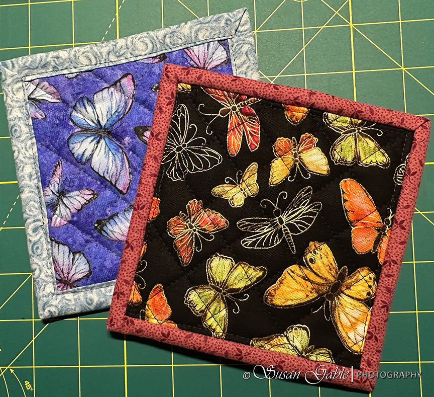
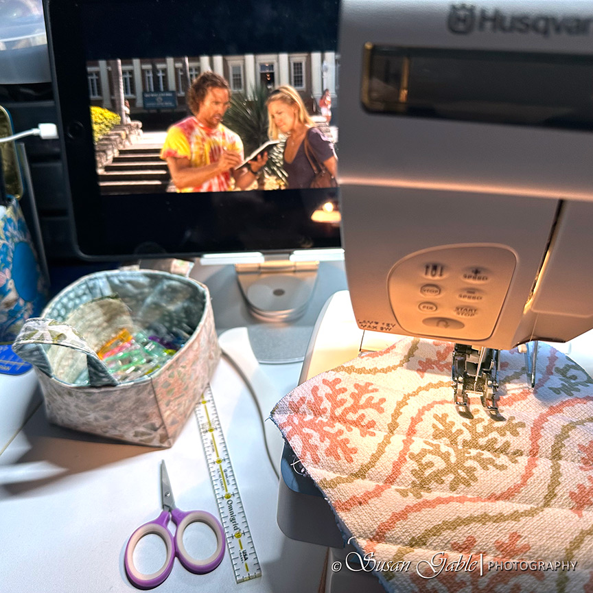
Sewing Mug Rugs & Some Sewing Tips
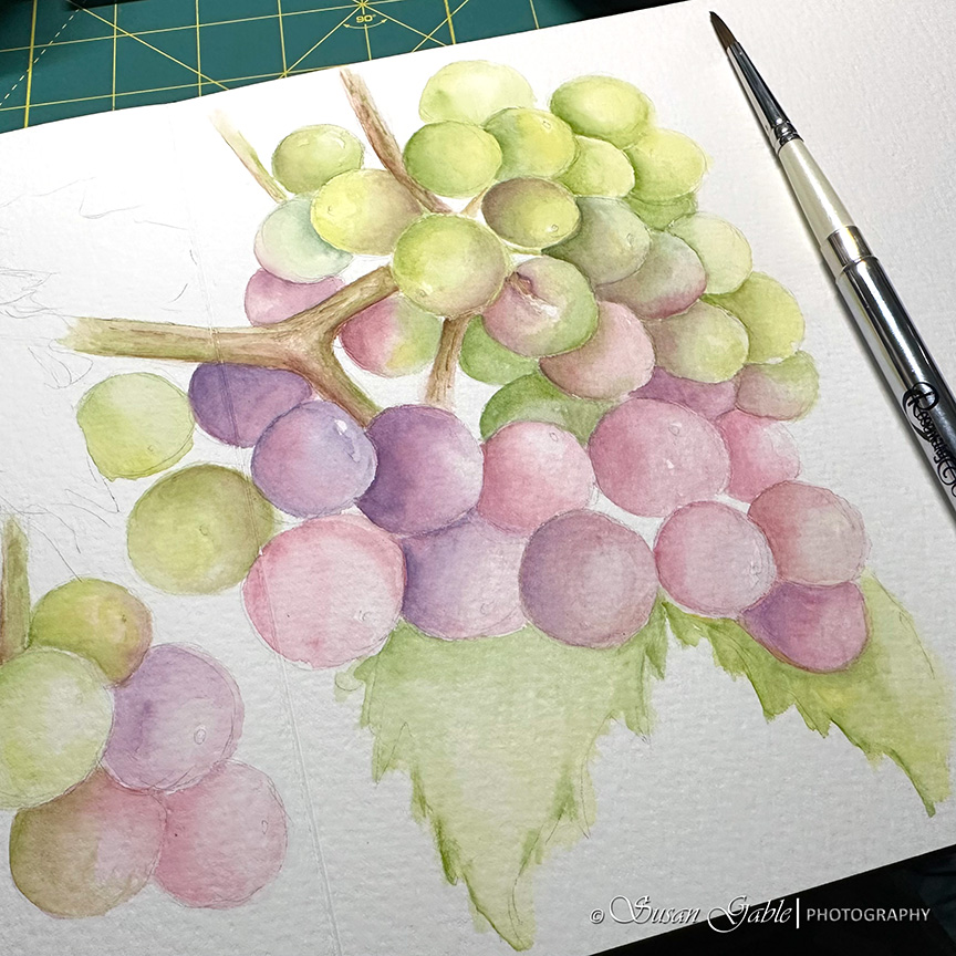
A Watercolor Grape Sketch in Two Sketchbooks: Funto & Luchetti
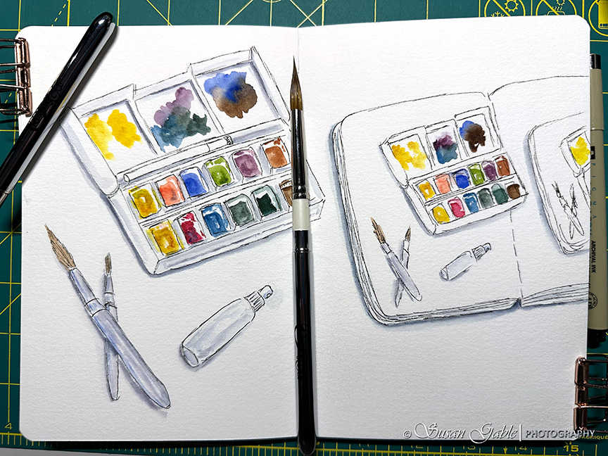
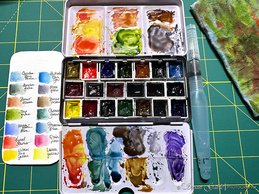
My Watercolor Tools: Palettes & Brushes I’m Using
Sewing Mug Mats and Helpful Sewing Tips
Another Watercolor Pumpkin Painting
It’s Pumpkin Time!
Next Page
Subscribe
Subscribed
SusieG Studio
Join 88 other subscribers
Sign me up
Already have a WordPress.com account?
Log in now.
SusieG Studio
Subscribe
Subscribed
Sign up
Log in
Report this content
View site in Reader
Manage subscriptions
Collapse this bar