Skip to content
SusieG Studio
Search
Category:
Stillman & Birn
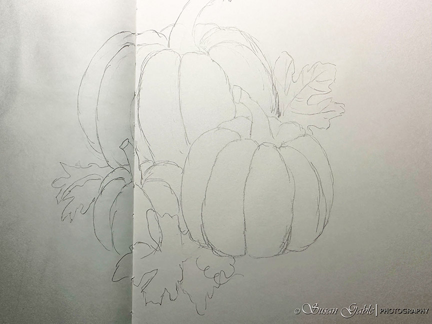
Another Watercolor Pumpkin Painting
My First 2025 Pen & Ink Sketch: a Peony
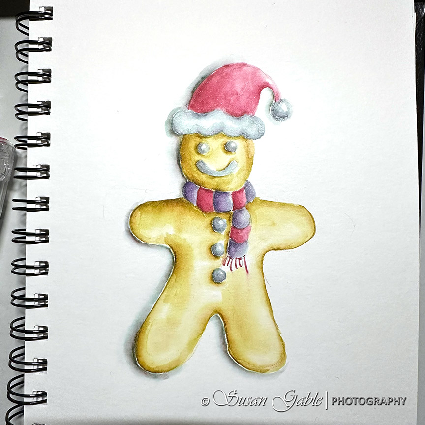
Merry Christmas! My Other December Sketches
Holly & Berries #1 and #2 – Pen & Ink Sketches and a Prompt
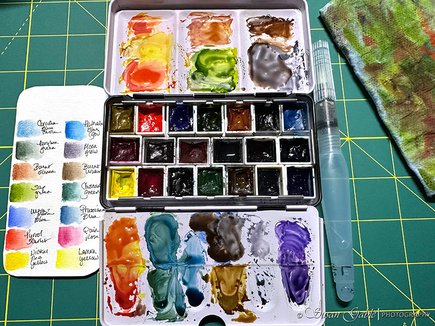
December Inks in My Art Pens
Finding an Hour Here & There
Remember My Pumpkin Sketch?
Next Page
Subscribe
Subscribed
SusieG Studio
Join 88 other subscribers
Sign me up
Already have a WordPress.com account?
Log in now.
SusieG Studio
Subscribe
Subscribed
Sign up
Log in
Report this content
View site in Reader
Manage subscriptions
Collapse this bar