Skip to content
SusieG Studio
Search
Category:
Journal
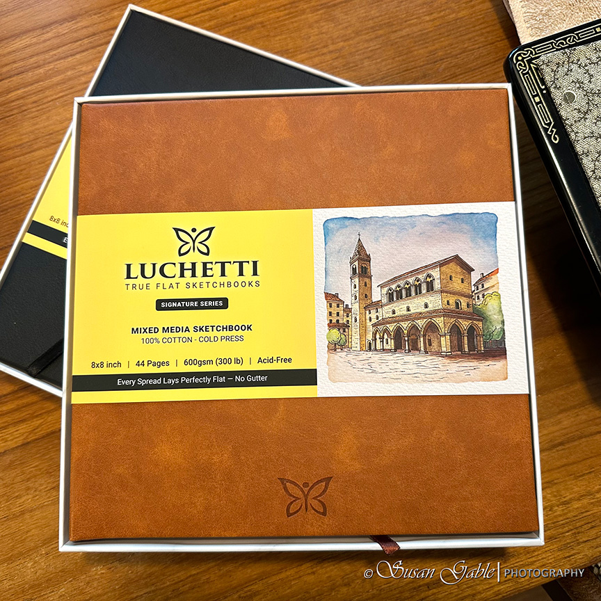
Trying a New Luchetti Sketchbook
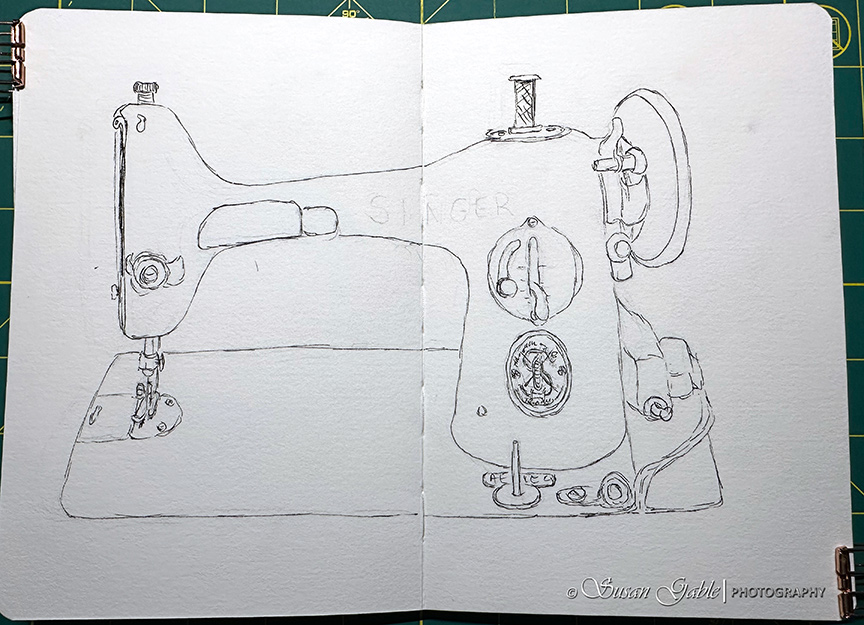
A Quick Sketch
My Galen Leather Expansi-Folio Wide A5 Zip Folio
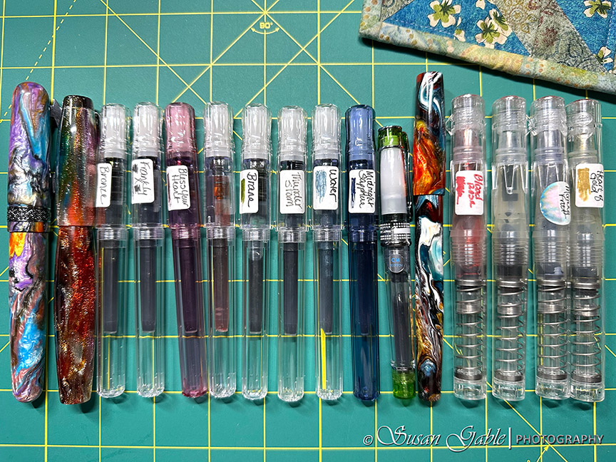
Currently Inked: Sixteen Fountain Pens
My 2025 DC Pen Show Wish List Items and a Lot More
I Tried Getting Back into Painting with Watercolors
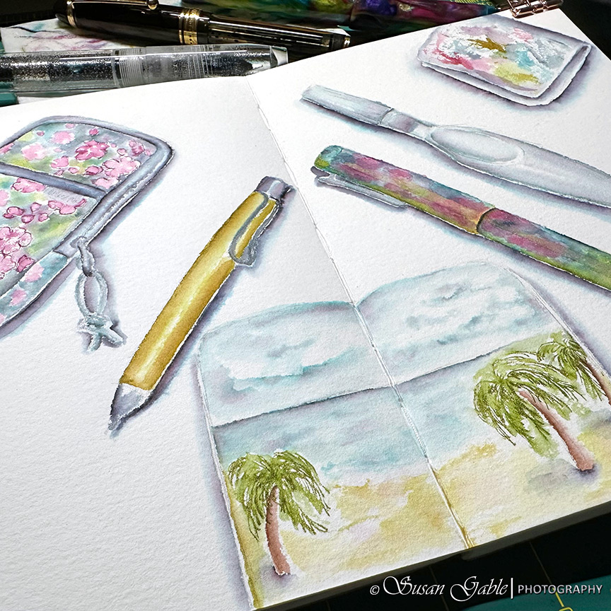
Sketching My Art Tools – Pen & Ink Wash
Next Page
Subscribe
Subscribed
SusieG Studio
Join 88 other subscribers
Sign me up
Already have a WordPress.com account?
Log in now.
SusieG Studio
Subscribe
Subscribed
Sign up
Log in
Report this content
View site in Reader
Manage subscriptions
Collapse this bar