Skip to content
SusieG Studio
Search
Category:
DeAtramentis Inks
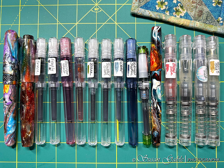
Currently Inked: Sixteen Fountain Pens
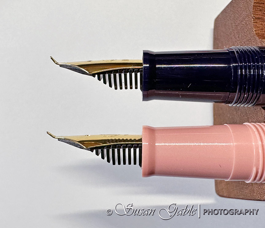
Starting to Fill My Fountain Pens
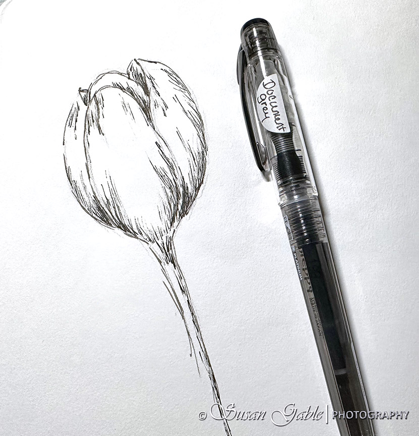
I Am Still Sketching
My Sketches-Created With My Sailor Profit ‘Fude de Mannen’ Nib
Quick Watercolor Sketches and a Prompt
A Finished Page from My Art Journal
A Simple Floral Sketch & Prompt
Next Page
Subscribe
Subscribed
SusieG Studio
Join 88 other subscribers
Sign me up
Already have a WordPress.com account?
Log in now.
SusieG Studio
Subscribe
Subscribed
Sign up
Log in
Report this content
View site in Reader
Manage subscriptions
Collapse this bar