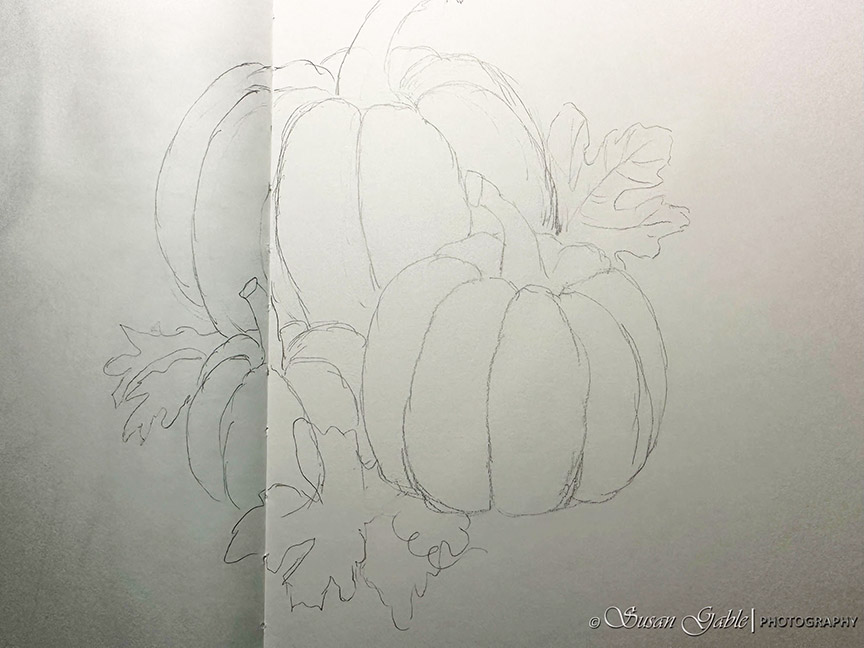
Back in September, I wrote about the start of my pumpkin pen & ink sketch. A work in progress.

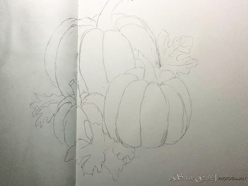
Here’s my original rough pencil sketch of my three pumpkins in my 8″x10″ journal.
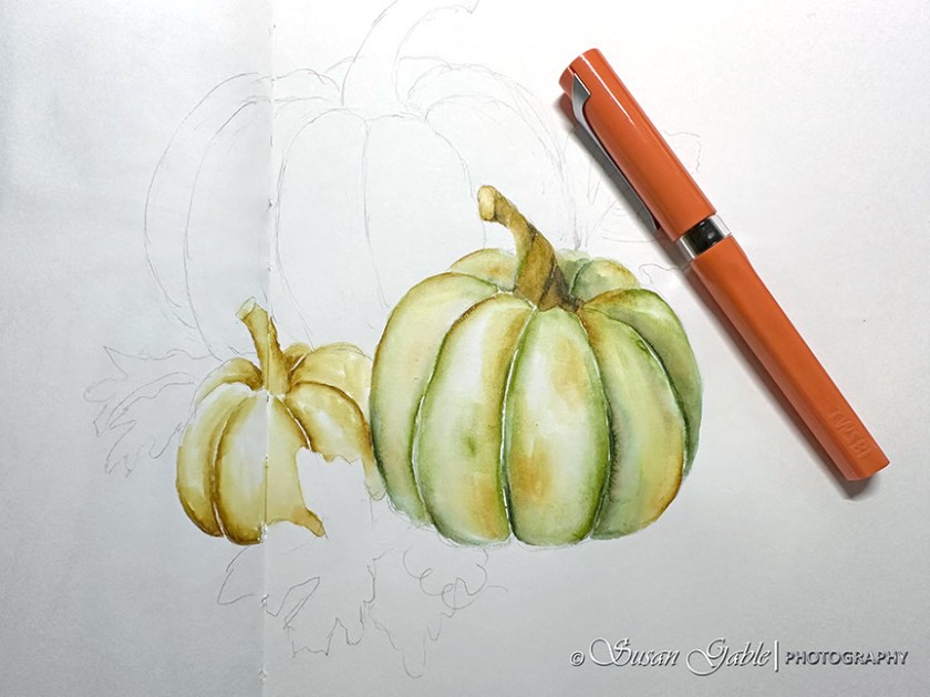
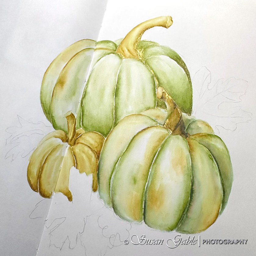
I had skipped my process of outlining my sketch in permanent ink and went straight into my pen & ink wash. I had worked each section/segment of my pumpkin and allowed it to dry so the inky colors would not run into each other. Since I was working in layers, I let each layer dry completely before I applied an additional wash over the previous color. I found this technique added a bit more “punch” of color to my object and added a bit more depth to my sketch.
I started out using a dark green (Eucalyptus Leaf) color to define the sections of the pumpkin. Notice it was not a continuous line of dark color. I applied the dark green in areas to accentuate the curves and created more depth.

After I created a few layers of inky wash on my first pumpkin, I moved on to the next smaller pumpkin. I decided to use my fave golden yellow ink (Heart of Gold) for this smaller pumpkin and added two layers of the same color.
While I was waiting to my other pumpkins to dry, I started to work on my third pumpkin. I had intentions of just sketching an all green pumpkin and then changed my mind at the last minute.
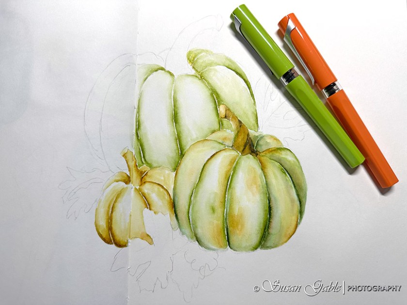
So I shifted gears and added a bit of yellow on the left edge and also used the yellow for the top stem. The colors on my pumpkins worked out well and created an overall cohesive sketch.

When I’m in my creative zone, I trust my gut feeling. Sometimes I stick to my creative plan. Other times, a light bulb goes off in my head and I adjust my creative plan. Go with the flow. Just do it.
Here’s an angled view of my sketch to show off the shimmers.
I continued to use the green (Prairie Green) for the leaves and made sure to leave a bit of white or light areas to create some depth.
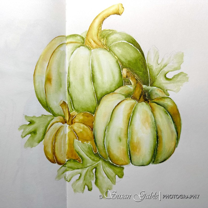
I’m quite happy with how my pumpkin sketch turned out. I decided to stop adding additional layers of color. Sometimes “less” is better.
Most of the green I used in my sketch was Prairie Green. It’s my fave green ink color and I enjoyed using it for sketching. I liked how the green color lightened up a bit with water. To create the medium green color, I applied layers of green ink. Prairie Green also blends nicely on my paper.
Did anyone notice that I left off the shadows underneath my pumpkins and leaves? I might have to call my sketch-Floating Pumpkins!
Inks: KWZ/Galen Leather Exclusive Prairie Green (shimmer). Robert Oster Heart of Gold (shimmer), Melon Tea, and Eucalyptus Leaf
Pens: TWSBI Swipe with Stub 1.1 nib
Journal: Stillman & Birn Alpha Softcover 8″x10″


Leave a comment