-
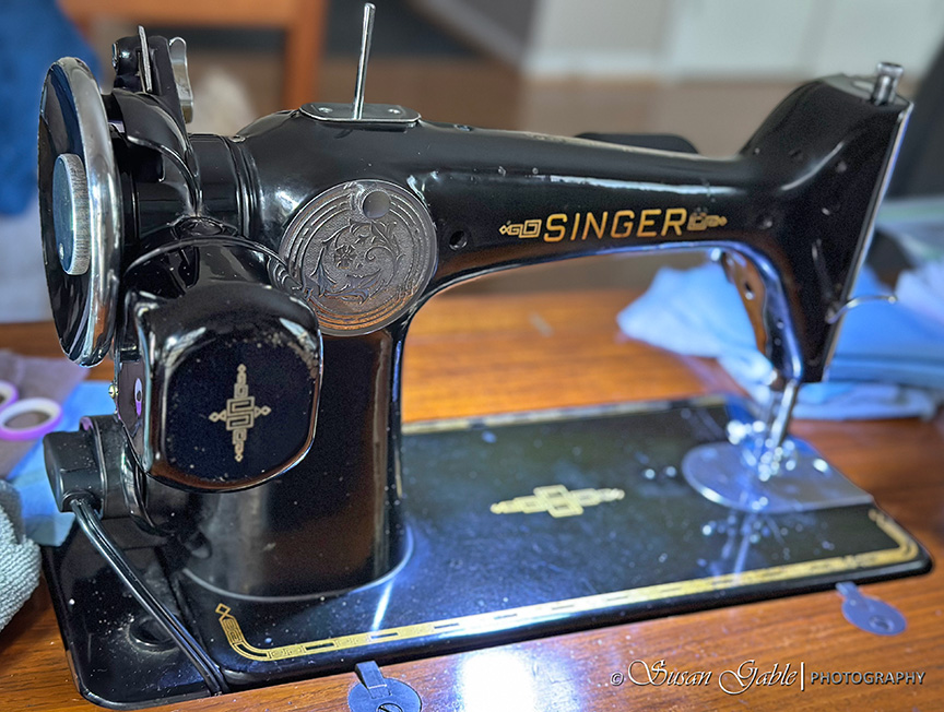 Continue reading →: My Singer 201-2: Part 7-True 201 Personality & My Featherweight
I’ve been watercolor painting non-stop for the last few weeks and documenting my creativity. You’ve probably noticed my sewing has taken a back seat for a bit. I did have this blog post about my Singer 201 sitting in my drafts folder for a few weeks. I wanted to take…
-
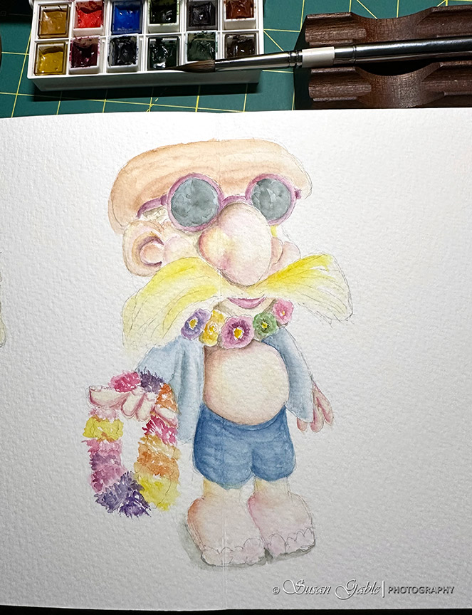
 Continue reading →: My Garden Gnome Watercolor Sketch & Learning About My Painting Style
I started with a pencil sketch and drew the basic shapes and outlines of my Garden Gnome. Here’s what my two page spread looked like. I used my gnome statue as a reference and to get the proportions right in my sketch. I decided to sketch a few additional details…
-
 Continue reading →: Painting a Maui Nix for Fun
Note: This blog post was published late in the evening and of course the next morning I find quite a few paragraphs with bad grammar and basically bad writing where my thoughts were not flowing right. I’ve updated this blog post and hope I fixed most of my errors. Just…
-
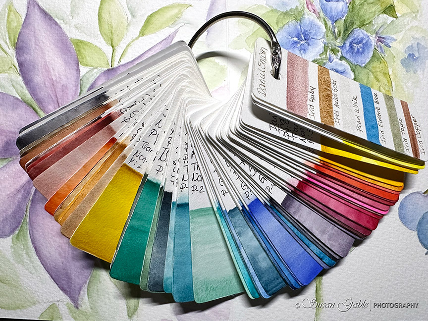 Continue reading →: Changing Out Four Colors in My Watercolor Palette & My Swatch Cards
The good thing about using a small palette is I get to work with a limited number of colors at one time. From this limited palette, I can experiment and create colorful mixes of additional colors to use. For the last few months I’ve been using the same paint colors.…
-
 Continue reading →: A Small Floral Painting in My Luchetti Sketchbook: Bluebells
I thought it would be fun to create a smaller floral painting. I’m in between projects and I wanted to keep my sketching skills going. So, I had to gather a few of my smaller travel brushes and get in some practice time. In early Spring, I took this picture…
-
 Continue reading →: How To Sew: A Quick Drawstring Gift Bag
Warning: You might want to grab some coffee, tea, or water for today’s blog post. Enjoy! I had an idea to sew another quick project on my vintage Singer sewing machine. I had sewn two mug rugs for my friend and I needed some sort of bag to complete the…
-
 Continue reading →: Clematis Watercolor Painting in My Luchetti Sketchbook-Part 2: My Finished Painting
Last week I posted about my watercolor painting of a clematis flower that I started and did not finish. I mentioned that I was going to pause and let my painting dry. This pause was for a very good reason. I wanted to share with my blog readers that I…
Welcome to my Studio!

I’m an artist who enjoys spending time in my studio creating art and sharing my artistic adventures.
Follow me on my artistic journey. I’ll be sharing the products I use along with tips and tricks.
Update #1: I’ve given my website a new look and fixing a few things along the way
Update #2: I’m currently in my watercolor and sewing phase. Two areas that compete for my time.
Join me on my artistic adventures!
Be notified when I publish my blog post and receive updates.


