Skip to content
SusieG Studio
Search
Category:
Products/Reviews
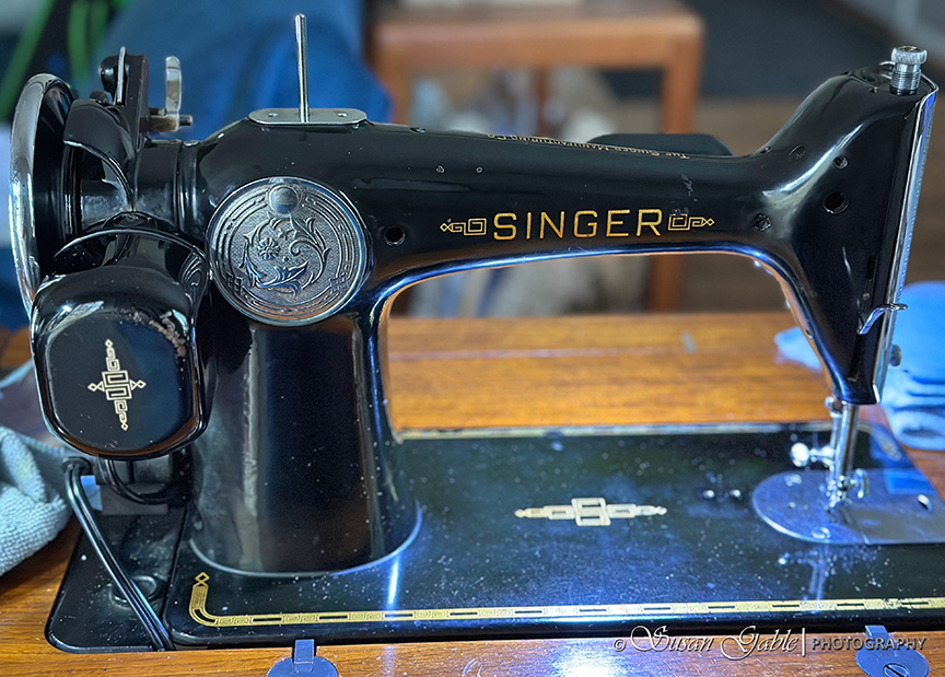
My Singer 201-2: Part 4-Cleaning the Nooks & Crannies with Chrome Polish
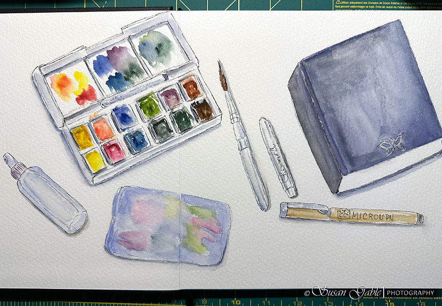
Luchetti Sketchbook – My Watercolor Sketch
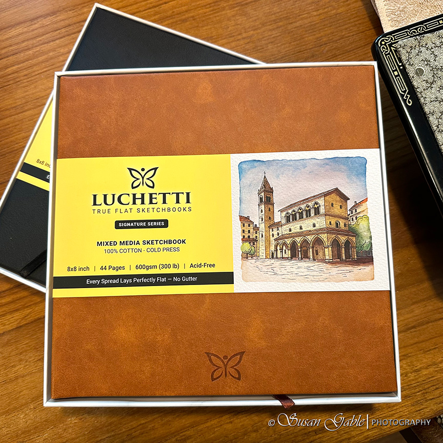
Trying a New Luchetti Sketchbook
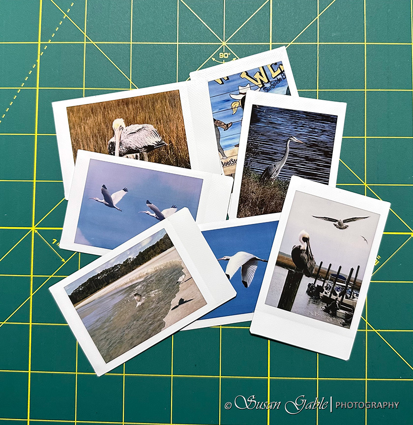
My FujiFilm Instax Mini Link 2 Portable Printer Experience/Experiment
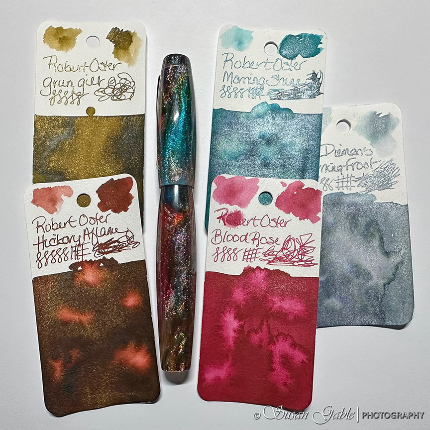
My Zodiac Pen in Primary Manipulation 5
My Galen Leather Expansi-Folio Wide A5 Zip Folio
My Conklin 1898 Primary Manipulation 4.5
Next Page
Subscribe
Subscribed
SusieG Studio
Join 88 other subscribers
Sign me up
Already have a WordPress.com account?
Log in now.
SusieG Studio
Subscribe
Subscribed
Sign up
Log in
Report this content
View site in Reader
Manage subscriptions
Collapse this bar