Skip to content
SusieG Studio
Search
Category:
Diamine
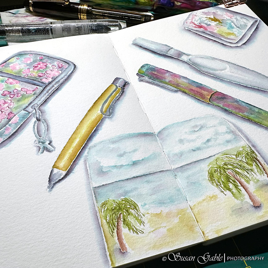
Sketching My Art Tools – Pen & Ink Wash
My Two Black Fountain Pen Inky Colors
Another Jinhao x159 with (#8) Extra Fine Nib
More Jinhao x159s…Please
Day 25: The Last Day with My Swatches of Green Inks
Day 24: More Blue-Purple Swatches
Day 23: My Non-Coral Red Swatches
Next Page
Subscribe
Subscribed
SusieG Studio
Join 88 other subscribers
Sign me up
Already have a WordPress.com account?
Log in now.
SusieG Studio
Subscribe
Subscribed
Sign up
Log in
Report this content
View site in Reader
Manage subscriptions
Collapse this bar