Skip to content
SusieG Studio
Search
Category:
Lochby
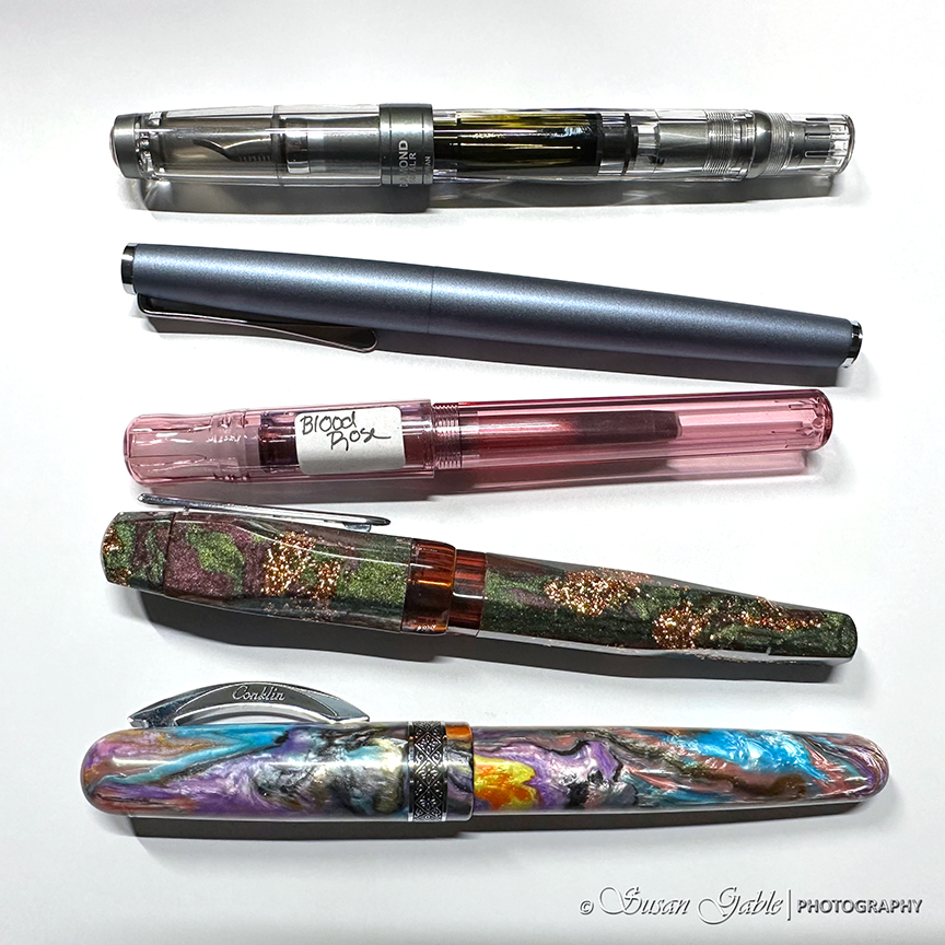
My Currently Inked Fountain Pens
2023 DC Pen Show Haul- Robert Oster Signature Inks & Vanness Special Edition Ink
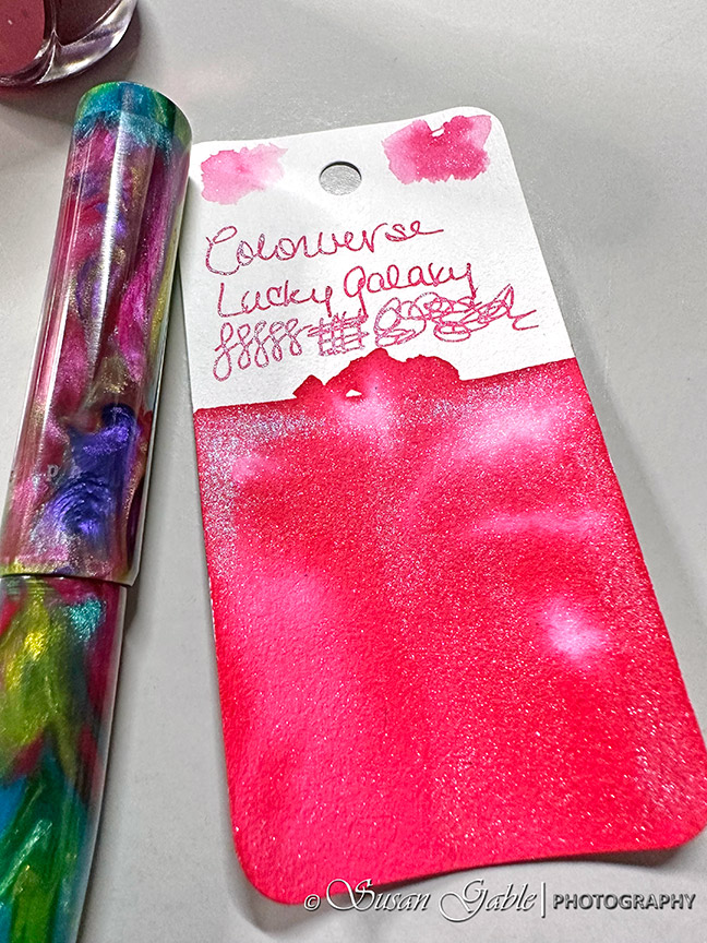
2023 DC Pen Show Haul – Colorverse & Lucky Star Pens Special Ink
Sketching Progress
Creating Sketches While Traveling
Acorns!
My Favorite Journal Cover by Lochby
Next Page
Subscribe
Subscribed
SusieG Studio
Join 88 other subscribers
Sign me up
Already have a WordPress.com account?
Log in now.
SusieG Studio
Subscribe
Subscribed
Sign up
Log in
Report this content
View site in Reader
Manage subscriptions
Collapse this bar