Skip to content
SusieG Studio
Search
Category:
Learning
How To Sew: A Quick Drawstring Gift Bag
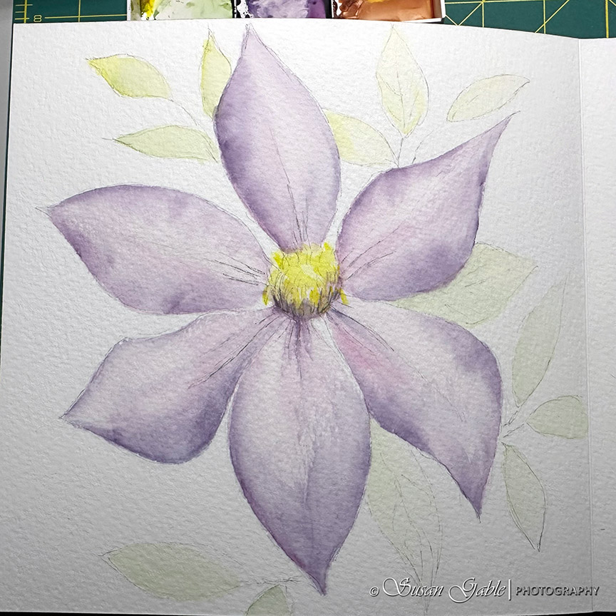
A Clematis Watercolor Adventure in My Luchetti Sketchbook-Part 1: Initial Sketch and Building Layers of Colors
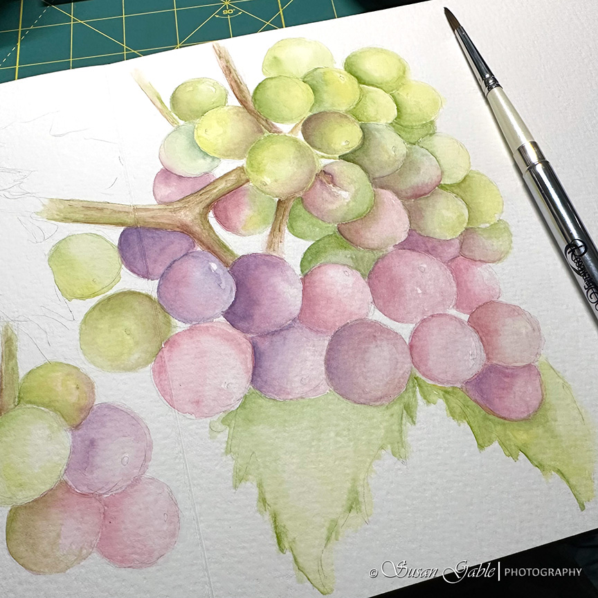
A Watercolor Grape Sketch in Two Sketchbooks: Funto & Luchetti
New Look & Making Adjustments & Test Post
I Tried Getting Back into Painting with Watercolors
Holly & Berries #1 and #2 – Pen & Ink Sketches and a Prompt
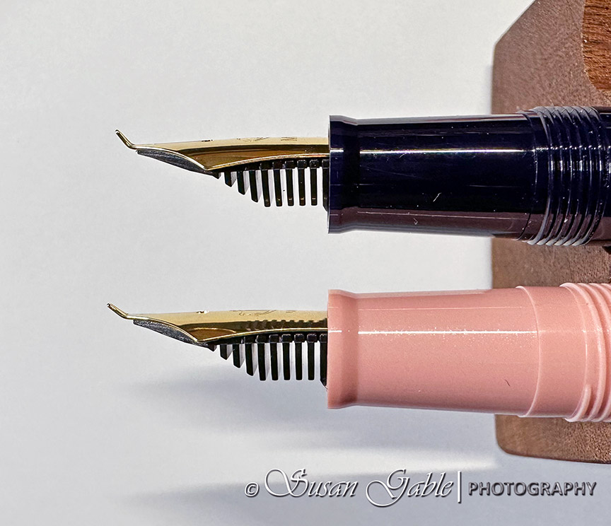
My Sketches-Created With My Sailor Profit ‘Fude de Mannen’ Nib
Next Page
Subscribe
Subscribed
SusieG Studio
Join 88 other subscribers
Sign me up
Already have a WordPress.com account?
Log in now.
SusieG Studio
Subscribe
Subscribed
Sign up
Log in
Report this content
View site in Reader
Manage subscriptions
Collapse this bar