Skip to content
SusieG Studio
Search
Category:
Pen & Ink
It’s Pumpkin Time!
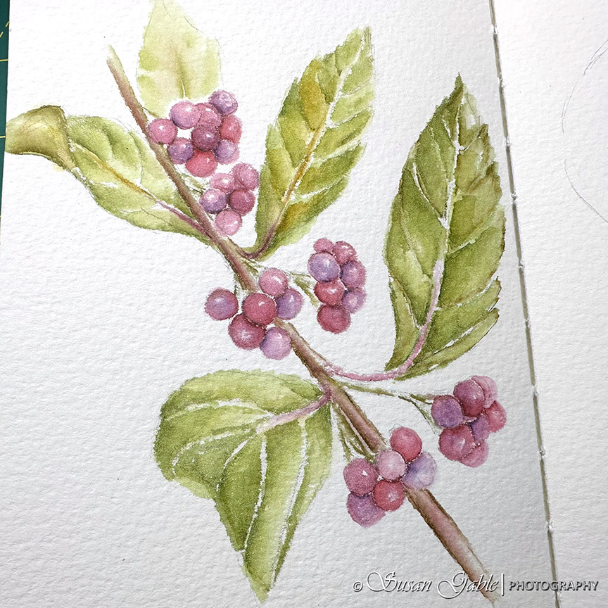
A Few of My Pen & Ink Drawings & Discoveries
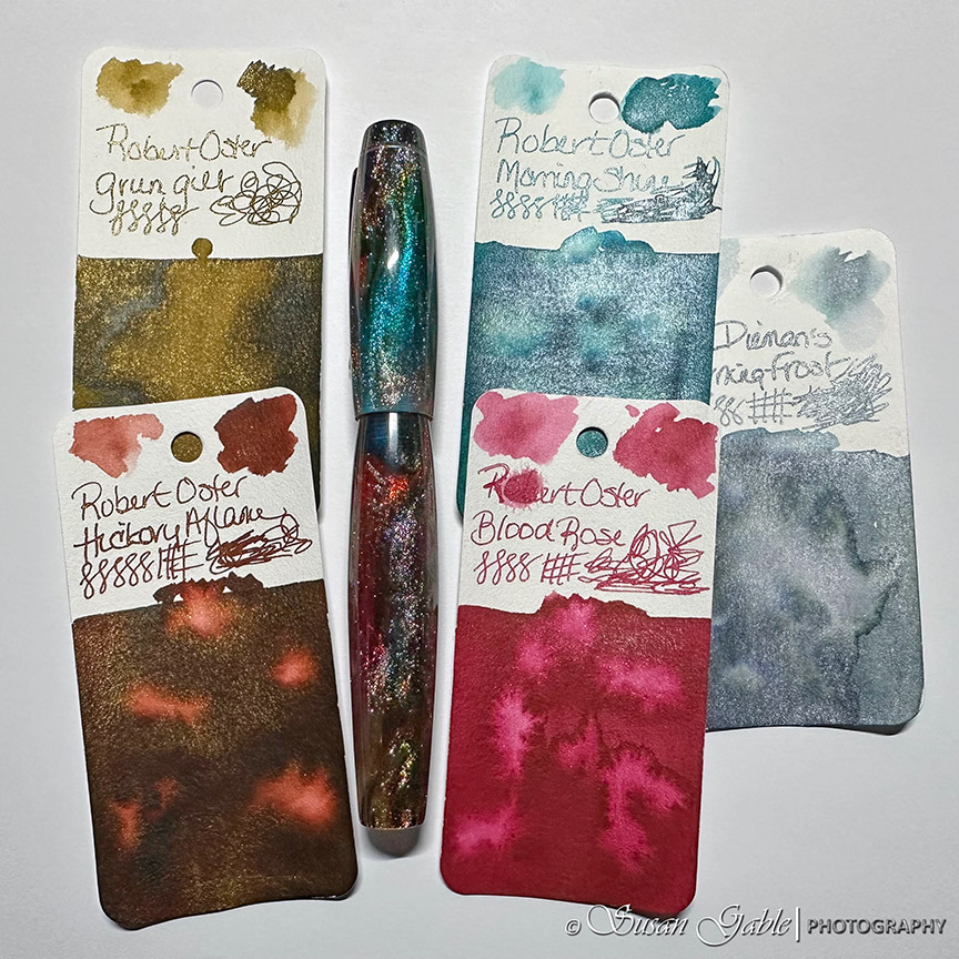
Needing an Orange Ink for My Sketches
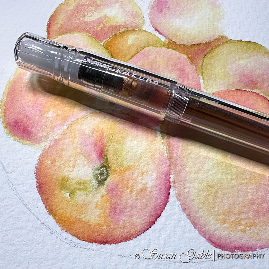
My Apple Drawing
My Zodiac Pen in Primary Manipulation 5
My Conklin 1898 Primary Manipulation 4.5
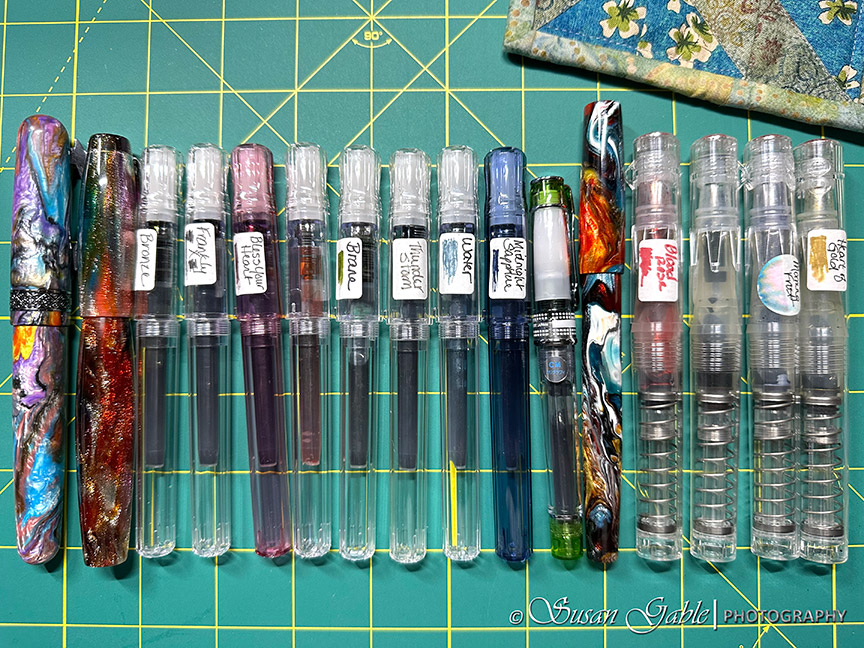
Currently Inked: Sixteen Fountain Pens
Next Page
Subscribe
Subscribed
SusieG Studio
Join 88 other subscribers
Sign me up
Already have a WordPress.com account?
Log in now.
SusieG Studio
Subscribe
Subscribed
Sign up
Log in
Report this content
View site in Reader
Manage subscriptions
Collapse this bar