I’ve recently had a change in my work life at my local garden center. I’ve been working indoors (home decor) for the last year and I’m now working outside with beautiful perennial plants. I have to say, I am extremely happy with this change both mentally and physically. I get to take care of beautiful plants and help/chat with the customers about their plant needs. Oh and I’m receiving plenty of vitamin D…just what my doctor ordered.
Since I’m working in a different department, my work hours have also changed and so I no longer have my morning time for sketching nor blogging. This explains why I have been MIA from my blog for a bit and why the ink in my artsy fountain pens have gone dry. I’ve been trying to figure out a new system or balance of life where I can still keep my creativity going and maintain this blog.
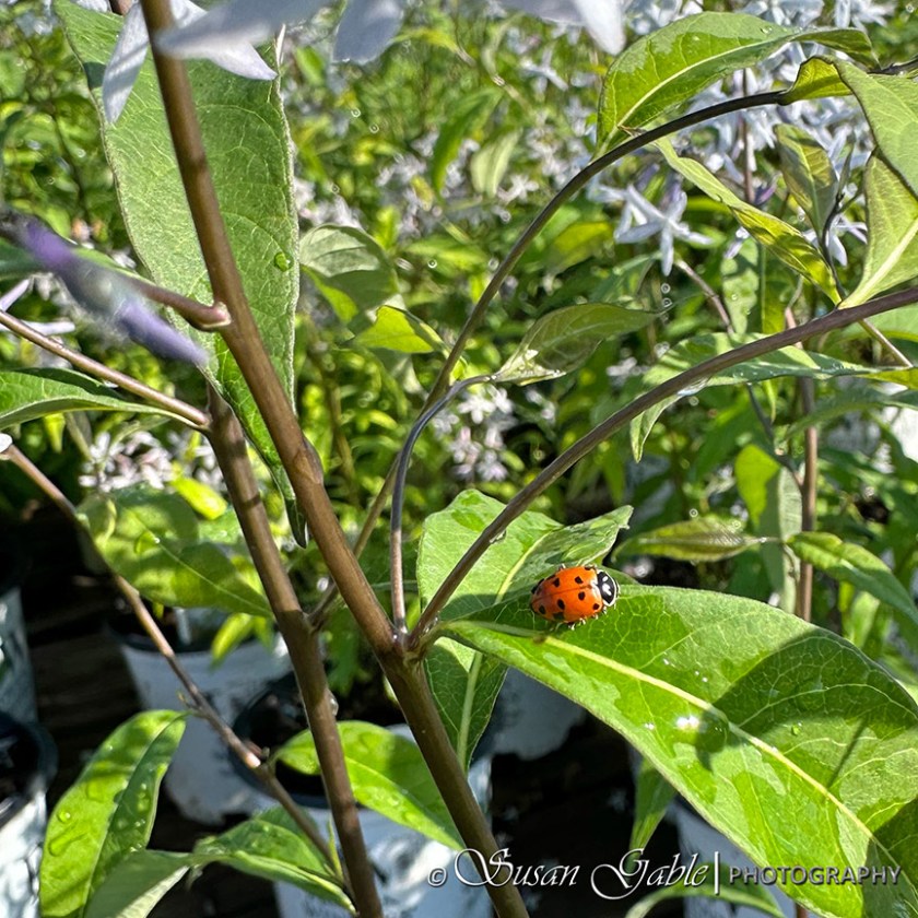
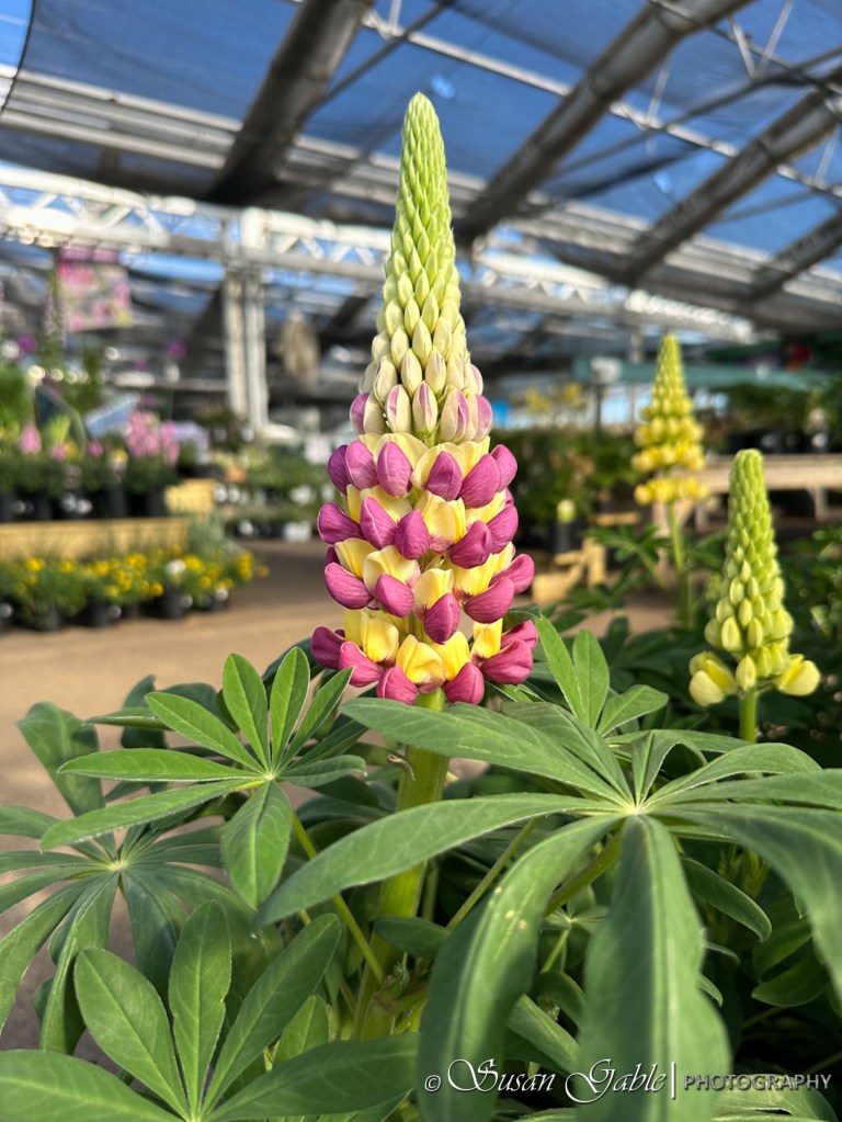
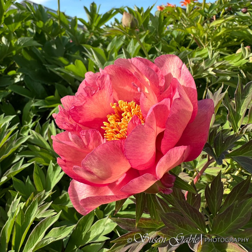
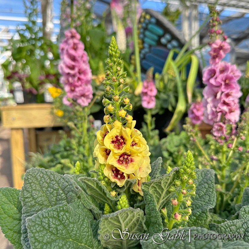
In the meantime, I have been taking pictures of the beauty that’s around me at the garden center. I thought I would share a few here.
My ladybug friend
Lupines
Peony Itoh Hillary
Lupines
Water drops around the Lupine leaves
Verbascum
Achillea
Sketching Prompt: Maybe a few of my floral pictures could be used as a prompt for your sketches. Sketch a bug or a few petals.
Looks like I’ll be busy cleaning and soaking my fountains pens that contained the dried up inks. Did I mention they were shimmering inks?
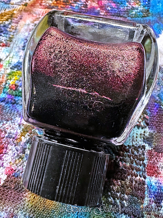
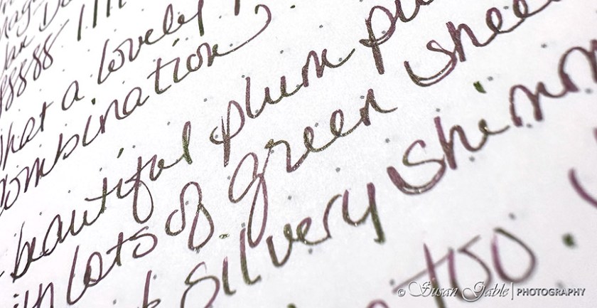
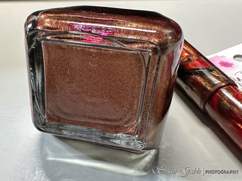
I’m back with another Van Dieman’s Ink review. This lovely ink is called Tortoiseshell. After I saw the initial ink swatches and sample writings, I knew this would become another inky fave for me.
Tortoiseshell is a beautiful plummy-purple color. At first, the shimmers appear to be coppery, but my picture is showing something else.
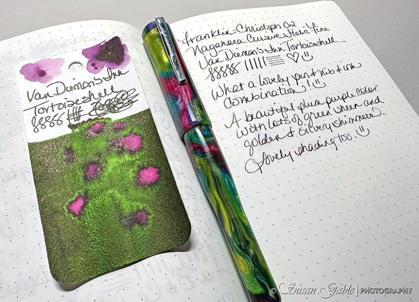
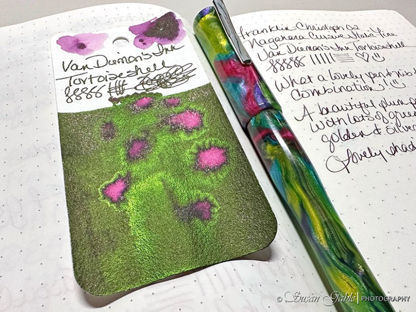
My 02 Intrinisic (prototype) from Franklin-Christoph is a perfect match for this wonderful ink color. There’s a ton of green sheen on my swatch card with some coppery shimmers.
Here’s a closer look at my swatch card with the incredible green sheen.
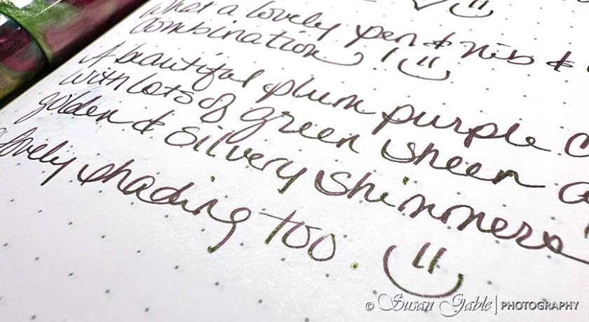
On paper with a fine nib, my writing sample shows the purple color and hints of shimmer along with bits of sheen.
Here’s a different angle of my writing sample. I’m sure if I had used a broader nib, the sheen would show up more.
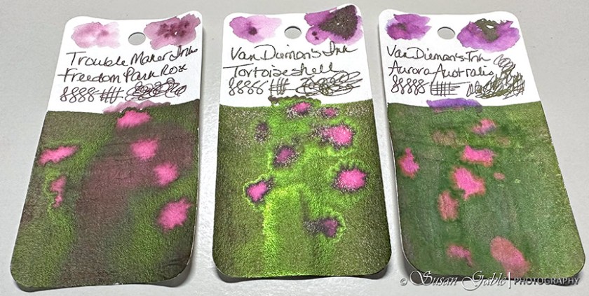
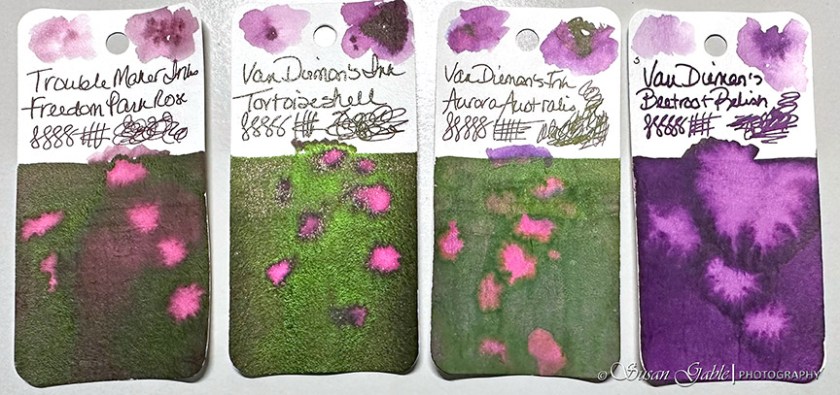
It didn’t take me too long to find some swatch cards that had similar color properties to Tortoiseshell. They are quite close in the underlying color as well as sheen.
Freedom Park Rose is just a tad bit lighter than Tortoiseshell and the green sheen is not as bright.
My swatch of Aurora Australis is from a sample and the ink looks quite dull and lifeless on my swatch card. I wonder if I received a sample from a bad batch.
Just for fun, I added my Beetroot Relish swatch to the mix.
Tortoiseshell is a lovely and wet purple ink. The bright green sheen is gorgeous when it appears on my paper. After I shook my bottle, I purposely refrained from filling my pen quickly as I did not want to get too much shimmers in my pen.
I’ve been enjoying this pen & nib & ink combination for writing in my journal. I can’t wait to sketch with this beautiful ink and see the results.
Ink: Van Dieman’s Ink Feline Series Tortoiseshell
Pen: Franklin-Christoph 02 Intrinsic (prototype) with #6 Nagahara Fine Cursive Italic nib
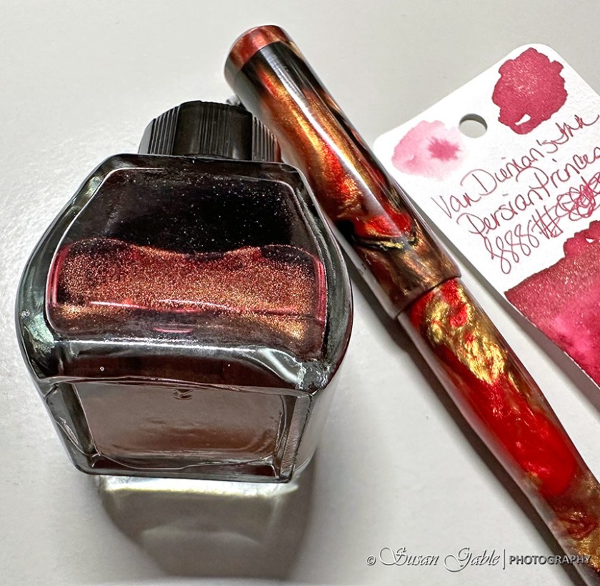
I found a lovely pinky shimmering ink called Persian Princess.
Naturally I had to turn my bottle to see what kind of shimmers were included. From this angle the shimmers appear to be coppery and rose. It matches the swirls of color (Golden Rule) in my fountain pen.
I let the shimmering ink settle a bit and then turned my bottle again. Plenty of gorgeous sparkles.
At first glance, Persian Princess appears to be very similar to my favorite Blood Rose ink.
My eyes can immediate see a difference between these two inky colors. Persian Princess is a true pink color while Blood Rose leans more towards red.
I have plenty of room for both colors in my inky collection and to use in my artsy adventures. Persian Princess has fast become another favorite ink of mine. A true pink color with plenty of coppery particles.
I mostly use Blood Rose for my artwork that requires a beautiful red ink color.
I can see some future floral sketches using both ink colors in my upcoming sketching adventures.
Inks: Van Dieman’s Ink Persian Princess. Robert Oster Blood Rose
Pen: Franklin-Christoph/Galen Leather/Brooks Golden Rule exclusive 02 Intrinsic model with Medium nib
For the last few days, I’ve found some time to sketch in the morning before heading off to work. The month of December has been a great month for sketching as there is no shortage of Christmas themes and ideas. I always try to challenge myself and sketch objects I haven’t created before. After using all this creative energy, I now have a backlog of December sketches that I can share with you.
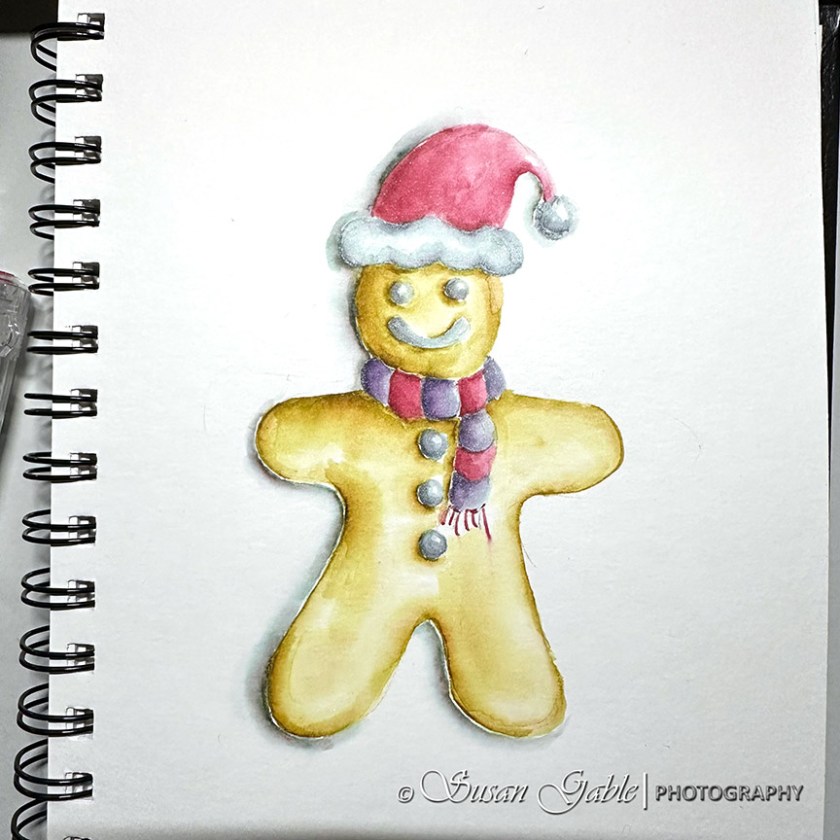
Here’s my sketch of a gingerbread cookie. In my mind, it was definitely a gluten-free version. Hahaha!
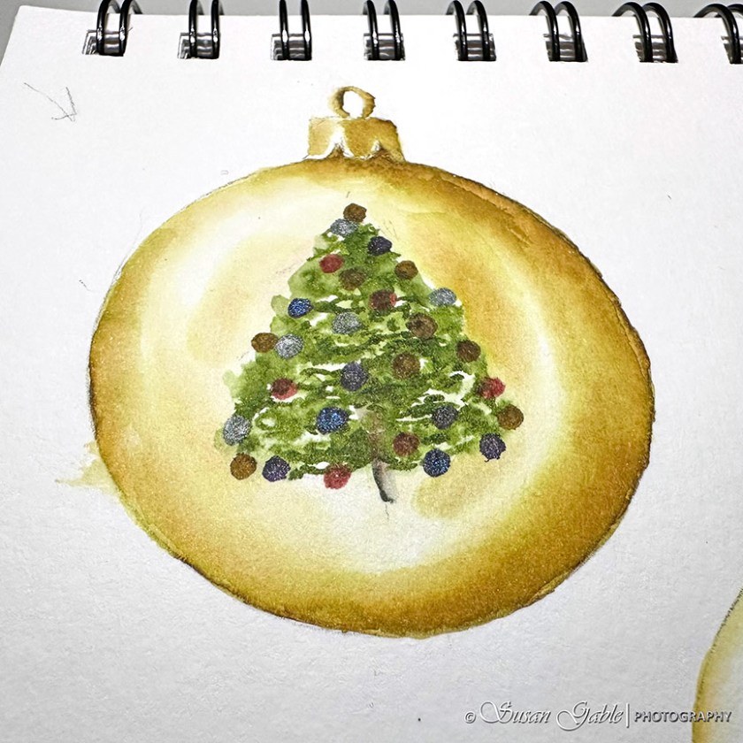
One morning, I decided to sketch round ornaments. I traced three round circles on my paper and picked up my pen with Heart of Gold and started with the middle circle. I spent some time adding layers of shimmering gold and leaving plenty of white space.
I moved on to the next circle and decided to challenge myself by sketching swirls. I decided to use Heart of Gold for all three ornaments for a consistent color theme. I added Blood Rose to create the swirls.
I try to leave some white spaces for the highlights and always cognizant where my light source is coming from.
The next day, I attempted to finish my ornaments sketch. I wanted to use my Prairie Green ink in my third ornament and thought a tree would look nice. I tried to add some color to the tree, but it’s looking a bit flat on the ornament.
I made sure to use shimmering inks in the ornaments on the tree.
Tip: Did you notice the arrow I sketched in the upper left corner? A reminder of where my light source is coming from.
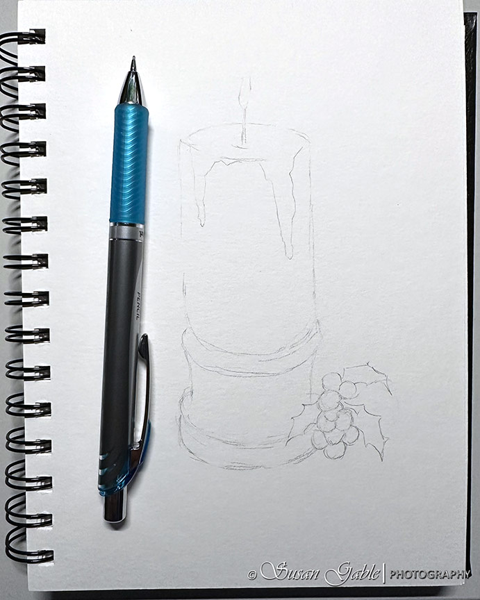
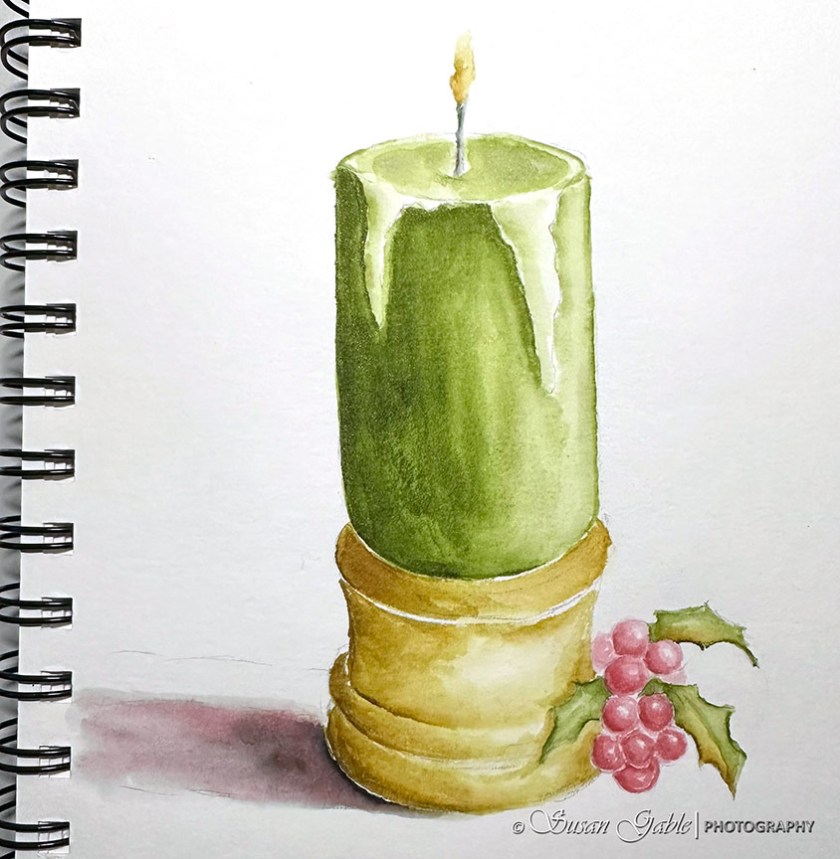
My next sketch is a candle. I thought about sketching a tapered candle, but that would have been too easy. Instead, I came up with this 5 minute sketch.
I’m finally getting my perspectives right. My candle and holder is not looking wonky. I’m quite happy with this.
Here’s my final candle sketch. The cast shadow did not come out the way it should look. I’ve been using shimmering inks in my December sketches and I picked Schwarz Rose to use for my cast shadows instead of my standard go to Thunderstorm ink. I wasn’t thinking about the underlying colors that Schwarz Rose contains nor the word “rose” in the name. Lessons learned. I went ahead and added Thunderstorm to the shadow. Good ole reliable Thunderstorm.
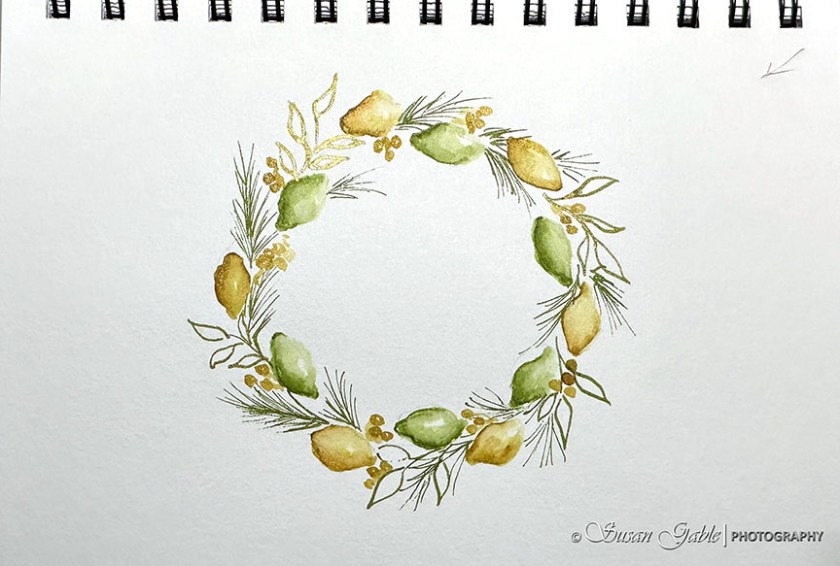
My next sketch is this Citrus wreath. I did not want to sketch the typical wreath greens and red berries I have done in the past. I decided to sketch lemons and limes. Here I used my fave inky colors Heart of Gold and Prairie Green.
My work schedule is changing again and I will have to shift gears and find time to sketch during the evening hours. I also want to get back into using my gouache paints and get some practice time in. I also have a few fountain pens and inky stuff to share.
Wishing everyone a joyous holiday with your family and friends.
Inks: Robert Oster Heart of Gold, Blood Rose, Schwarz Rose, and Thunderstorm. KWZ/Galen Leather exclusive Prairie Green. Van Dieman’s Ink Morning Frost
In my previous blog post I had posted a picture of my Holly & Berries sketch. During my sketching process, I had forgotten to take pictures of my sketching adventure. I frantically looked around in my recent photos and found only one picture.
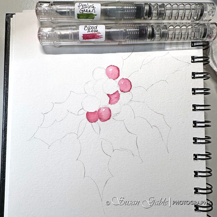
So I decided to sketch another version. I called this new version #2. I started my sketch in pencil with mostly outlines of the shapes and not a whole lot of details.
In this sketch, I tackled the berries first with Blood Rose and laid down the initial layer of color. I remembered to leave a bit of white on my paper for highlights.
I worked different areas of my sketch in sections. I wanted my berries to be lighter towards my light source and darker where very little light shows through. I reminded myself that I needed to let each layer of ink application dry completely. I stopped working the berries and left a few uncolored.
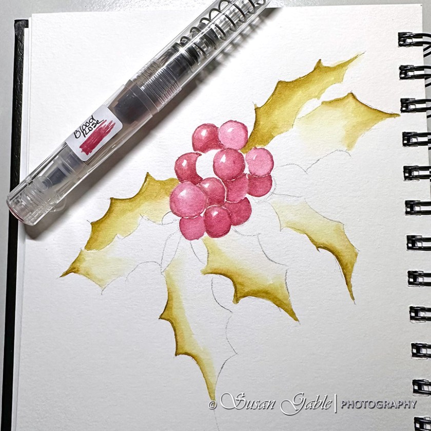
I moved on the holly leaves and created the initial layers with Heart of Gold. I drew lines along the edge of each holly leaf and applied my water brush to the edge and pulled the color towards the middle of the leaf. I worked on one leaf at a time before moving onto the next leaf.
While I waited for the holly leaves to dry, I went ahead and colored in the remaining berries. At this point in my sketch my berries appeared to pop-off the paper. This was the look I wanted to achieve. I also remembered not to overwork my pen & ink washes.
Now that I have achieved the look I wanted my berries to have, I went back to work on the holly leaves. This time, I picked up Prairie Green and applied the color to other areas of my leaves. This coloring process is more of what I’ve dreamed up in my mind. I wanted my leaves to have a blending of two colors.
I picked up my pencil and added in the center lines of my holly leaves. There have been times when I’ve applied my inky washes and forgot to take a break to see what I was doing and my sketch would look a bit wonky and a bit flat.
During my sketching process, I made a mental reminder that my light source came from the top left.
Here’s my completed Holly & Berry #2 pen & ink sketch. Noticed how my pencil lines disappeared under my ink. I left the two upper holly leaves as shapes with no details. They were further away from me and in the background. I should have softened or lightened the edges of the these two leaves, instead I kept adding additional layers of colors. Lesson learned.
Prompt: Create a holly and berry sketch. Use your favorite red, green, and yellow inky colors. Create a sketch with just the berries. Create another sketch with just the holly leaves. For the third sketch, create a sketch with both berries and holly leaves together.
Inks: Robert Oster Blood Rose and Heart of Gold. KWZ/Galen Leather Exclusive Prairie Green
I finally got around to cleaning the last drops of ink from my art pens.
I pulled out my swatch cards and immediately gravitated towards my shimmering inks collection. Since December is a holiday month it only made sense to go with sparkling ink colors.
I’m trying out new-to-me Avery labels that I found at my local Staples store. I like the size and shape of this rectangle label. I can see what I’ve written and my swatch of color better than the round labels I’ve been using. They are removable labels so when I get ready to clean my pens in four months, I should not have any issues removing them from my pens.
To celebrate using my newly inked pens, I created a quick sketch using Blood Rose, Prairie Green, and Heart of Gold.
I’m a bit out of practice with my pen & ink art medium as I’ve been playing with my gouache paints which requires a different painting technique. For my short sessions of free time I should stick to my pen & ink sketches and use my longer sessions for my gouache sketches.
Now that my fountain pens are filled with sparkling inks, I’m more inclined to sketch more. Stay tuned!
Inks Used in My Sketch: KWZ/Galen Leather Exclusive Prairie Green. Robert Oster Blood Rose and Heart of Gold
Other Inks: Robert Oster Silver Dawn, Blue Velvet Storm, and Schwarz Rose. Van Dieman’s Ink Morning Frost
Pens: TWSBI Go with Stub 1.1 nibs
Journal: Stillman & Birn Alpha Softcover 7-1/2″ x 7-1/2″
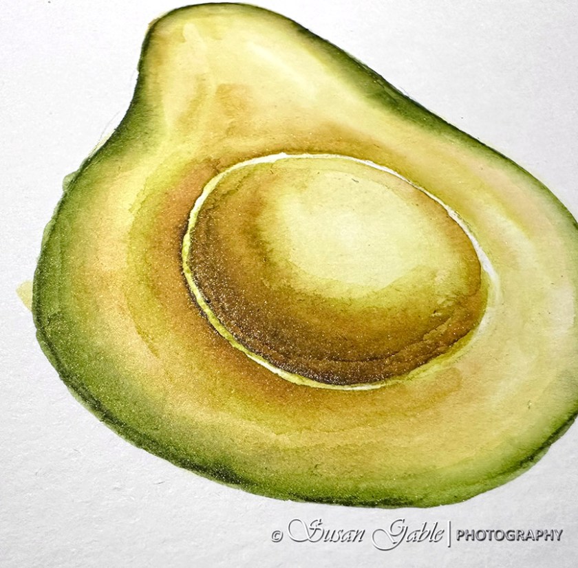
I was trying to use up the ink in my TWSBI Swipes. I hate to admit, I had these pens inked up since August when I taught my pen & ink wash workshops. Four months later and my inks were still flowing in my pens. I knew it was time for some pen cleaning, but I wanted to create one more sketch with the remaining inks.
I’m not sure why, but I was thinking about avocados the other day. I used Prairie Green and Heart of Gold to create my avocado sketch.
I added a few layers of inky colors and decided to stop and let my sketch rest for a bit. I took this picture and noticed something going on with my green Swipe.
I had to show the bits of shimmering particles in my sketch. It was amazing to see how much shimmer was still flowing out onto my paper.
I noticed my Swipe had developed a long crack starting at the top of its cap. Strange place for a crack. I expected it to develop near the thread area where the cap screws into the body.
While I enjoy using my TWSBIs, I won’t be purchasing anymore Swipes. I’ll stick to my dependable TWSBI GO for my pen & ink sketches.
Before I end this post, I wanted to share that I added a new art medium to my artsy adventure. I’ve been painting with gouache. Maybe I should say attempted to paint with gouache. I picked up a few tubes (primary colors) and enjoyed the process of mixing the colors. I’ve been learning how to use these paints to create my artwork. Personally, I feel there’s a big learning curve. I’m practicing and learning new painting techniques before I can develop my own painting style. This is a work in progress.
Inks: Robert Oster Heart of Gold. KWZ/Galen Leather Exclusive Prairie Green
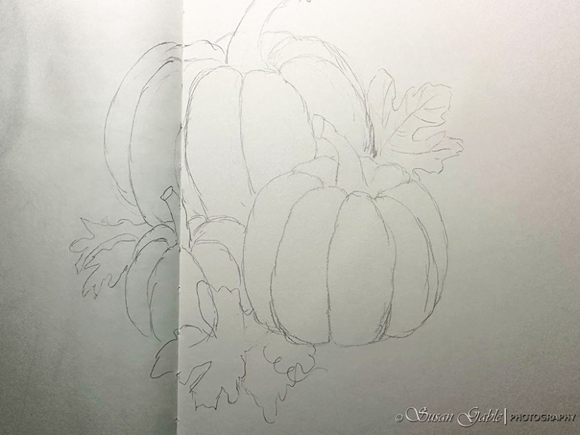
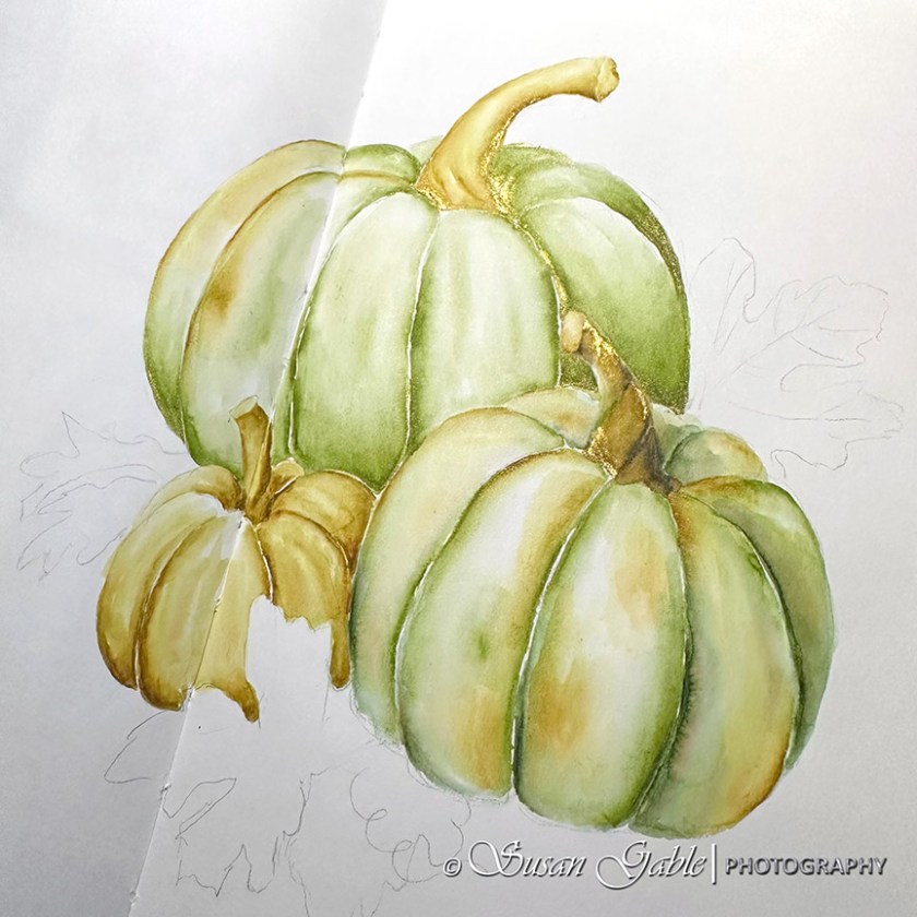
Back in September, I wrote about the start of my pumpkin pen & ink sketch. A work in progress.
Here’s my original rough pencil sketch of my three pumpkins in my 8″x10″ journal.
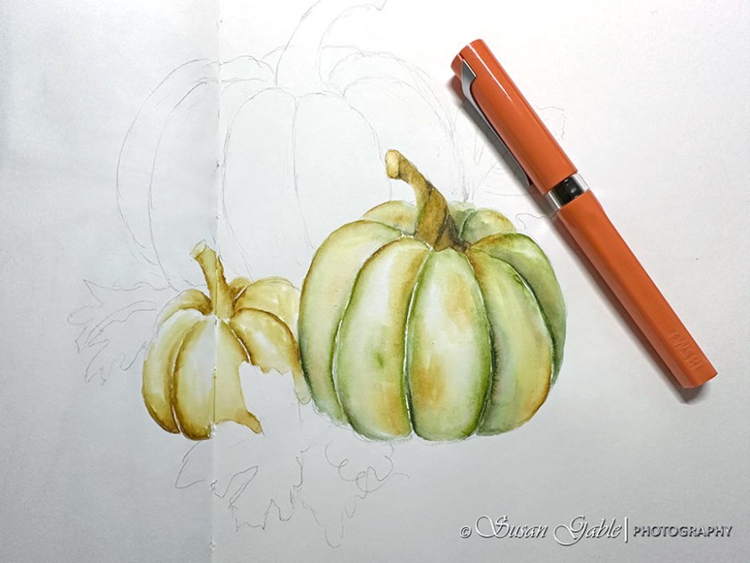
I had skipped my process of outlining my sketch in permanent ink and went straight into my pen & ink wash. I had worked each section/segment of my pumpkin and allowed it to dry so the inky colors would not run into each other. Since I was working in layers, I let each layer dry completely before I applied an additional wash over the previous color. I found this technique added a bit more “punch” of color to my object and added a bit more depth to my sketch.
I started out using a dark green (Eucalyptus Leaf) color to define the sections of the pumpkin. Notice it was not a continuous line of dark color. I applied the dark green in areas to accentuate the curves and created more depth.
After I created a few layers of inky wash on my first pumpkin, I moved on to the next smaller pumpkin. I decided to use my fave golden yellow ink (Heart of Gold) for this smaller pumpkin and added two layers of the same color.
While I was waiting to my other pumpkins to dry, I started to work on my third pumpkin. I had intentions of just sketching an all green pumpkin and then changed my mind at the last minute.
So I shifted gears and added a bit of yellow on the left edge and also used the yellow for the top stem. The colors on my pumpkins worked out well and created an overall cohesive sketch.
When I’m in my creative zone, I trust my gut feeling. Sometimes I stick to my creative plan. Other times, a light bulb goes off in my head and I adjust my creative plan. Go with the flow. Just do it.
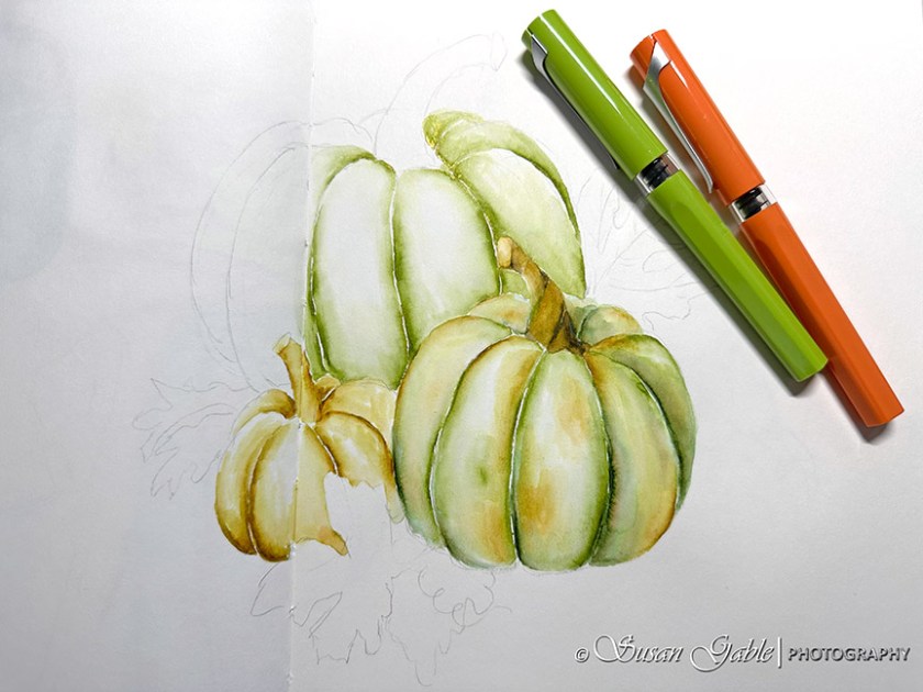
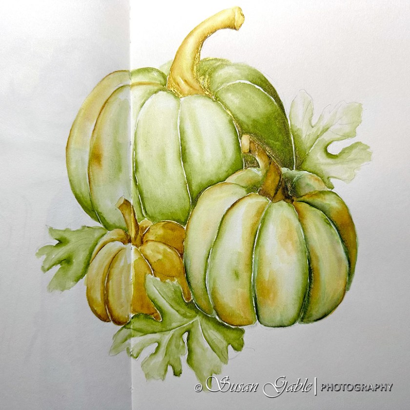
Here’s an angled view of my sketch to show off the shimmers.
I continued to use the green (Prairie Green) for the leaves and made sure to leave a bit of white or light areas to create some depth.
I’m quite happy with how my pumpkin sketch turned out. I decided to stop adding additional layers of color. Sometimes “less” is better.
Most of the green I used in my sketch was Prairie Green. It’s my fave green ink color and I enjoyed using it for sketching. I liked how the green color lightened up a bit with water. To create the medium green color, I applied layers of green ink. Prairie Green also blends nicely on my paper.
Did anyone notice that I left off the shadows underneath my pumpkins and leaves? I might have to call my sketch-Floating Pumpkins!
Inks: KWZ/Galen Leather Exclusive Prairie Green (shimmer). Robert Oster Heart of Gold (shimmer), Melon Tea, and Eucalyptus Leaf
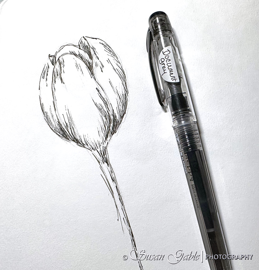
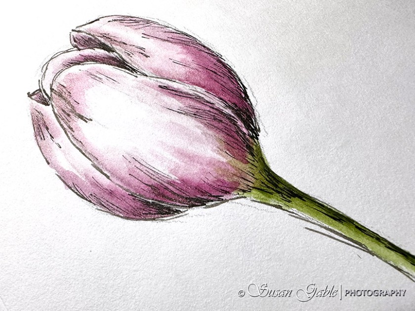
My last post was about using my Sailor Fude nib pen. I’m still using it to sketch my outlines along with my Platinum Preppy. Both are filled with DeAtramentis Document inks.
For the following sketch, I decided to just use my Preppy. It was easier to create the finer lines with this extra fine nib. I’m still practicing with contour lines to show shapes and curves.
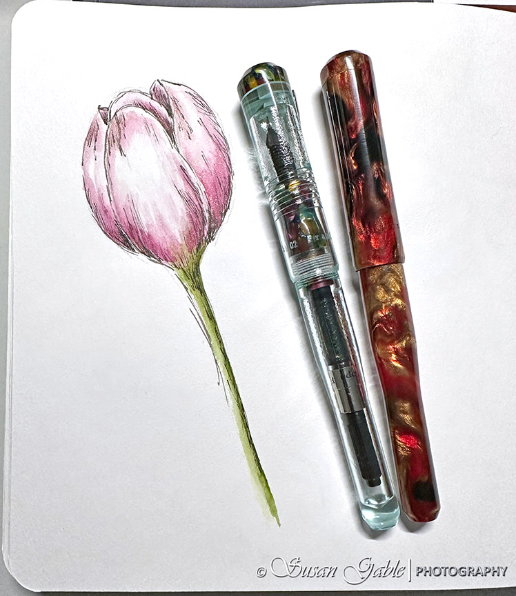
I’m also trying to incorporate flowers into my sketches. I chose a tulip for a quick and easy sketch.
I currently have a handful of pens filled with ink and pulled my favorite Franklin-Christoph pens filled with pink and green inks. My Antique Glass is filled with Anna’s Hummingbird Wing and my Golden Rule is filled with Persian Princess. Both colors are shimmering inks.
Later this evening, I plan on adding another or final layer of color to my sketch. In the meantime, I wanted to get this posted on my blog. Before life gets in the way again.
I’m enjoying my F-C model 02 pens. I like how the caps post deeply on the pens. No accidentally flinging the caps off and watching them fly across my desk.
There are times I feel the need to erase my pencil marks. Sometimes I will just let it be.
Pens: Franklin-Christoph Model 02 Intrinsic in Antique Glass with Cathedral trim with Nagahara Fine Cursive Italic nib and Golden Rule with Nagahara Medium Cursive Italic nib. Platinum Preppy with 02 Extra Fine nib
Inks: Van Dieman’s Ink in Anna’s Hummingbird Wing and Persian Princess. DeAtramentis Document Grey
I saw an artist on IG who created some beautiful monochromatic artwork in his journal. His artwork consisted of beautiful thin lines with dramatic bold strokes of color. I searched through his posts to find the tools he was using. He was using a green Sailor Fude de Mannen fountain pen. This is a long body plastic fountain pen with a 55 degree Fude nib.
I remembered I had a pink version with a 40 degree Fude nib. I also have a black Sailor Profit that came with a 55 degree Fude nib. I pulled out my two Sailor fountain pens and my long forgotten experiment from last year came back to me. I looked at the pink section on my black body fountain pen. Yes, I had swapped the sections between my two Sailor pens. That was my experimental hack that ended abruptly.
My initial thoughts on these two Fude nibs were I needed a lot of practice to get used to the nib’s capabilities. At my normal writing angle, I was producing broad strokes of lines and ended up writing larger than normal to compensate for the overly wet nib.
I found the 40 degree Fude nib was better for my writing experience. On the other hand my 55 degree Fude nib was so smooth.
Fude nib comparison
For sketching, I felt a bit out of control when trying to sketch with both nibs. Bold lines would appear when I wanted thinner lines. I also felt my fingers would cramp a bit from holding the pen. Nothing like a good death-grip on a fountain pen. Hahaha!
Fast forward to now and I can honestly say, I’m getting used to my Fude nib. I had a moment where I thought “if someone else can create beautiful artwork” I should be able to as well in my own creative style.
Here’s my sketch of a pumpkin. I initially sketched an outline with my pencil and then sketched over my graphite lines with my Fude nib pen. I practiced by creating thin lines and holding my pen at higher angles. The broadest lines were easy to produce as I held my pen like I would normally use it for writing. A thought came to me to produce the lines like I was holding a paint brush. That appeared to help and I was able to create brush-like strokes of color on my paper.
Here’s my sketch of an echinacea flower. I realized I don’t have too many sketches of flowers in my journals. I used to think that sketching petals were time consuming and I was still learning about perspectives. Using my Fude nib pen might changed my mind. Also, it doesn’t hurt that I work for a local nursery and I’m always taking pictures of flowers to use for future sketching projects.
I started with the center of my flower and sketched the shape. I then sketched out the main petal shapes and thought about perspective. Larger petals closer to me and smaller and less detail petals further away.
I used my Fude to create the dots on the center of the flower. Bolder dots placed close together to create the shading or darkest side. I created the smaller and lighter dots further apart to represent some shaping and not give too much detail.
At this point, I was feeling almost “one with my Fude nib” and created my second pumpkin sketch. By this time I felt like my Fude nib was my paint brush. In my sketch, I started to see my broad stroke of lines as brush strokes. A lovely and cool experiment on my paper.
After I sketched for 15 minutes in my journal, I noticed my fingers were a bit cramped from switching the pen angle in my hand. My very own “death grip” had made an appearance. This was more than likely one of the reasons I stopped using my Fude nibs last year.
I’ve been enjoying my time with my Sailor Profit with Fude nib that I went ahead and purchased another one. For this second pen, I plan filling it with a non-permanent ink like Thunderstorm or Schwarz Rose and use this pen to create some interesting pen and ink washes for sketching.
Tips:
To get a fine thin line, turn nib upside down for reverse writing OR hold nib vertical
To get broad line, use pen at normal writing angle
To get broadest line, use pen at angle below writing angle
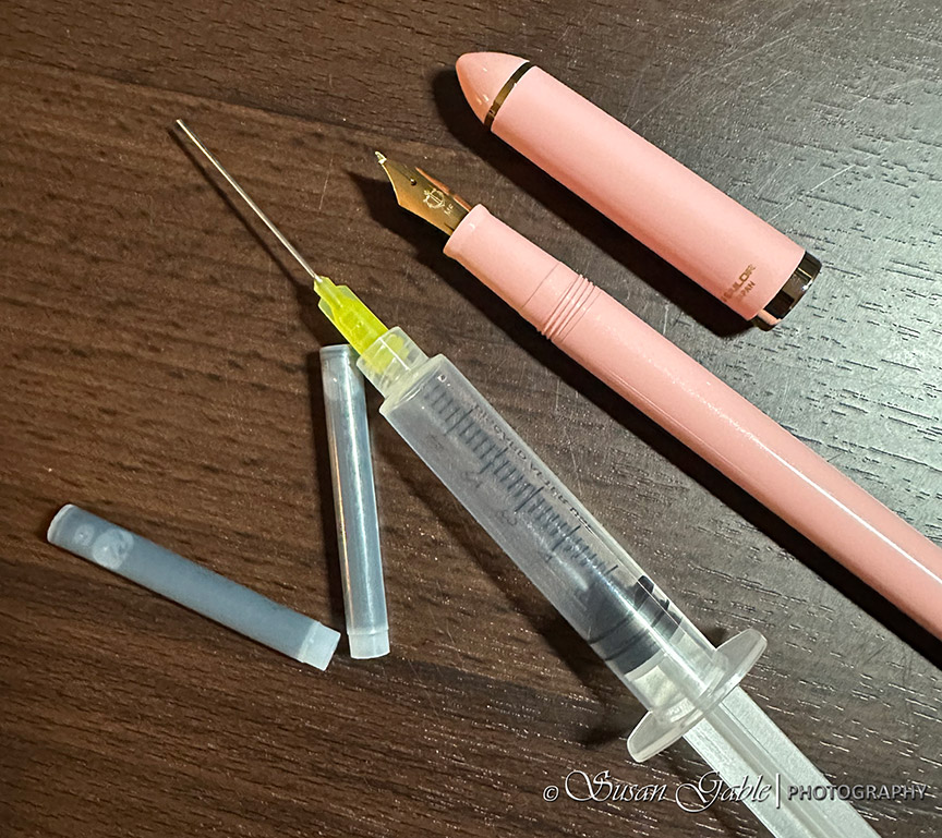
Re-use Sailor ink cartridges as they hold more ink than the Sailor converter (Fude nibs are gushers when writing/sketching with broader lines)
Booth my Sailor Fude de Mannen (pink) and Profit Fude (black) came with two ink cartridges. The converter is sold separately. I actually prefer to use the ink cartridges and fill them with my own inky colors.
I use an ink syringe to draw out the included black in from the cartridges. I push down on the syringe to remove the ink. Once the cartridge is empty, I refill it with clean water. I use the syringe to draw out the dirty water. I repeat this process until any remnants of the black ink is gone. I plan on filling my cartridge with Schwarz Rose and use it for my pen & ink washes.
Pros: Inexpensive fountain pen with a lovely Fude nib. Can create thin lines to broadest lines. Comes with two ink cartridges.
Cons: A plastic pen that causes my fingers to cramp. More than likely the result of holding it with a death grip. Hahaha! Does not include a converter.
Ink: DeAtramentis Document Urban Grey
Pens: Sailor Fude de Mannen in pink with 40 degree nib. Sailor Profit Fude de Mannen in black with 55 degree nib