-
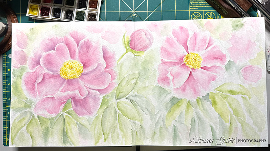 Continue reading →: A Peony Watercolor Painting in My Luchetti Sketchbook
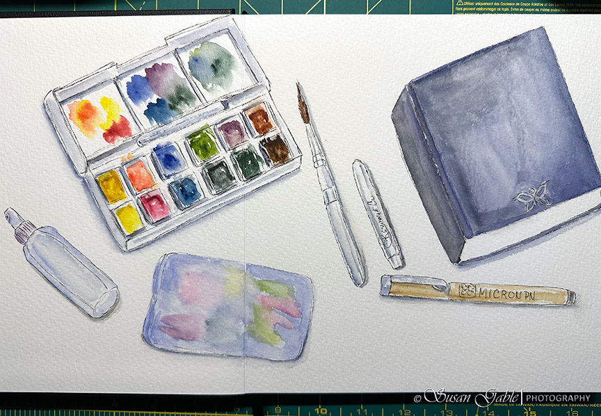
My sketching creativity has been flowing when I’m not participating in my other hobbies. I’m still using my new Luchetti sketchbook and I’m finding the need to create bigger paintings across two pages. That can only mean I’m feeling quite comfortable with my new book and I’m doing less erasing…
-
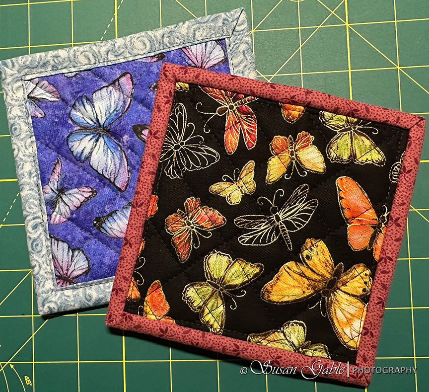 Continue reading →: Sewing Mug Rugs & Some Sewing Tips
I mentioned a while ago about reducing chaos with the number of tools I have to create my artwork. This also applies to my sewing world. I have found ways to make my sewing time more efficient and create less waste from my sewing projects. I’ve also been removing several…
-
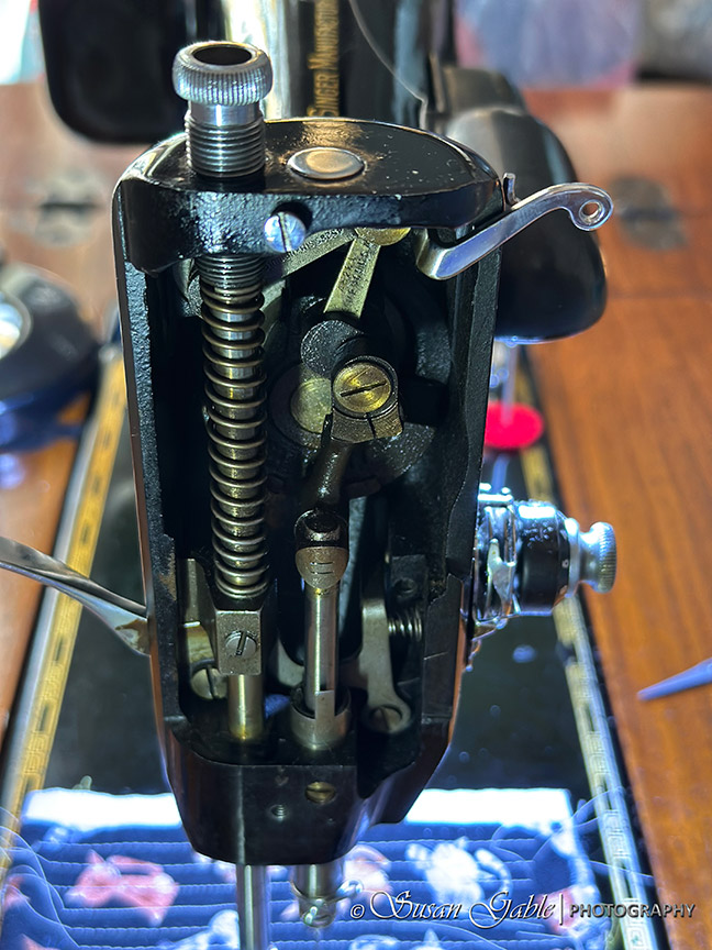
 Continue reading →: My Singer 201-2: Part 6-Needle Bar Motion While Winding a Bobbin Issue
My mind kept going back to the day I picked up my Singer 201. I was given a quick demo on how to use the machine and basic maintenance like oiling the key areas of the machine. One of the demos included how to wind a bobbin. As the bobbin…
-
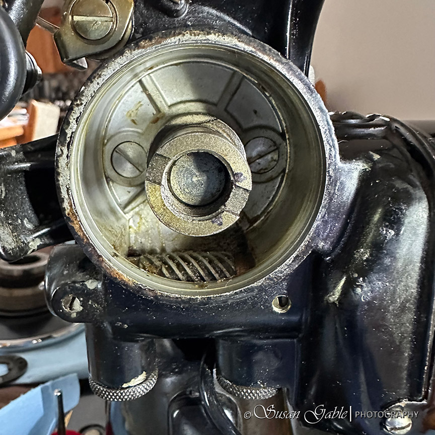
 Continue reading →: My Singer 201-2: Part 5-Taking a Look Behind the Decorative Plates and Under My Machine
I’ve pretty much shown the outer parts of my machine and the final polishing I’ve done so far. Now, it’s time to show what’s behind the beautiful and decorative chrome plates. On the Left Side Here is the side face plate or what some folks call the nose plate. I’m…
-
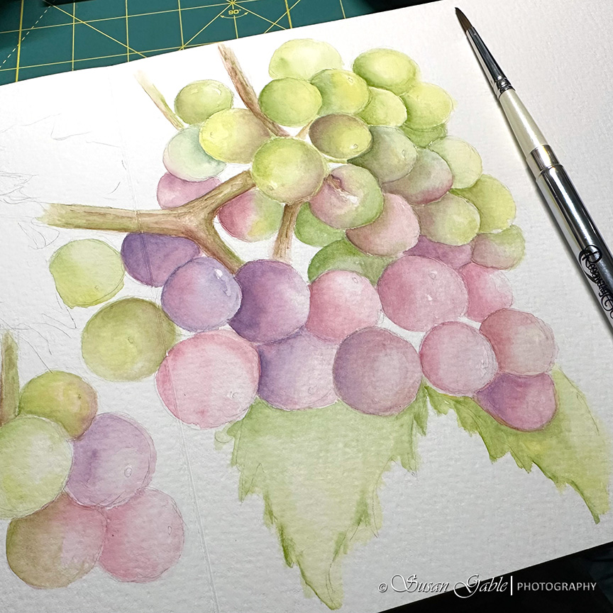 Continue reading →: A Watercolor Grape Sketch in Two Sketchbooks: Funto & Luchetti
I’m happy to say the right side of my brain has been working overtime. I’ve been experimenting with my sketching tools including my watercolor paints. Mixing colors with a limited palette and adjusting the amount of water I use. Also I have been figuring out whether to sketch with my…
-
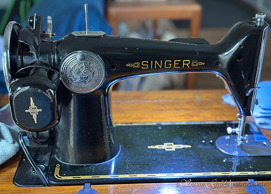 Continue reading →: My Singer 201-2: Part 4-Cleaning the Nooks & Crannies with Chrome Polish
I’m back to working on my Singer sewing machine. There were still some parts of my 201 that were bothering me to no end. I’m talking about the dirty pieces that were staring back at me while I sat in front of my machine. One particular area turned out to…
-
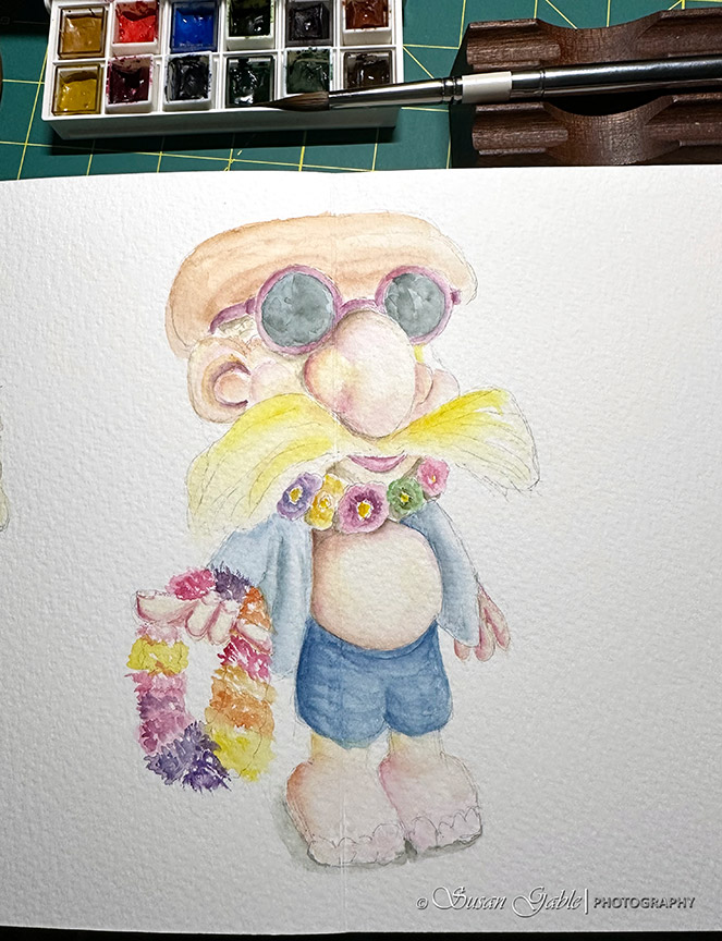
 Continue reading →: Luchetti Sketchbook – My Watercolor Sketch
You’ll remember I started a sketch in my new sketchbook. Well, I could not wait to start applying paint onto paper. I have to mention that I was a bit nervous when I started to paint. My inner voice was telling me not to mess this up. I immediately I…
Welcome to my Studio!

I’m an artist who enjoys spending time in my studio creating art and sharing my artistic adventures.
Follow me on my artistic journey. I’ll be sharing the products I use along with tips and tricks.
Update #1: I’ve given my website a new look and fixing a few things along the way
Update #2: I’m currently in my watercolor and sewing phase. Two areas that compete for my time.
Join me on my artistic adventures!
Be notified when I publish my blog post and receive updates.