Skip to content
SusieG Studio
Search
Category:
Pen & Ink
My 2025 DC Pen Show Wish List Items and a Lot More
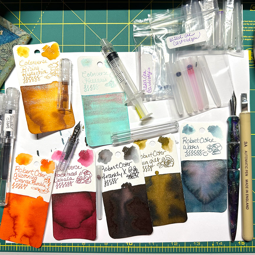
How to Fill an Ink Cartridge
Let’s Talk About Robert Oster Signature Ink – Thunderstorm
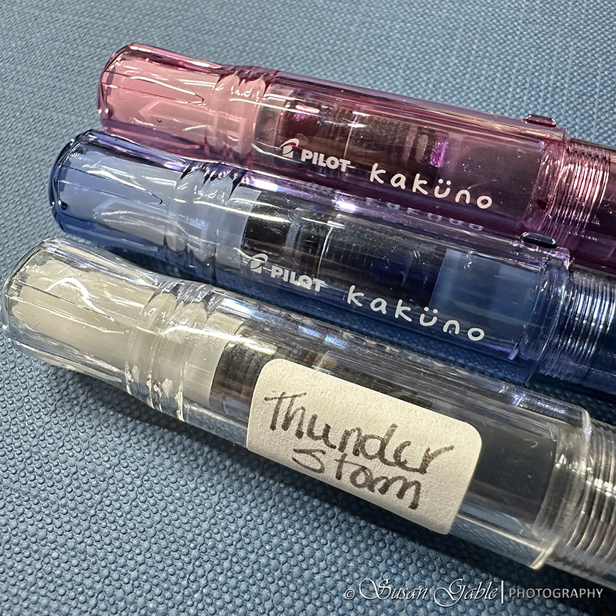
My Pilot Kakuno Fountain Pens
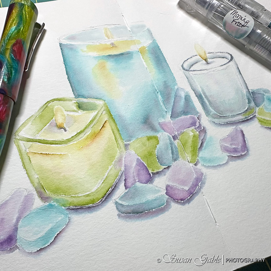
Glass – My Pen & Ink Wash Sketch
Framing My Sketches & Not What You Think
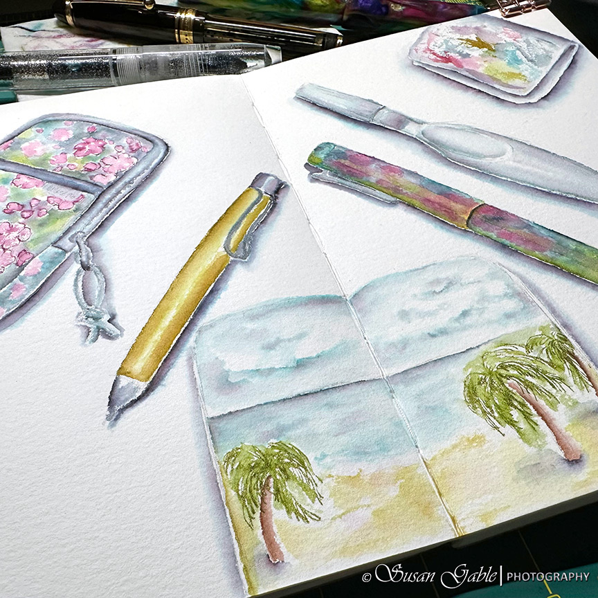
Sketching My Art Tools – Pen & Ink Wash
Previous Page
Next Page
Subscribe
Subscribed
SusieG Studio
Join 88 other subscribers
Sign me up
Already have a WordPress.com account?
Log in now.
SusieG Studio
Subscribe
Subscribed
Sign up
Log in
Report this content
View site in Reader
Manage subscriptions
Collapse this bar