Sometime last year I created two beach sketches. One was a watercolor sketch in my watercolor journal. The other was a pen & ink sketch created in a different art journal.
This year, I thought it would be fun to create another one. This time I used one sketch book to create the two art samples.
Here’s a side-by-side view using the two different mediums.
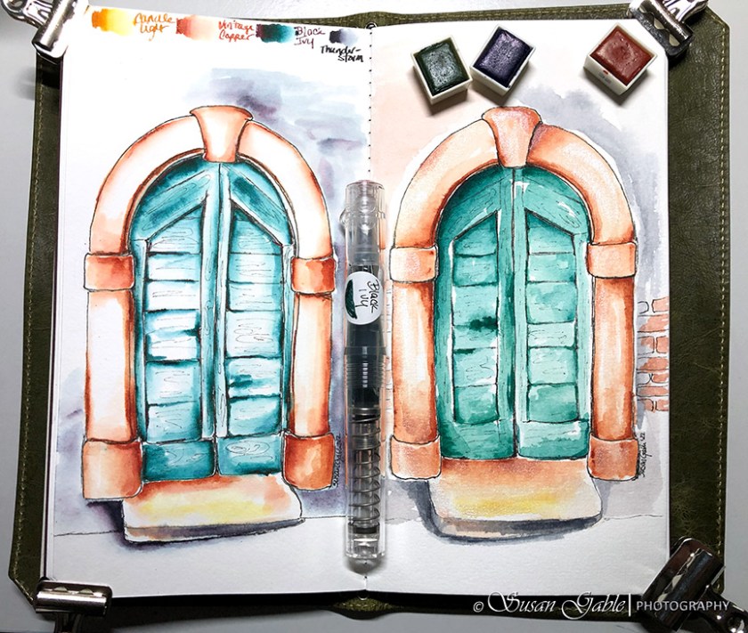
The left side was created using my fountain pens and inks. The right side was created using my watercolor pans of colors.
I have several watercolor palettes in my collection and I chose a palette where I thought the colors would be similar to the fountain pen inks I used. During my watercolor session, it was amazing to see how close I could capture the colors I used in my pen & ink sketch.
My pen & ink sketch took less than an hour to create. I used three layers to build up the colors and contrast.
My watercolor sketch took a few hours to create. I started with the lightest colors first and built each layer using a darker color. I also had to wait for each layer to dry completely before I could paint additional colors. That is why it took so long to finish this piece.
I love working with this watercolor paper. It can handle the brush strokes and all the water I lay down on this paper. There is hardly any paper buckling and no bleed through on the back side of the paper.
Pens: Platinum Preppy in 02 (extra fine nib) with Carbon ink. TWSBI GOs with Stub 1.1 nibs
Inks: Diamine Candle Light, Vintage Copper, & Black Ivy. Robert Oster Thunderstorm
Watercolor Paints: Art Philosophy Confections Palette: Apple, White Mocha, Pistachio Cream, mix of Blackberry and Pecan (grays), and a mixture of Key Lime and Blueberry (teal)
Journal: Franklin-Christoph Watercolor VN
Journal Cover: Franklin-Christoph Vagabond NWF


Leave a comment