
I started with a pencil sketch and drew the basic shapes and outlines of my Garden Gnome.
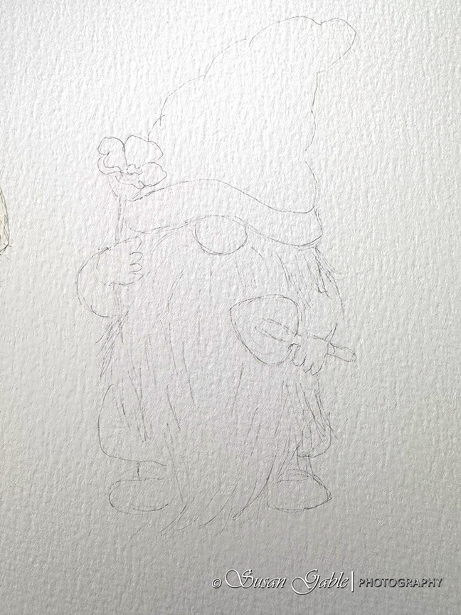
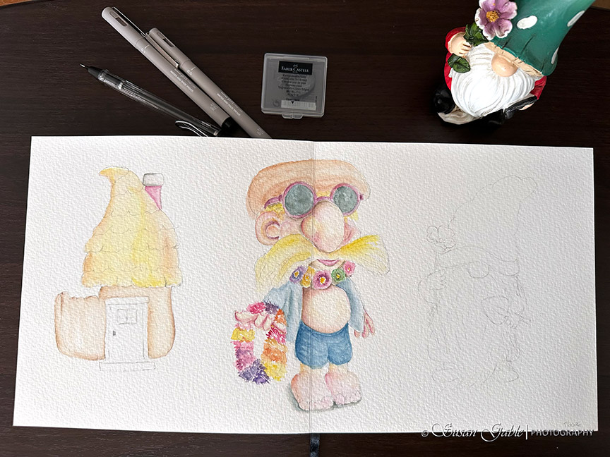
Here’s what my two page spread looked like. I used my gnome statue as a reference and to get the proportions right in my sketch.
I decided to sketch a few additional details to the Gnome and I used my UniPin pen to create darker lines for the shadows. In some areas I’m sketching my lines closer together to give the area more depth. I’m creating light strokes across my paper and not pressing down on the nib. You can see in the pictures that the Luchetti paper has a lot of texture to it. If I pressed down too hard on my pen’s fine tip, eventually the tip will wear away quickly. So, light strokes across the paper works best for me.
I thought I was going to need both of my 01 and 05 fine tip pens. I ended up using just the 01 fine tip pen to create my sketch.
I added some flowers to the Gnome’s cap to give it a little more interest. I’m using my artist license to change up a few things. I love how my Uni-Pin pen with light grey ink makes my sketch look like a graphite drawing.
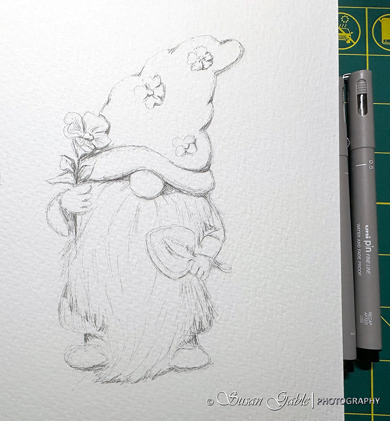
I have to give myself a pat on my back. I feel as though I’m getting better at sketching and I’m feeling comfortable adding more details to my sketches. The additional details enhances my watercolor sketches. We’ll see how well my Gnome painting looks when I’m finished.
I’ve been looking at my current swatch card of colors to figure out what colors and/or color mixes I might want to use on my gnome. Like what color to use to paint the flowers in the hat and even the hat itself. Also what color mix to use on the gnome’s beard.
I pulled out a color chart and mixing guide. It’s a useful chart if you’re starting out in watercolors and need help with understanding the basics like primary, secondary, complementary and other color mixes. It’s a good reminder for me, but I decided to go with my gut instincts.
My first layer of colors are predominantly light washes. Tea-like consistency and painting wet-on-wet. I painted the hat with a mix of Quinacridone Rose and Prussian Blue. I painted the shirt next with a light wash of Prussian Blue. I made sure to leave a bit of the white from the paper for highlights.
To create the initial highlights, I let my paint move around on the damp paper where the paint needs to go. I will wipe my brush clean on a towel and use my brush to pick up and remove the paint that made it’s way into a highlighted area.
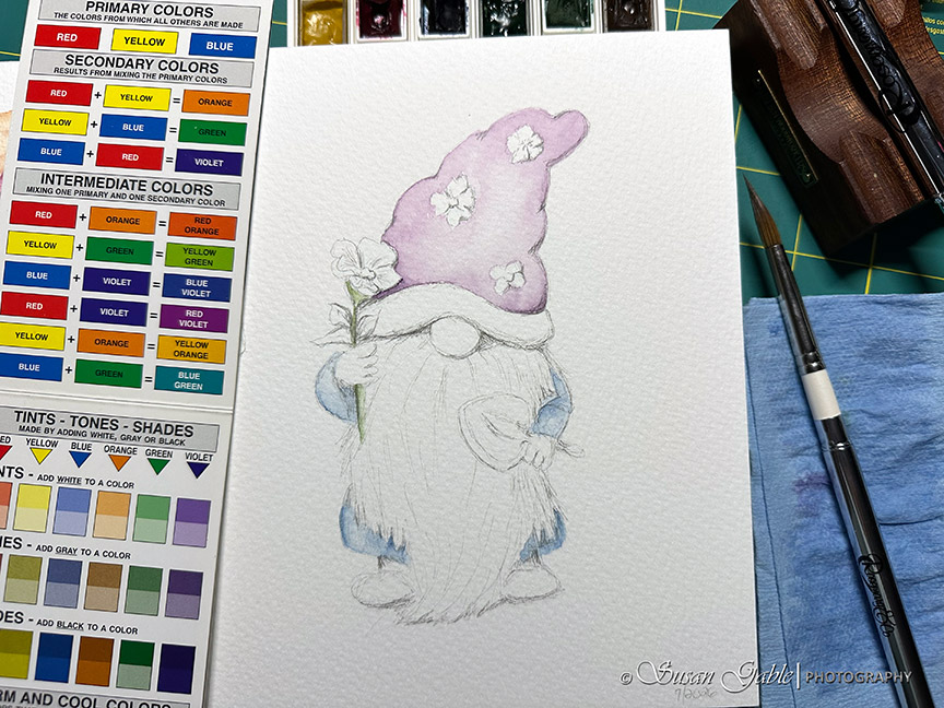
Next, I started to working on the smaller parts of my sketch like the flowers and the hand shovel. I used a tiny bit of Pyrrol Scarlet mixed with Yellow Ochre to create a light wash for the gnome’s skin. I used a light wash of Burnt Sienna for the hand shovel.
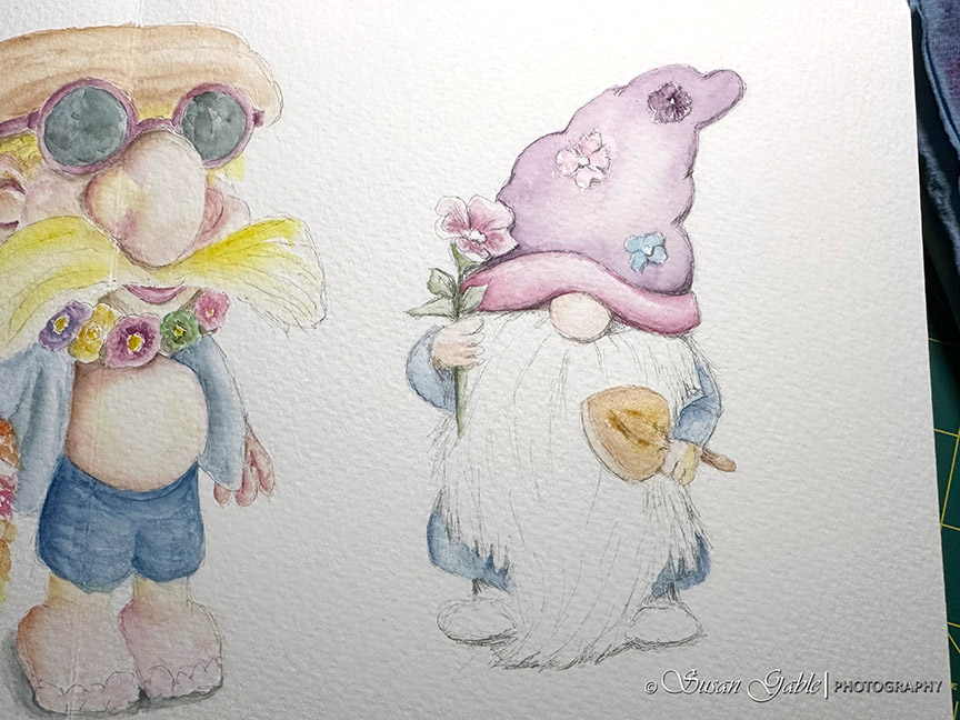
I decided to leave the gnome’s beard white, but I needed to add in the shading/shadows on the beard. Prussian Blue seemed to be a really good all purpose blue color to create the shadows in the beard. To keep the beard from blending into the shirt color, I went ahead and darkened the shirt. The beard stands out a bit more and it also looks a bit more fluffy.
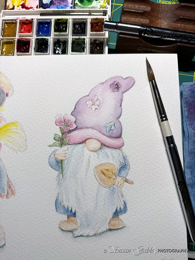
So far, I’m quite happy with my color choices. I’m also happy that it only took an hour of my time to get to this point in my painting process. While I’m waiting for my painting to dry, I’m documenting my steps and taking pictures and then adding them to this blog post.
Painting. Taking pictures. Typing. Repeat.
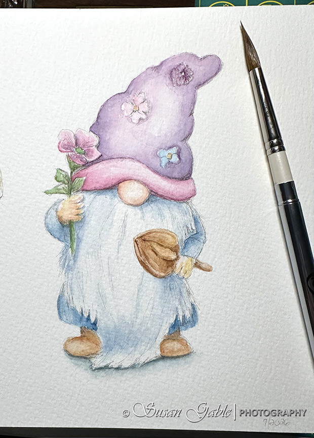
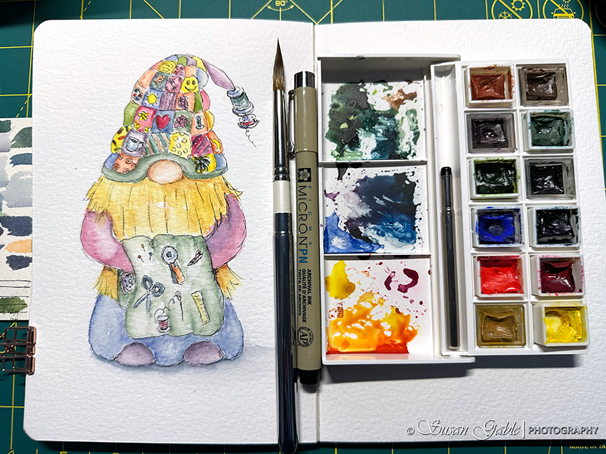
Here my final Garden Gnome sketch. I softened the hard edges by going over the areas with a light wash of color. It was mostly around the hat area.
I have to say I’m really proud of this painting. My ink sketch and the colors I selected worked well together. A happy Garden Gnome painting. It even brought a smile to my Hubby’s face when I showed it to him.
Summary:
One of the things I’ve noticed about my watercolor journey, I’m getting quicker with painting my pieces. I’ve figured out what my water to paint ratios should be. Light watercolor washes in the first few layers using wet-on-wet applications. Establish the lighter base colors. The last few layers use more paint to water ratio. Adding shadows and keeping the highlights to add some depth.
I also figured out my shadow colors. In my previous blog post I mentioned I did not like the color mix I was using for the shadows. I had mixed Prussian Blue with Burnt Umber. To me that mix looked a bit flat. I decided to try another mix using Prussian Blue and Burnt Sienna. This turned out to be a better shadow mix for me.
As you can see, I’m still working with my favorite watercolor tools and paint colors. My #8 pointed round brush is a workhorse. This was the only brush I used for my Garden Gnome sketch. It lays down a nice wash of color where I need it go and the fine tip allows me to paint finer lines.
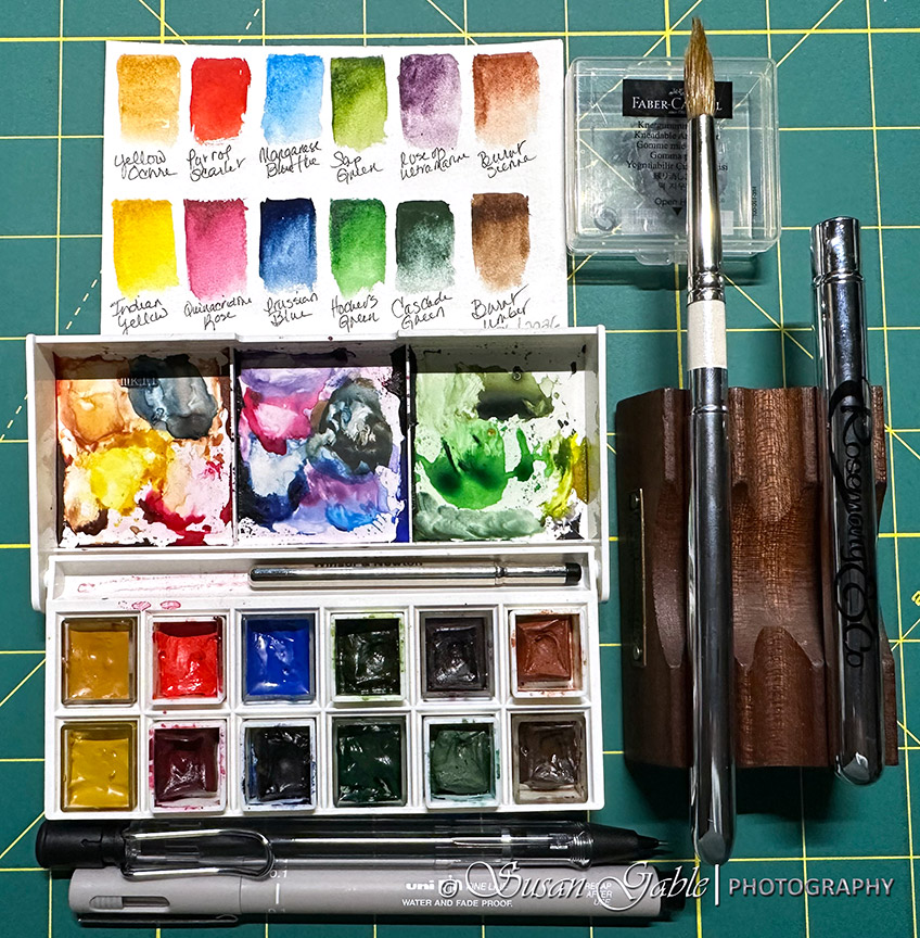
The paint colors I’m using are working well. I’ll decide after painting a few more pieces if I need to change my mind on one or two colors in my palette. I’m finding my favorite colors to use by themselves and also how well they mix together. We will what colors I end up with.
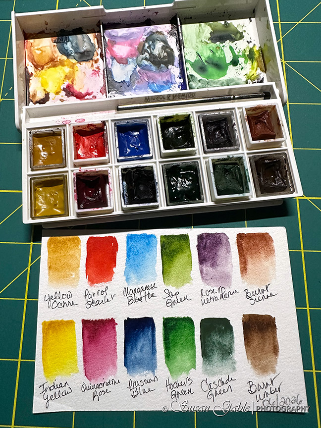
One more thing I would like to share. I no longer clean my palette in between projects. As long as I keep the same paint pans in my palette, I have found I can reuse my mixes. The only thing I need to do is make sure I keep each mixing area consistent with the colors I use. In the previous picture I show the three mixing areas in my plastic palette. The left side has my Yellow Ochre, Pyrrol Scarlet and Burnt Sienna colors. The middle mixing area has my Quinacridone Rose, Prussian Blue, and Manganese Blue colors. The right side has mostly my green colors with some bits of yellow and blue. So far this process is working brilliantly for my painting needs.
My Luchetti sketchbook paper is a dream to paint on. I’ve mentioned before that the paper loves all the layers of paint and water I’ve applied to it. The cold press paper texture is lovely to work on. I’ve enjoyed painting in a larger sketchbook format. I believe this sketchbook is motivating me to paint more. It’s my happy sketchbook.
Color Chart: Pocket Guide to Mixing Color by The Color Wheel Company
Pencil: Lamy Studio pencil with 0.5mm HB lead
Pen: Uni PinFine Line in 01 size with Light Grey ink
Paint: Daniel Smith Extra Fine Watercolors in Yellow Ochre, Pyrrol Scarlet, Quinacridone Rose, Manganese Blue, Prussian Blue, Cascade Green, Hooker’s Green, Rose of Ultramarine, and Burnt Sienna
Brush: Rosemary & Co R13-Sable Blend Pointed #8. This brush can be found at Art Toolkit at this link.
Journal: Luchetti True Flat Sketchbook. Mixed Media. 100% cotton. Cold Press. 8″x8″ with 22 sheets/44 pages. 600gsm (300lb). Archival. Acid-Free. Gelatin-free vegan sizing. Vegan PU leather covers. The sketchbook can be found at this link.
Palette: Winsor & Newton. There is an empty palette with an included small travel brush available on Amazon.




Leave a Reply