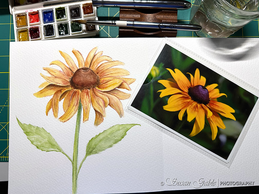
For the month of July, I’ve been challenging myself to create watercolor sketches from a few floral pictures I have taken around our garden. I’m not very good at sketching from memory so I have to rely on my photos.
Over the years, I have printed my fave floral pictures and placed them in a photo album. I should call it my reference photo album as I’m always flipping through the pages looking for something or an idea to sketch. One of my favorite pictures is one of a Rudbeckia flower. I took this picture many, many years ago. It was one of those times where I was at the right place and at the right time with perfect lighting and the flower held a striking pose for me.
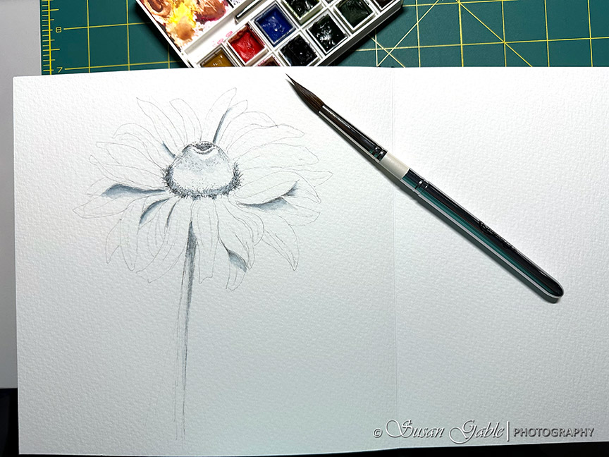
I know I’ve sketched this flower many times before using graphite and also pen & ink wash. I decided it would be a great time to create a watercolor painting and get more practice time. Here’s my sketch where I used my Uni-Pin permanent ink pens in 01 and 05. I used my 01 pen to sketch the outlines of the flower and the 05 to create the shadows in the flower and some darker details in the center of the flower.

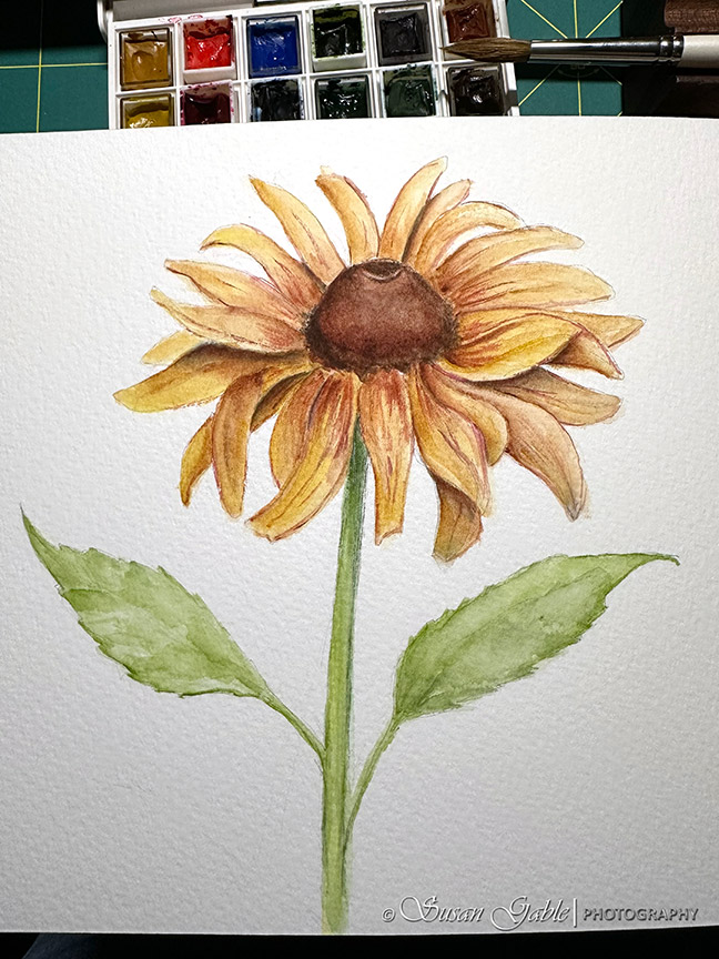
I decided to change up my painting process and I started the first layer by adding shadows to the flower petals. I used a mixture of Prussian Blue and Burnt Sienna to create this moody gray-blue color.
Once the first layer of paint was dry, I went ahead and applied light washes of color to the whole flower. I used Indian Yellow and Yellow Ochre for the flower petals and added a hint of Burnt Sienna. For the stem I used Sap Green.
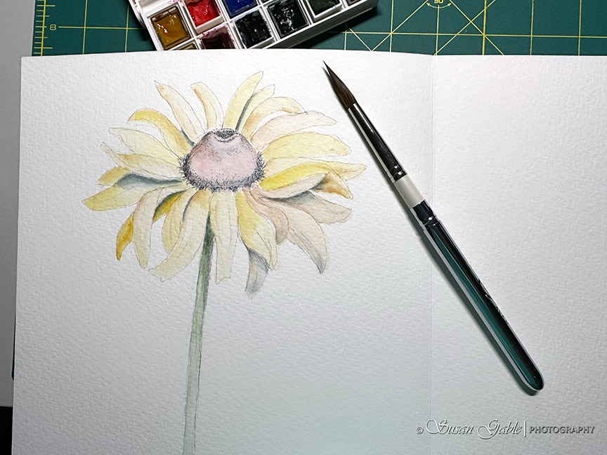
During this initial stage of painting I was looking for ways to make my flower have a bit of glow. I added more yellow to certain petals. I also added Burnt Sienna around the edges of a few petals to bring some depth to the flower.
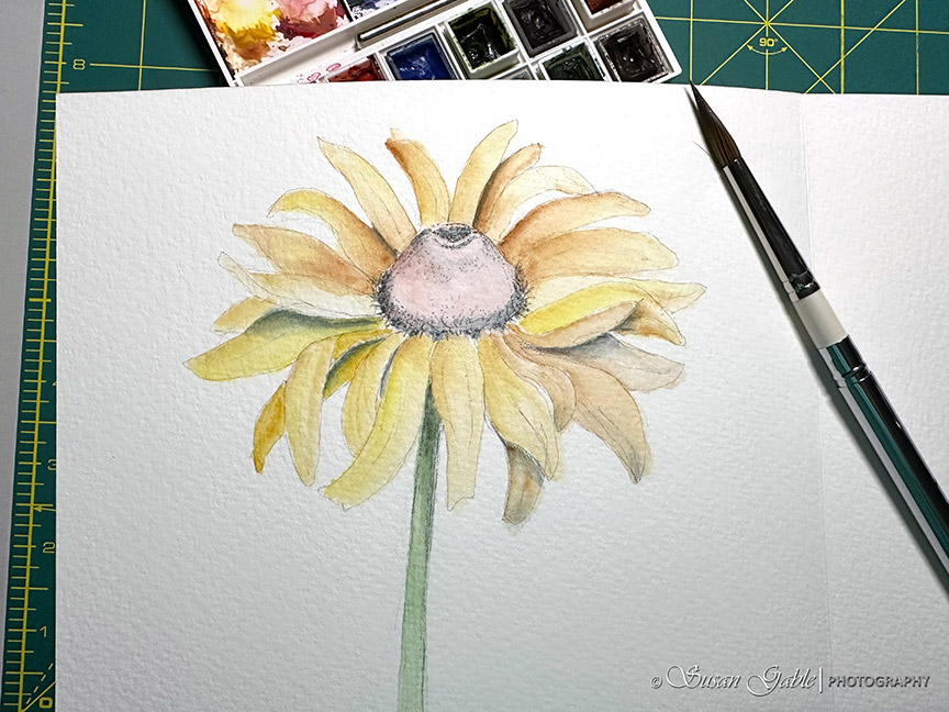
I used a combination of Burnt Sienna and Burnt Umber for the center of the flower. I’m careful to leave a few areas for highlights.

I stop to take a break from this painting. I see a tiny issue with my sketch. No worries. It’s a practice sketch.
Here’s my reference picture that I’m using for this sketch. I forgot to mention that I use my creative license by not painting an exact copy of my photo. I challenge myself to look at it from a different perspective. My painted flower is tilted forward. I picked a few petals from the picture to establish the perspective and sketched the other petals randomly.

I finished my painting by adding detail lines on the flower petals and darkened the center using Burnt Umber. At this part of my painting process I used more paint to water ratio. Not quite cream consistency. Again, I’m experimenting with my paint consistency with my brush.
My flower did look a bit naked and so I added two green leaves. A painted a loose sketch of the green leaves as I did not want them to compete with the flower.

Summary
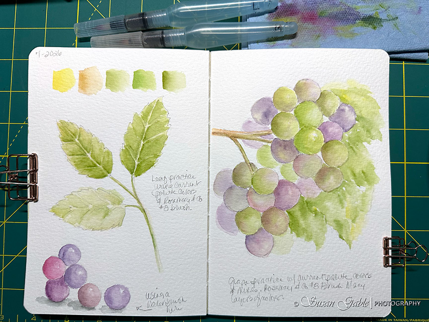
I’m learning to add more details to my painting by dipping my slight damp brush into paint and applying the paint onto dry paper. My fave #8 pointed round brush is doing an excellent job with creating the fine lines with finer details.
The more I use my current palette of colors, the more I’m identifying my favorite paint colors to mix with. I’m also finding I’m not using Rose of Ultramarine at all in my paintings. I prefer to mix my own purple colors by using Quinacridone Rose and Prussian Blue.
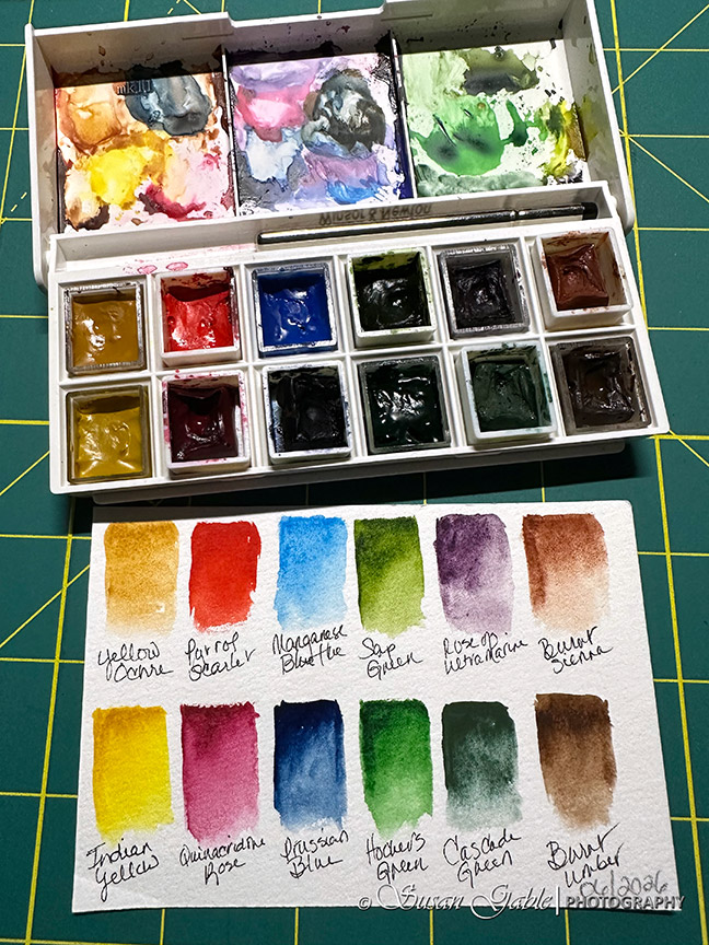
So I plan on removing my Rose of Ultramarine from my palette. Not sure what other color I will add to my palette. Stay tuned!
Pen: Uni PinFine Line in 01 and 05 size with Light Grey permanent ink
Paint: Daniel Smith Extra Fine Watercolors in Indian Yellow, Yellow Ochre, Prussian Blue, Sap Green, Burnt Sienna, and Burnt Umber
Brush: Rosemary & Co R13-Sable Blend Pointed #8. This brush can be found at Art Toolkit at this link.
Journal: Luchetti True Flat Sketchbook. Mixed Media. 100% cotton. Cold Press. 8″x8″ with 22 sheets/44 pages. 600gsm (300lb). Archival. Acid-Free. Gelatin-free vegan sizing. Vegan PU leather covers. The sketchbook can be found at this link.


 SusieG Studio
Leave a comment