Skip to content
SusieG Studio
Search
Category:
Lamy
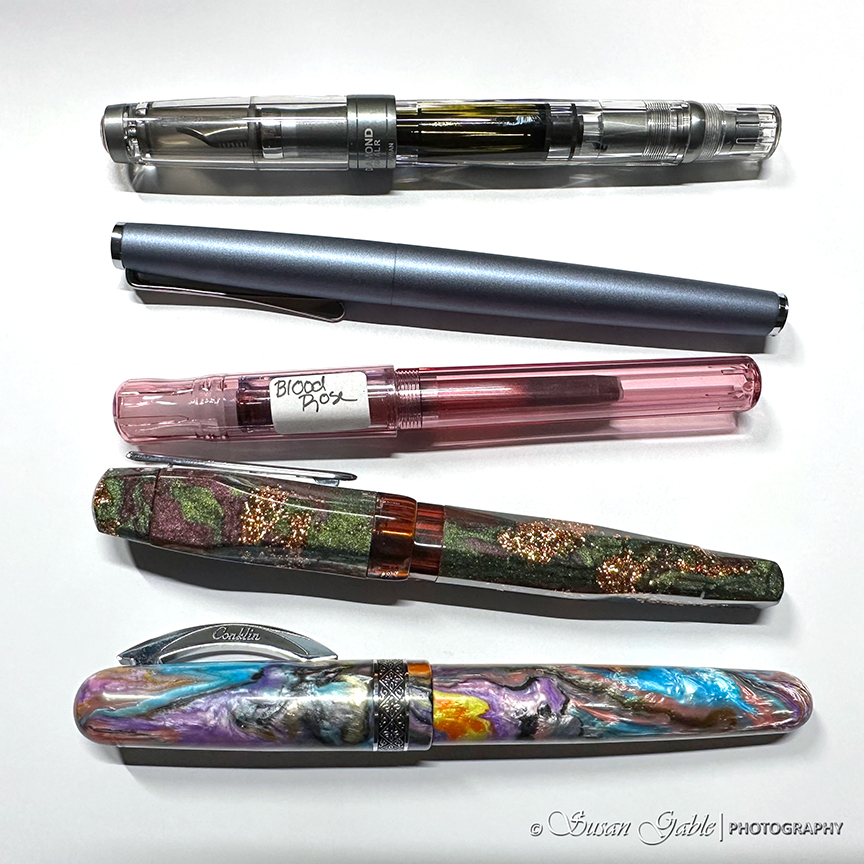
My Currently Inked Fountain Pens
Another Watercolor Pumpkin Painting
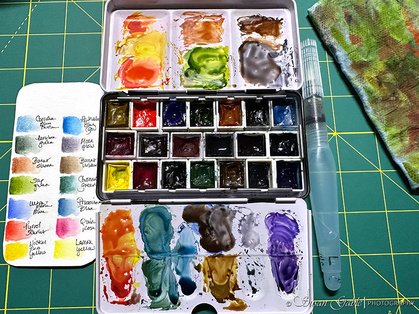
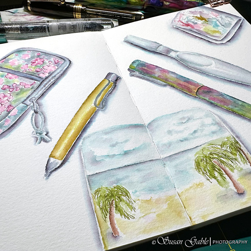
Sketching My Art Tools – Pen & Ink Wash
Workshop Prompt – Labor Day Weekend
Dominant Industry Inks
Sketching with My Lamy Ballpoint Pen
Follow the Butterfly
Next Page
Subscribe
Subscribed
SusieG Studio
Join 88 other subscribers
Sign me up
Already have a WordPress.com account?
Log in now.
SusieG Studio
Subscribe
Subscribed
Sign up
Log in
Report this content
View site in Reader
Manage subscriptions
Collapse this bar