I found this blog post in my drafts folder from late last year and I forgot to share it. I thought I would go ahead and publish it for those of you who were curious about these limited edition ink colors.
There were two inks I received back in June of last year. I wrote a blog post for each ink color and forgot to show writing samples and swatches together.
I currently have two pens (GO with Medium nib) inked with each color. I’ve been writing with these pens for a few days and wanted to share some of the writing and sketching experiences while using these two black ink colors.
At first, one would think a black ink is basically a black ink color. True. For me, it’s much more than the basic black color. These two inks have their own unique personalities and I like each of them for what they show on paper.
SHOGUN
Let’s start with my first black ink called Shogun. The base color of this ink is a true neutral black ink color. When I say neutral, it does no possess any other underlying color(s) other than black or dark gray.

When I applied water to this ink, the underlying color I saw is a neutral gray color. I really enjoyed this neutral ink’s personality/characteristic. It’s a lovely and subtle black ink color.
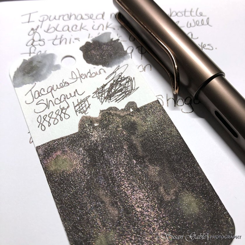
Sheen: There is a slight dark sheen in this ink. It’s not noticeable in regular writing, but I can see it in my swatch.
Shading: There’s not much shading that I can see in this ink and from my writing samples.
Shimmers: The shimmers at first appear to be pink. When I look at the shimmers in the bottle it appears to be more rose gold or coppery-like. It’s a gorgeous shimmery color.
PATINA ROARING BLACK
This beautiful ink appeared on my radar because of the swatches I saw on social media. Since I was in a black inky mood, I thought I would give this ink a try. If some of you have been following me for a few years, you know that I have a bit of a love/hate relationship with some of the earlier FWP inky colors that were too light in color to write with and also too dry to sketch with.
This particular inky color changed my mind about FWP. My swatch showed quite a bit of personality for a black ink. It showed a lovely blue underlying color along with golden shimmers. My swatch also showed a lovely robust red sheen. Oh and who could not resist the cute perfume-looking bottle?
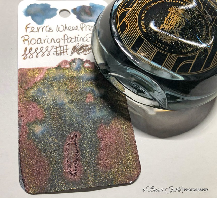
Sheen: A bright and lovely red sheen can be seen on my swatch.
Shading: There’s not much shading that I can see in this ink and from my writing samples.
Shimmers: This ink has golden shimmers.
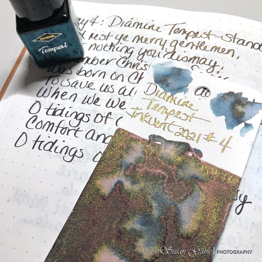
If I looked straight on at the writing sample I did with both inks, they looked very similar in color. The only way I could tell them apart was when I used my water brush and painted over the lines. Shogun has a neutral gray underlying color while Patina Roaring Black has a lovely blue color.
I just realized that FWP Patina Roaring Black has been sold out. That makes sense since that was a limited edition ink. A very nice and very similar inky replacement would be Diamine Tempest which comes in a 50ml bottle. Tempest is actually a dark blue ink with golden shimmers with a slight and subtle pinkish sheen. It’s not an exact match, but fairly close.
Inks: Jacques Herbin Shogun. Ferris Wheel Press Patina Roaring Black. Diamine Tempest (Red Inkvent Calendar)
Pens: TWSBI GOs with Medium nibs. Lamy Al-Star Marron with Fine nib.
Journal: GLP Creations The Author Tomoe River Paper 68gsm


Leave a comment