Skip to content
SusieG Studio
Search
Category:
Jacques Herbin
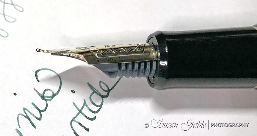
My Pilot Custom 742 with WA (Waverly) nib
My Two Black Fountain Pen Inky Colors
Pausing for Station Identification: Most of My Swatch Cards
Day 2: My Inky Brown Swatches
A Fabulous Year with Narwhal/Nahvalur
One More Use For a Nib Holder
Follow the Butterfly
Next Page
Subscribe
Subscribed
SusieG Studio
Join 88 other subscribers
Sign me up
Already have a WordPress.com account?
Log in now.
SusieG Studio
Subscribe
Subscribed
Sign up
Log in
Report this content
View site in Reader
Manage subscriptions
Collapse this bar