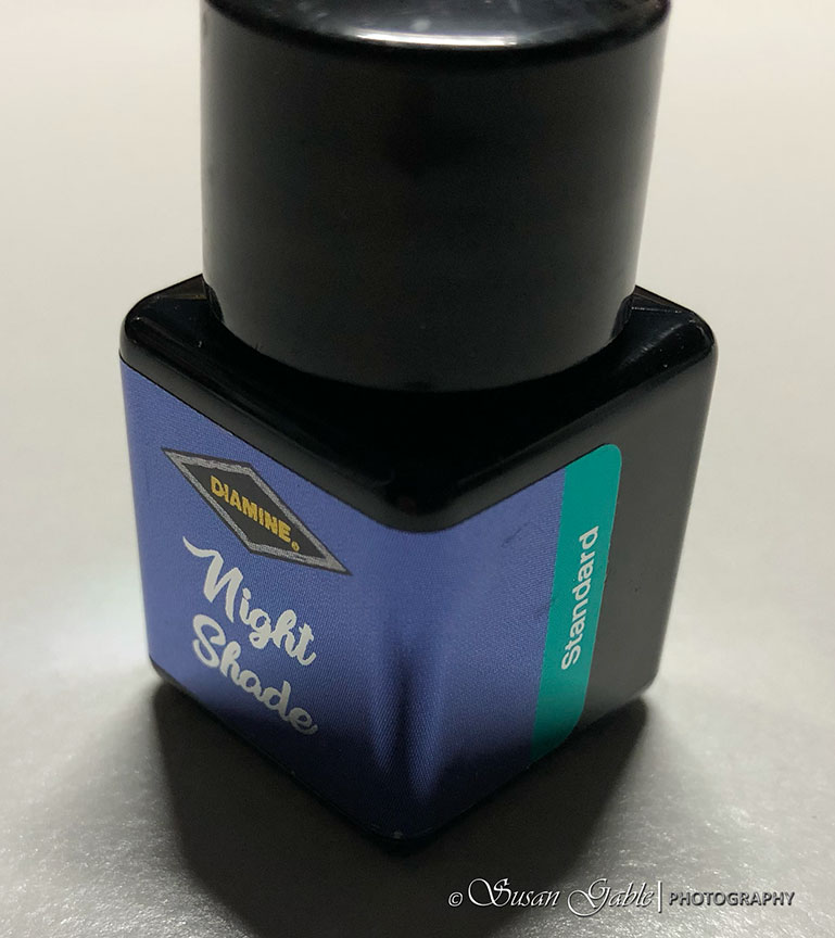
Ink: Diamine Night Shade
Another standard and beautiful purple ink that leans towards blue.
For some of the standard inks in this calendar, I’ve been using my glass dip pen for my writing samples.

Like the other standard inks this also has a bit of shading. There’s a tiny bit of black sheen. My swatch card shows some pink and mostly bright blue undertones.
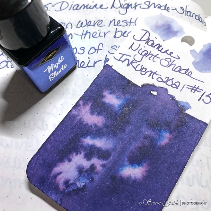
Another beautiful ink wash. A mysterious looking ink with some personality.

This is an interesting ink color. At first, I thought I was seeing a blue ink leaning towards purple. The I put my swatch card against a few other swatch colors and I see purple leaning towards blue. It’s a beautiful and unusual color.
Ink: Diamine Night Shade (standard)
Pens: Glass dip pen. Automatic pen.
Journal: GLP Creations with TRP (68gsm)
Paper: Grumbacher Mixed Media


Leave a comment