Based on my personal experience, I find most Diamine colors to be wet inks. It’s more than likely based on the color choices I have made so far. I enjoy seeing how the Diamine inks react to water and they do make gorgeous ink washes.
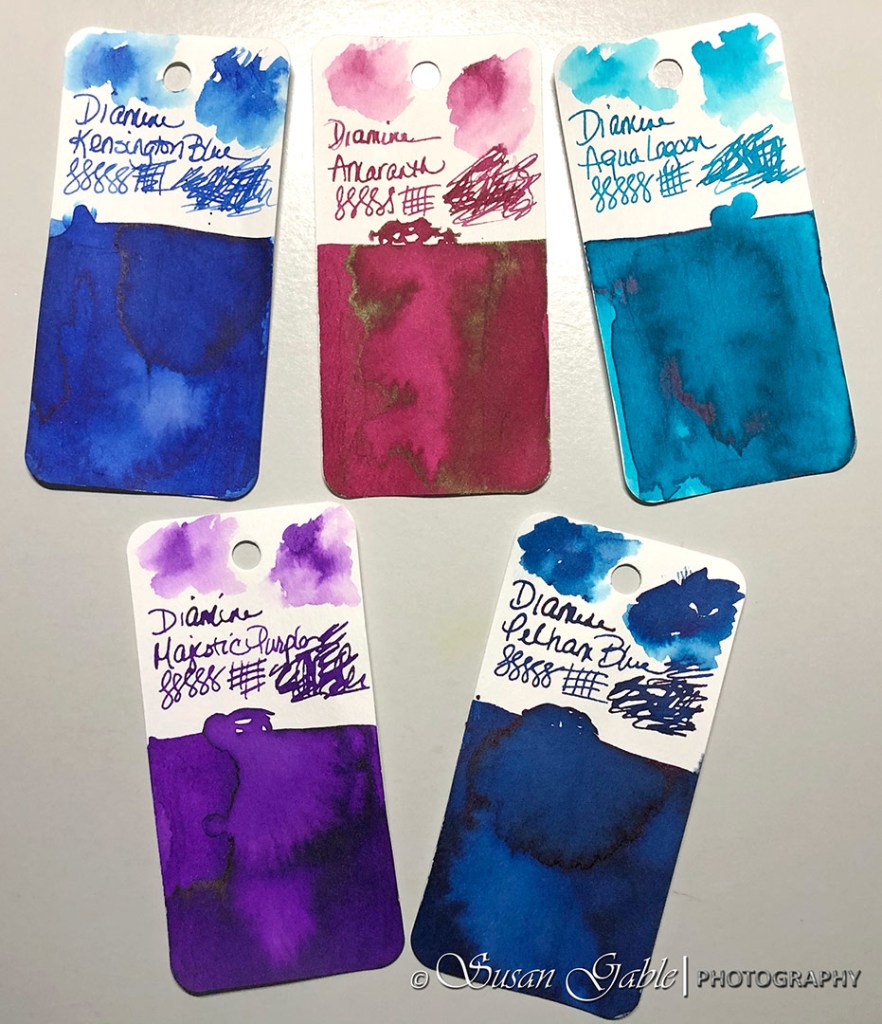
I selected colors that were on my wish list. Some of them might be close to the colors I all ready have in the Robert Oster line, but are different. My gut instincts tell me that Diamine colors have a bit more punch in their ink vibrancy with a bit more character. They each have their own personalities.
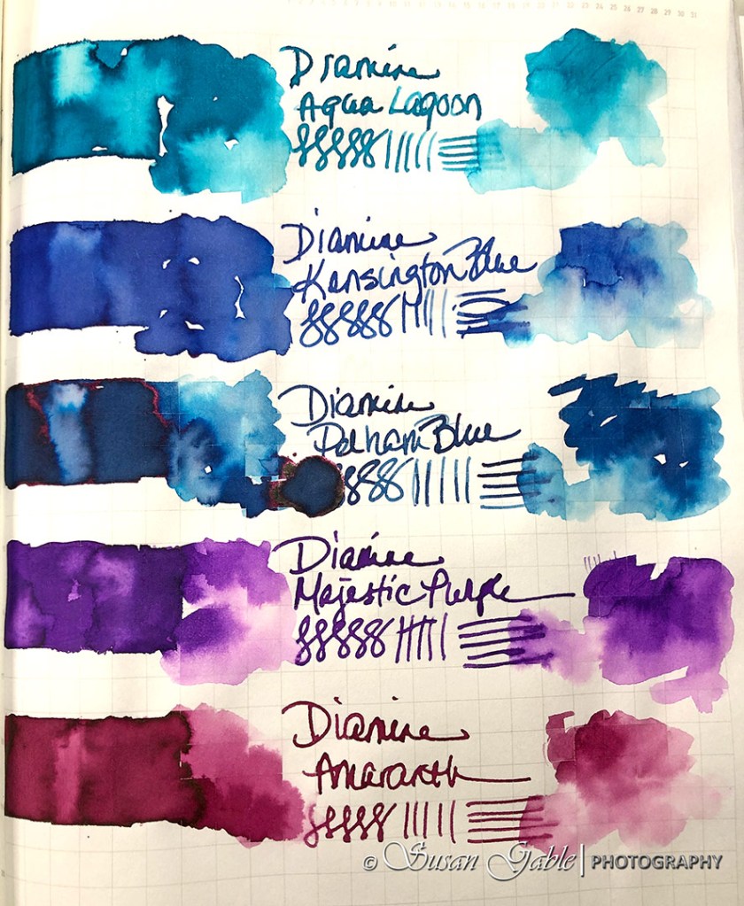
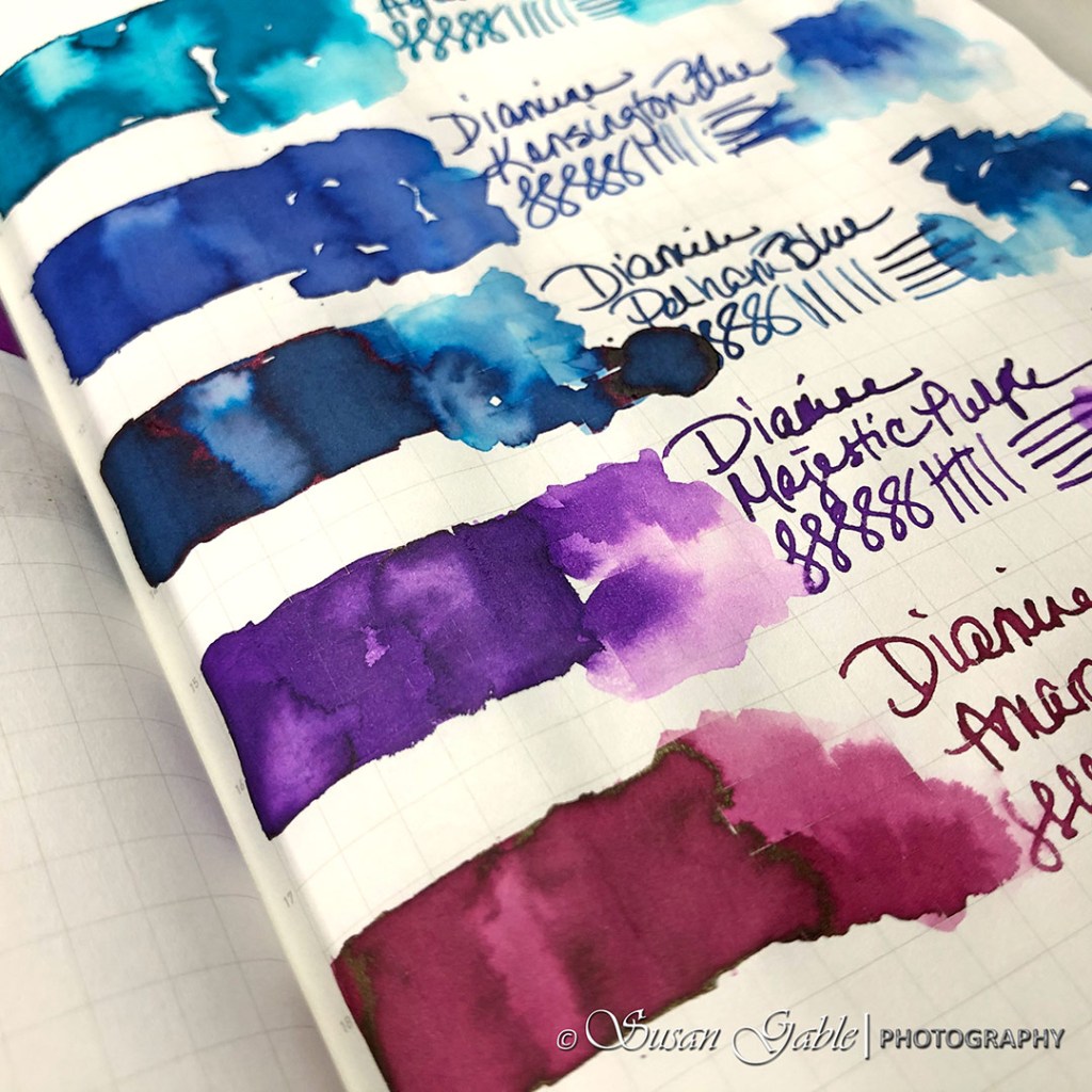
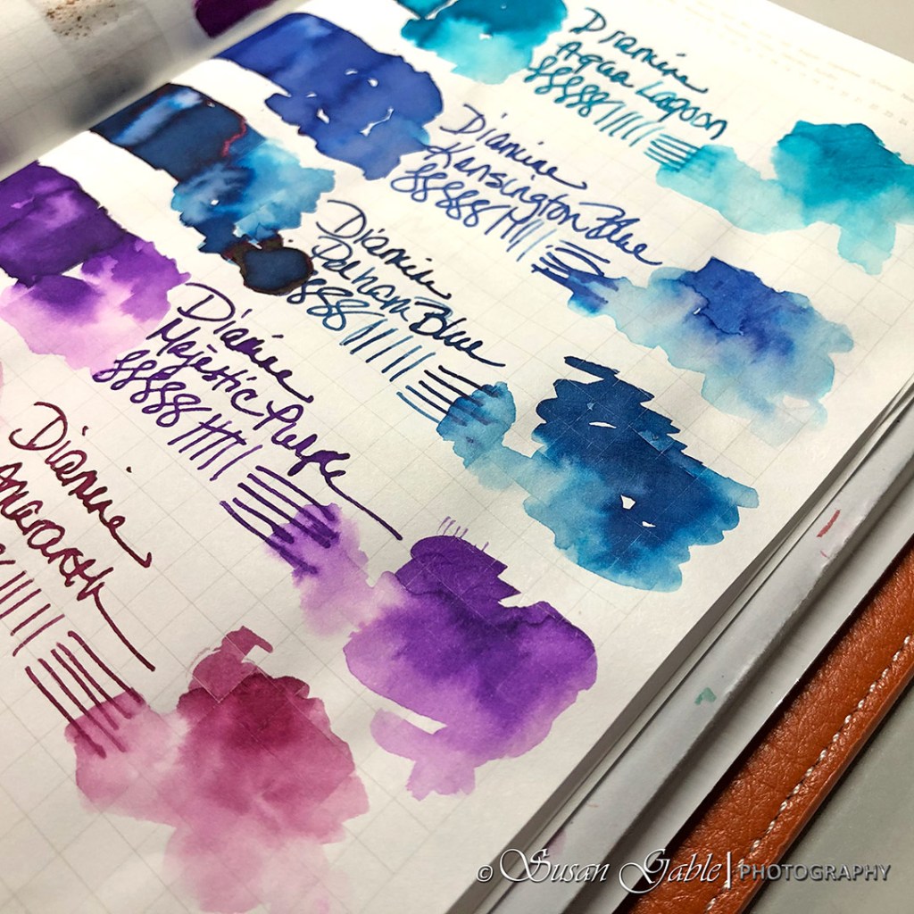
I had a spare Pilot Prera available and I immediately inked it with Diamine Amaranth. This color reminds me of a vibrant raspberry color or a bright burgundy wine color. A gorgeous shading color with some sheen. The sheen looks a bit like brown-green.
I’ve read that this color is similar to Noodler’s Black Swan in Australian Roses. I’ve seen samples on the Internet and they look very close. I think this Amaranth color has a bit more character especially with the sheen. The Noodler’s ink looks a bit flat, but is still a vibrant color.
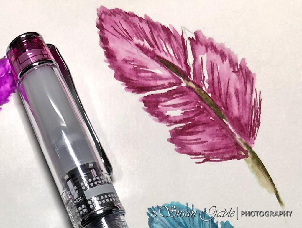
As I start using and emptying the inks in my current pens, I plan on filling them with the remaining Diamine inks I have here. I’ve been sticking to my goal of five maximum number of pens inked and so far doing a great job. From my swatches, I’m looking forward to writing and sketching with the Majestic Purple, Aqua Lagoon, and Kensington Blue as they appear to be very bold and bright colors.
Pen: Pilot Prera in Pink with Calligraphy Medium (CM) nib. Automatic pen and glass dip pen for the swatching
Inks: Diamine Amaranth, Majestic Purple, Aqua Lagoon, Kensington Blue, and Pelham Blue
Journal: Stalogy 365 B6


Leave a comment