I could literally have up to 15 TWSBI GOs filled with various ink colors at one time. Would I be able to remember all the colors I have inked in my pens? More than likely no. That’s why you will see the round Avery labels on my pens.
While my pens are labelled with the name of the ink and dabbled with a sample of the ink color, I still have to fall back on a color swatch or what I call my “cheat sheet” of colors.
I got this idea from when I used my watercolor palettes that I created with my tubes of watercolor paints. Again, similar issues when I looked at my palette and had a hard time identifying the color and what it might look like on my paper.
Here’s my sample swatches from my fountain pens that I used for my artwork. They are not just my TWSBI GOs, but also from my everyday writers (EDW) that I use daily. I’m using my Strathmore Series 500 Watercolor (cold press) paper conveniently sold precut into 5″x7″ pieces.

I’ve decided that when I’m adding a new color to my collection or filling up a pen with the ink, I will add a swatch on my palette card. As you can see I’ve had to expand my palette colors to a second card with a few of my latest ink acquisitions. Pretty soon I’ll be adding my current ink colors that I’ll bring into rotation over the next few months.

I prefer to use my Palette Ink Card or PIC when I’m sketching. I have a lot of blue and teal inks that sometimes I can’t remember if the color leans more towards blue or more towards green. I also have too many bottles of inks and there’s no way I can remember all my ink colors. That’s where this card comes in handy.

How do I create my mini ink swatches? I gently write vertical lines or downstrokes on the paper so it looks like a 1/4″ square. Before the ink dries, I take my water brush and paint the water over the 1/4″ square and gently pull the ink and water mix away from the square. Note: I try not to scratch the paper up with my pen which is why I suggested to do the lines gently. Otherwise you will have dark lines in the paper after applying the water. This takes a bit of practice.
My PIC is convenient and very portable to carry versus pulling out my Col-o-ring and searching through the gazillion ink swatch cards I have. I place my PIC in my art journal. I can see all my colors on my PIC and quickly decide what colors I will be using for my artwork.
I’m sure by the end of this year, my PIC will expand to over several sheets. Fingers crossed.
Note: I can see the chaos I created with these two cards. There’s no rhyme or reason to adding the colors to my PICs. I’m rethinking I need to break down the color range onto separate cards: blues/greens on one card, purples on another card, and reds/pinks on another. This might become a huge project where I can block a day or two and go through all my bottles of ink and create an organized PIC that make more sense in the long run. We’ll see what I end up doing.
Tips:
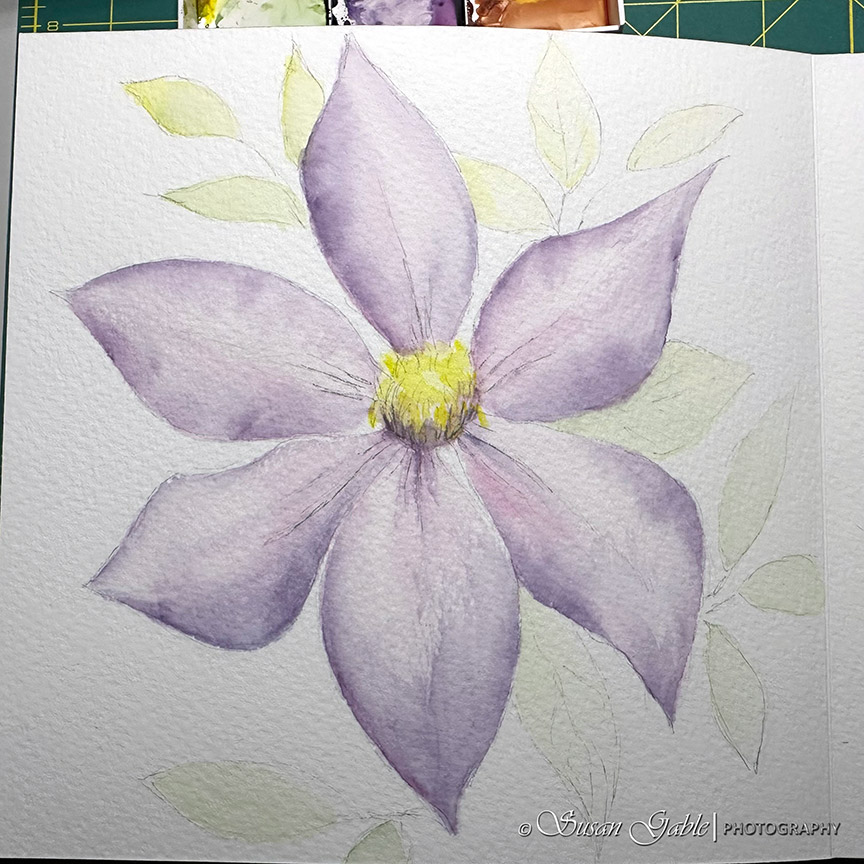
Strathmore paper (series 100-400) are known to be student grade paper. I found, for watercolor use, the Series 500 Premium paper is 100% cotton (140lb/300gm) and artist grade. I’m currently using a pack of 5″x7″ paper . I enjoy using their cold press paper for my pen and ink wash artwork. This paper holds up to the many layers of ink wash I create.
The next paper I enjoy using is Bee Paper 100% cotton water color paper. I used to find a pack of 25 in 5″x7″ size at Michael’s for a decent price. I no longer see that paper carried at my local shops. Like the Strathmore Series 500 paper, this Bee paper is great to use for testing and mixing colors and for quick sketches.
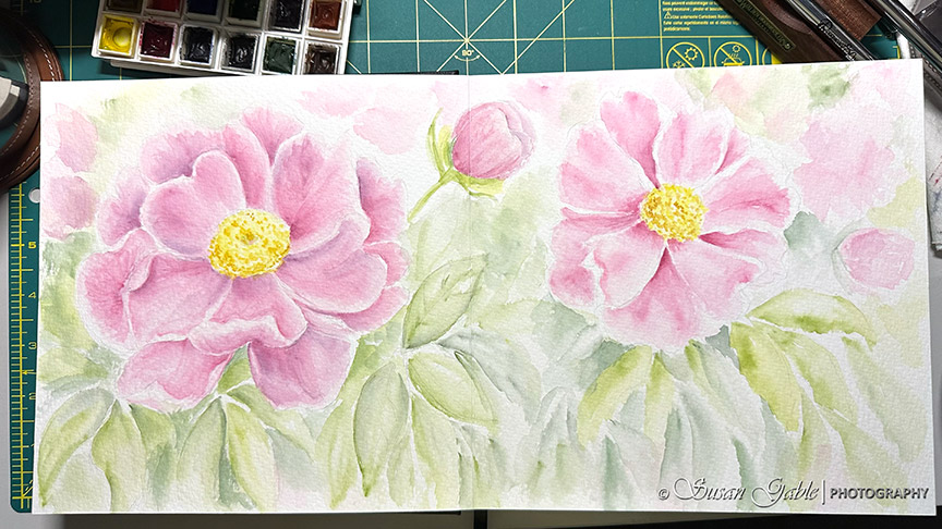
My go to artist-grade watercolor paper is Arches 9″x12″ cold press. I’m using up my pads of Arches paper and plan on buying the larger sheets of paper (22″x30″) and cutting them down to the size.
For my pen and ink artwork I like using the 5″x7″ size papers. For larger pieces of artwork, I will use my watercolors as I can easily paint larger swatches of colors versus trying to use my fountain pens to cover the larger areas.
For my fellow beginning artists and those in training, I highly recommend starting out with artist grade paper. There’s a huge difference in paper quality between student grade and artist grade paper. Learn to create on the good stuff and create good habits. Years ago, I had used student quality art supplies and it was hard to break the bad habits of using poor quality paper and I wondered why I had not shown any improvements in my art skills. Something to think about.


Leave a comment