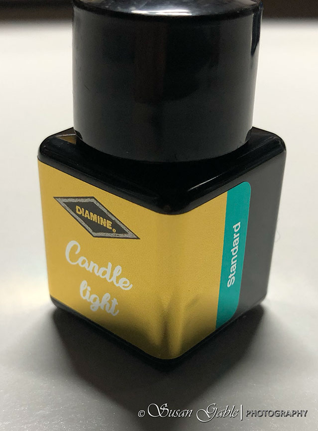
Inkvent Day #7: Diamine Candle Light
After opening the previous days’ inks, it was nice to see a lovely bright ink color appear on my radar. It’s a beautiful yellow ink that is also readable on paper.
Door #7 was a bit tricky to find as I was looking for a normal number 7. Diamine was clever with the candy cane.

Candle light is a lovely standard ink color.

There is not too much going on with this ink color other than quite a bit of shading.

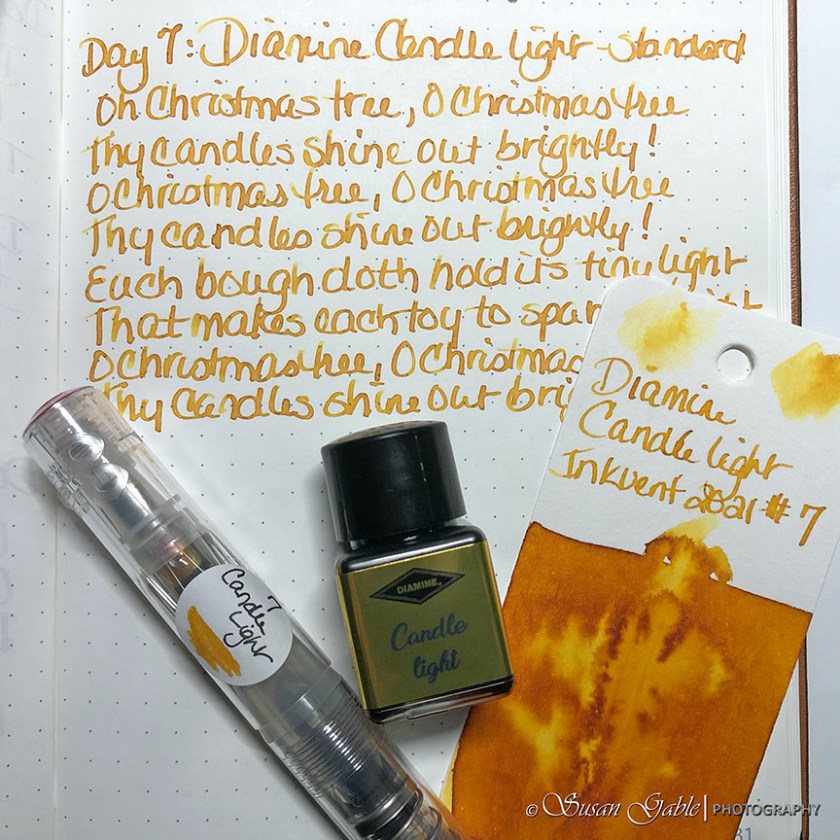
I’m very happy to see this ink has quite a bit of shading. For a yellow color it is readable on paper.

There’s a tiny-tiny bit of sheen. I can barely see it.

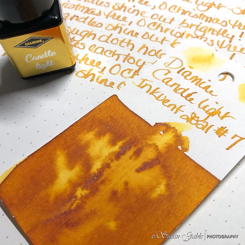
This ink creates a lovely ink wash.

I was flipping through my three (3) sets of Col-o-ring cards and the only yellows I have are from Robert Oster Signature Inks. The orange-y side of this color reminds me of RO Antelope Canyon. The bright yellow reminds me of RO Exclusive ink called Fire. No pictures (for now) of my swatches as I had a hard time photographing them and getting the correct colors to show.
Just for fun, I took my swatch and matched it against my Daniel Smith watercolors. It was quite close to Quinacridone Gold.
This beautiful Candle light ink color looks to be on the orange side and the underlying color is definitely yellow. How about a golden yellow?
Ink: Diamine Candle Light (standard)
Pens: TWSBI GO with Stub 1.1. Automatic pen
Journal: GLP Creations with TRP (68gsm)
Paper: Grumbacher Mixed Media
I don’t have any use for yellow inks at all. I can see how they would have utility for art, but not at all for writing for my purposes. Just another reason I wouldn’t spend $100+ on a bunch of inks I have never seen. I’m just too practical for such shenanigans, but I’m also glad that there are people like you around to show us what we are missing even if we are happy to be missing it:)
LikeLiked by 1 person
Thank you for your insight and comments. I can certainly understand your point on this. Do I spend my money on a new pen or more ink or something else? I was on the fence with this until I was able to use my rewards (points) towards this and get it for less. I was able to see a sneak peak of the colors and I knew 80% of the colors I would use for journaling and my artwork. That only confirmed that I made the right decision.
Considering how much ink is in the bottle (~12ml), this is much more cost effective versus getting ink samples at a later date. That is, If Diamine decides to come out with their larger bottle versions of this Red Inkvent Calendar.
I wanted to do something different while having a fun December and share the unveiling with others. I’m enjoying the level of surprises, OMGs, and lovely/unique inky characteristics I’m seeing. Will I do this again? I’m not sure as I now and will have a lot of gorgeous ink colors to play with. I still have 18 more doors to open. 🤩
LikeLike
I can certainly see the allure of having that fun interaction with others;) plus I’m really enjoying all the swatches people are doing. I usually don’t buy an ink unless I can see several samples of it so this is a great way for people like me to ‘window shop’ 😉
LikeLiked by 1 person
I agree and I also enjoy seeing all the swatches folks are creating. I also enjoy seeing their input into what inky characteristics they are seeing. The “window shopping” experience is going to get better! 🤩🥰
LikeLike
I really enjoyed the shading on this one and found it much less orange than Noodler’s Apache Sunset… and nowhere near as prone to bleeding through. I also enjoyed the haloing it offered, which is also visible in your photos. It makes the writing look almost 3D with the dark perimeter to the letters. Thanks for sharing your views and photos.
LikeLiked by 1 person
Thank you for your kind comments. 🥰 You described this ink perfectly. In my writing journal this color seems to pop off the page.
LikeLike