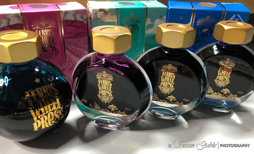
I first came across Ferris Wheel Press (FWP) when I was looking at their beautifully designed round bottles with a brass lug nut cap. A small number of their inks were available at a few online shops and selling fast. I managed to get a bottle of their stunning teal ink called Bluegrass Velvet.

Their round bottles of ink and packaging are quite unusual. A lot of thought went into their design including their FWP fonts and logos. Branding is important to them. It brings to my mind quality, upscale, uniqueness, durability, and desire. That is desire to have a bottle on my desk.
The caps on their bottles are made of brass. I actually enjoy opening a bottle of their ink. Even with my joint issues, it’s easy to wrap my fingers around the lug nut shape and twist.
Sometime last year, I came across the Ferris Wheel Press kickstarter campaign #2. It was my first time involved with a kickstarter and FWP provided wonderful information about their process, what products would be available, how to order, and a brief timeline on when their products would be shipping. They included in their kickstarter smaller bottles of ink and a new set of colors.
Three months past their target ship date, my order finally arrived in late Fall.

The smaller bottles are beautiful, but I was a bit underwhelmed with half of the colors I chose. I suppose it did not help that I received my new inks in the late Fall season while I was into the darker ink colors as well as shimmering inks.
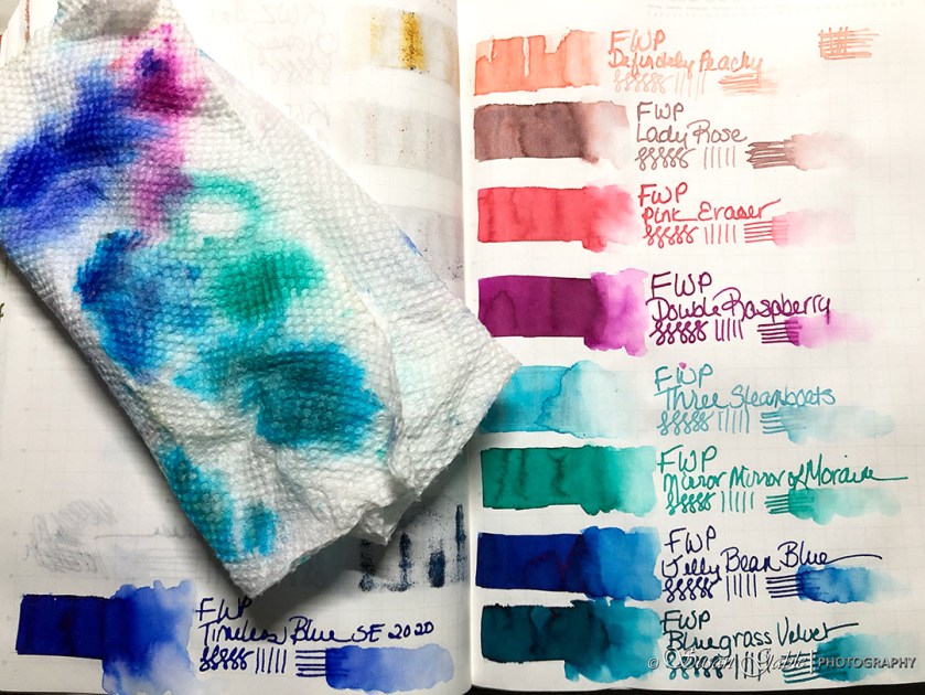
Now that we are into the Spring season, I decided to revisit the ink colors by swatching them in my ink journal.
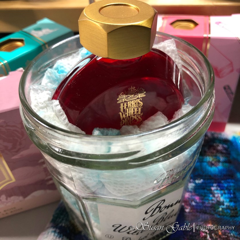
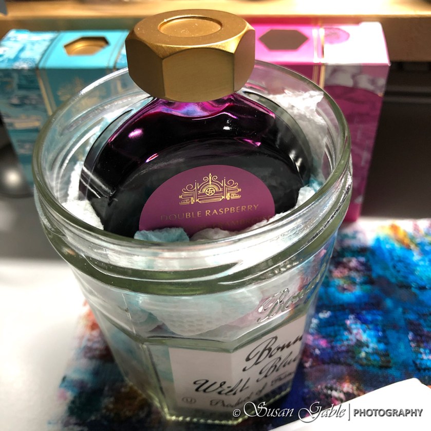
I had a fear to knocking the flat round ink jars over on my desk while swatching. I found an extra glass jar that I used to clean my fountain pens. The FWP bottle fits nice and snug into the paper towels bunched up in the my jar.

As I was swatching my ink colors, I started to change my mind about the FWP ink colors I had selected. The colors I thought were underwhelming, started to grow on me. That was a good sign!

I’m still on the fence with two colors: Definitely Peachy and Lady Rose. I should use them in my pen and ink sketches and see if I change my mind.

Bluegrass Velvet is still my favorite within the FWP ink colors and followed closely with Double Raspberry, Pink Eraser, Jelly Bean Blue, Mirror Mirror of Moraine, and Three Steamboats.

Looks like it will be a great time to pull out my empty TWSBI GOs and fill them with my FWP inks. So far from my swatching, they look like they would do well as ink washes.
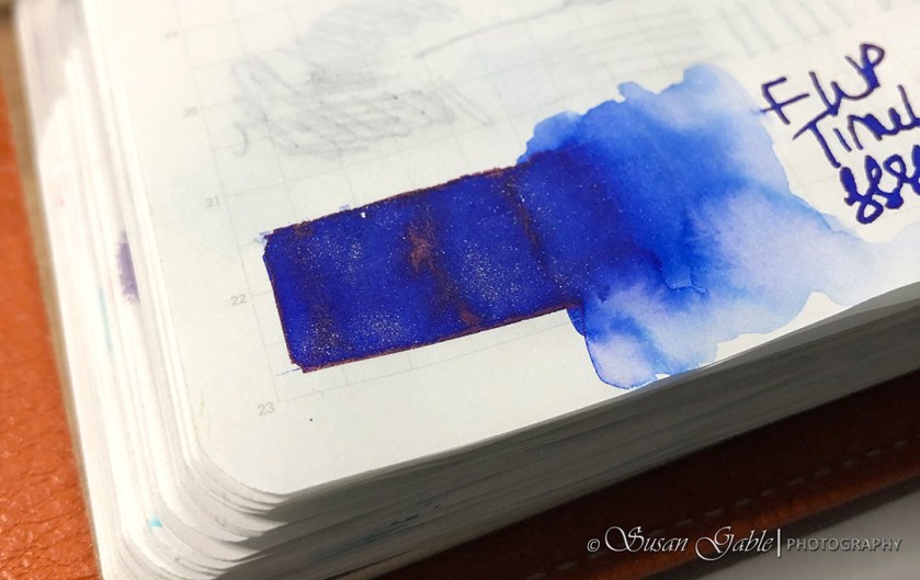
As part of the kickstarter campaign, they offered a special edition shimmering ink.
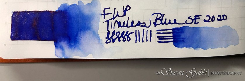
Timeless Blue is a deep dark blue ink color. It’s darker than Jelly Bean Blue.
During the open weeks of their kickstarter campaign, I changed my ink color selections. I trusted my gut instinct and decided against a few colors that appeared unsaturated and extremely light ink colors. I’m happy that I selected a good range of colors. Even the two I’m still on the fence with.
Unfortunately, I have no plans on taking part of future kickstarters with FWP. There were a few issues and decisions they made along the way after the campaign ended and while I was waiting for my inks. For me, the way they handled it gave me some bad vibes.
I would definitely purchase another FWP bottle of ink as long as the color was vibrant and saturated. If their “charger set” is available, I would recommend starting out with their glass vials of inks to see if the colors or ink appeals to you.
Pen: Glass dipped pen and automatic pen
Inks: Ferris Wheel Press
Journal: Stalogy 365


Leave a comment