Some of you already know that I love to take pictures. This has been an ongoing hobby that started many, many years ago. I have a huge collection of pictures that I’ve been using to create my artwork. I don’t have a photographic memory and so I have to rely on my photos for shapes, size, colors, etc. I also use my photos to avoid any copyright issues.
I start my rough sketches with an HB pencil and go over my paper with a very light touch. Sometimes I do have to erase rogue lines and erasing the light lines will avoid tearing or roughing up my paper. I then take my Platinum Preppy filled with Carbon ink and gently go over certain areas of my sketch to show a few outlines of my shapes and also to show where I might want darker areas (shadows and shading) to be.
Here’s an initial sketch with my pencil, Carbon ink, and the first fountain pen ink (Robert Oster Gold Antiqua) application.

Once the initial sketch starts taking shape, I will continue to add other colored inks to my drawing. I typically start with the lighter colored inks and then work my way to the darker inks. I’m careful to watch where my light source is coming from and place the appropriate shadows. In my sketch, the light source (the sun) is coming from the upper right side of my paper. I applied more gold to the right side of the palm leaves or fronds to make them glow a bit and a few on the left side of the tree.
I apply a water wash over certain areas of my sketch. I do this in stages and by sections before the ink dries on the paper. A little bit of water goes a long way. That’s why I use the smallest brush size. By the way, the Pentel Water Brushes comes in four sizes: Small, Medium, Large, and Flat.
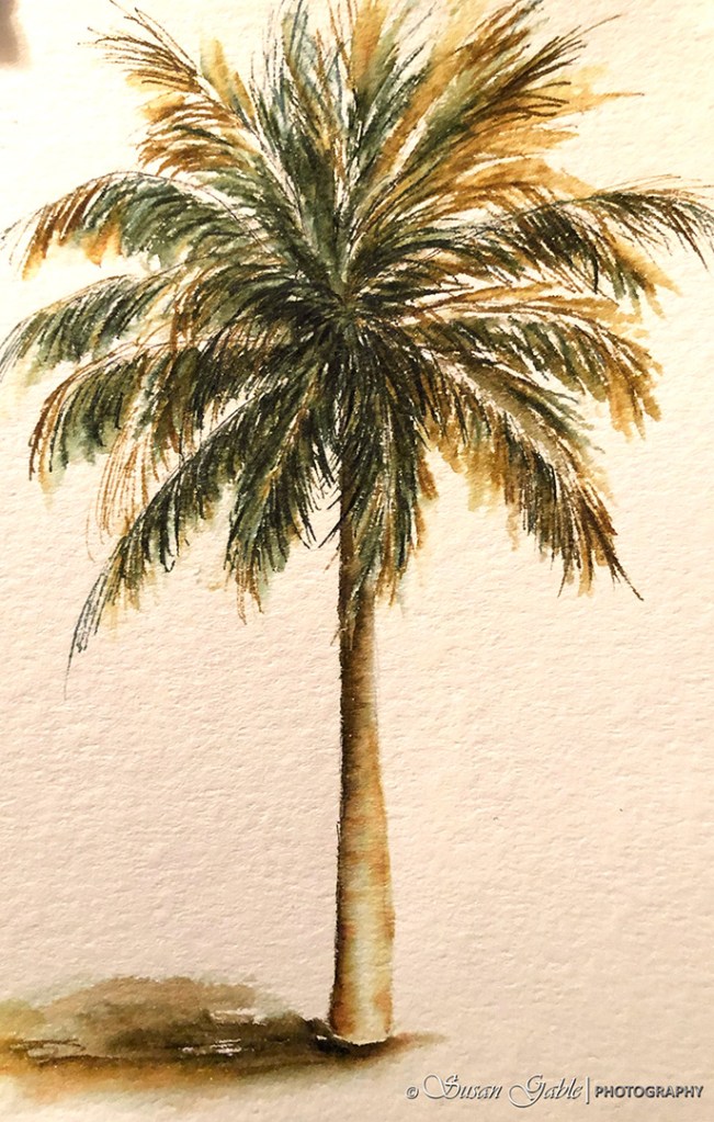
I’ve added the palm tree’s shadow at the bottom and on the left side of the tree. I applied a few lines RO Melon Tea and dabbed a bit of RO Thunderstorm into the Melon Tea and used 2-3 strokes of my water brush to blend the two inks together and careful not to overdue it. It’s okay to have some hard edges where the ink colors pool together.
I used the Melon Tea ink for the shading of the tree trunk (left side) and also used that color for the tree’s shadow. I use the Thunderstorm ink color for all of my base shadows and it mixes well with other colors on paper. It’s a dark blue black color the shades beautifully when water is applied to the ink. My palm tree looks grounded versus floating on the paper.
If I have diluted the ink on my paper too much, I will let that area dry completely. I go back with my pen and redraw the lines/shapes over the diluted/faded area.
I have been carving out some “art time” during the day and enjoying my time playing with some gorgeous ink colors. I plan on showing some incredible inks in future posts. Stay Safe!
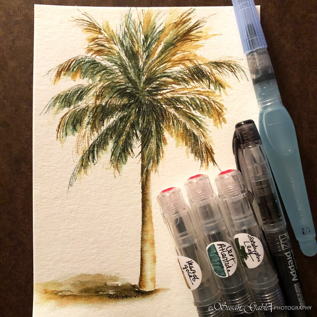
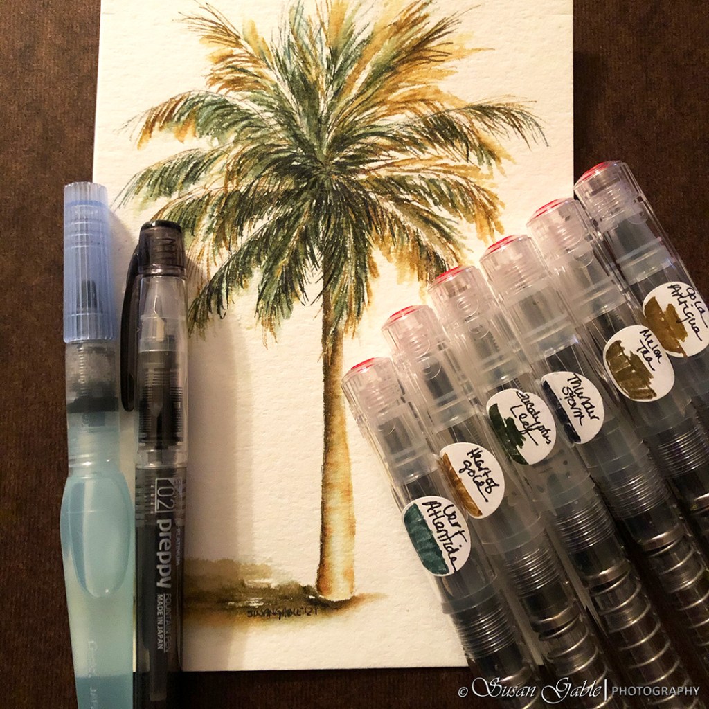
Pens: TWSBI GOs with Stub 1.1 nibs
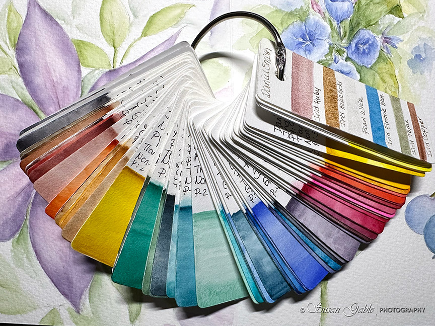
Inks: Jacques Herbin Vert Atlantide (shimmer) and Robert Oster Heart of Gold (shimmer), Eucalyptus Leaf, Thunderstorm, Melon Tea, and Gold Antiqua.
Tools: Platinum Preppy 02 Extra Fine nib and Platinum Carbon ink (permanent) and Pentel Water Brush (Small).
Paper: Strathmore 500 Premium Watercolor Cold Press


Leave a comment