
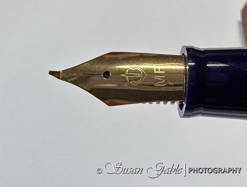
I saw an artist on IG who created some beautiful monochromatic artwork in his journal. His artwork consisted of beautiful thin lines with dramatic bold strokes of color. I searched through his posts to find the tools he was using. He was using a green Sailor Fude de Mannen fountain pen. This is a long body plastic fountain pen with a 55 degree Fude nib.
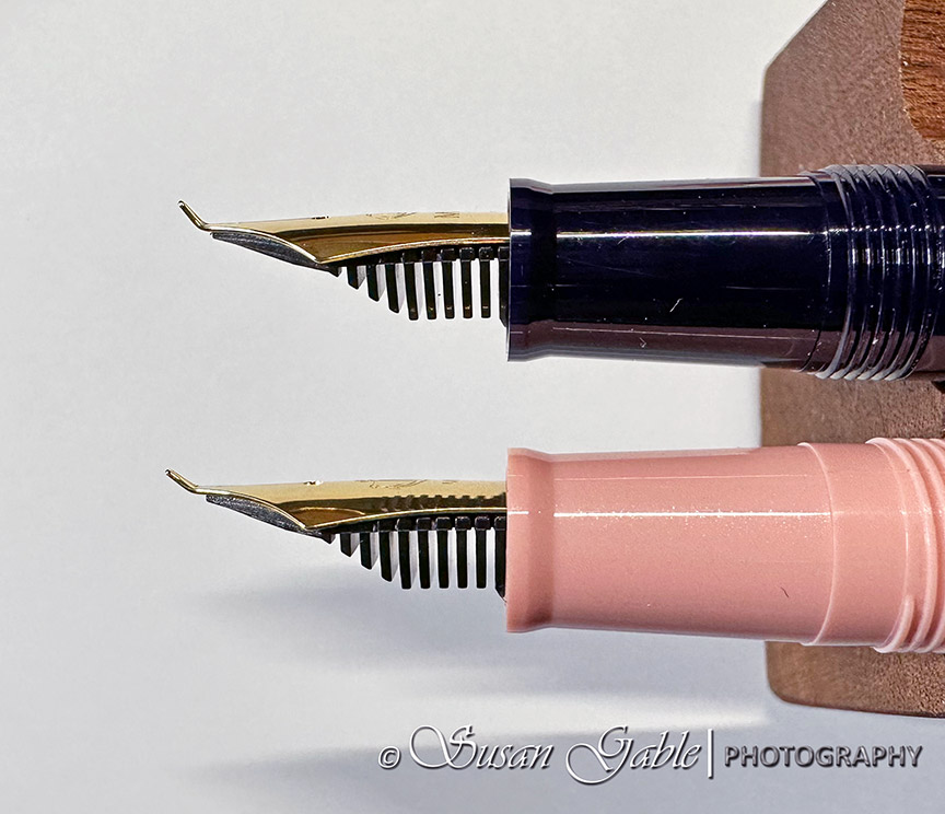
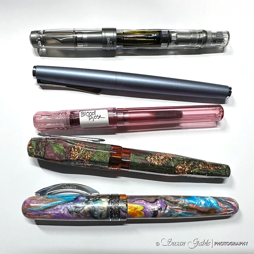
I remembered I had a pink version with a 40 degree Fude nib. I also have a black Sailor Profit that came with a 55 degree Fude nib. I pulled out my two Sailor fountain pens and my long forgotten experiment from last year came back to me. I looked at the pink section on my black body fountain pen. Yes, I had swapped the sections between my two Sailor pens. That was my experimental hack that ended abruptly.

My initial thoughts on these two Fude nibs were I needed a lot of practice to get used to the nib’s capabilities. At my normal writing angle, I was producing broad strokes of lines and ended up writing larger than normal to compensate for the overly wet nib.
I found the 40 degree Fude nib was better for my writing experience. On the other hand my 55 degree Fude nib was so smooth.


For sketching, I felt a bit out of control when trying to sketch with both nibs. Bold lines would appear when I wanted thinner lines. I also felt my fingers would cramp a bit from holding the pen. Nothing like a good death-grip on a fountain pen. Hahaha!
Fast forward to now and I can honestly say, I’m getting used to my Fude nib. I had a moment where I thought “if someone else can create beautiful artwork” I should be able to as well in my own creative style.
Here’s my sketch of a pumpkin. I initially sketched an outline with my pencil and then sketched over my graphite lines with my Fude nib pen. I practiced by creating thin lines and holding my pen at higher angles. The broadest lines were easy to produce as I held my pen like I would normally use it for writing. A thought came to me to produce the lines like I was holding a paint brush. That appeared to help and I was able to create brush-like strokes of color on my paper.

Here’s my sketch of an echinacea flower. I realized I don’t have too many sketches of flowers in my journals. I used to think that sketching petals were time consuming and I was still learning about perspectives. Using my Fude nib pen might changed my mind. Also, it doesn’t hurt that I work for a local nursery and I’m always taking pictures of flowers to use for future sketching projects.
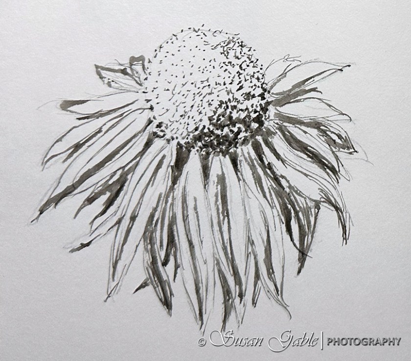
I started with the center of my flower and sketched the shape. I then sketched out the main petal shapes and thought about perspective. Larger petals closer to me and smaller and less detail petals further away.
I used my Fude to create the dots on the center of the flower. Bolder dots placed close together to create the shading or darkest side. I created the smaller and lighter dots further apart to represent some shaping and not give too much detail.
At this point, I was feeling almost “one with my Fude nib” and created my second pumpkin sketch. By this time I felt like my Fude nib was my paint brush. In my sketch, I started to see my broad stroke of lines as brush strokes. A lovely and cool experiment on my paper.

After I sketched for 15 minutes in my journal, I noticed my fingers were a bit cramped from switching the pen angle in my hand. My very own “death grip” had made an appearance. This was more than likely one of the reasons I stopped using my Fude nibs last year.
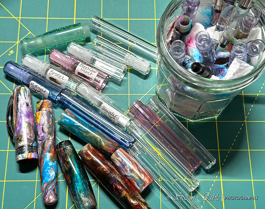
I’ve been enjoying my time with my Sailor Profit with Fude nib that I went ahead and purchased another one. For this second pen, I plan filling it with a non-permanent ink like Thunderstorm or Schwarz Rose and use this pen to create some interesting pen and ink washes for sketching.
Tips:
- To get a fine thin line, turn nib upside down for reverse writing OR hold nib vertical
- To get broad line, use pen at normal writing angle
- To get broadest line, use pen at angle below writing angle
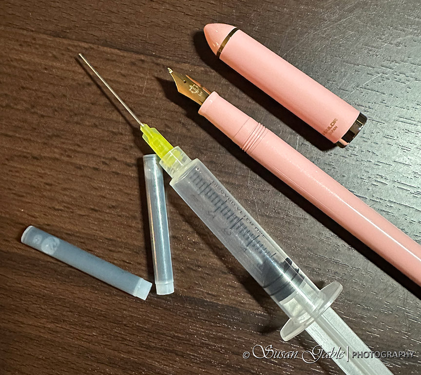
- Re-use Sailor ink cartridges as they hold more ink than the Sailor converter (Fude nibs are gushers when writing/sketching with broader lines)
Booth my Sailor Fude de Mannen (pink) and Profit Fude (black) came with two ink cartridges. The converter is sold separately. I actually prefer to use the ink cartridges and fill them with my own inky colors.
I use an ink syringe to draw out the included black in from the cartridges. I push down on the syringe to remove the ink. Once the cartridge is empty, I refill it with clean water. I use the syringe to draw out the dirty water. I repeat this process until any remnants of the black ink is gone. I plan on filling my cartridge with Schwarz Rose and use it for my pen & ink washes.
Pros: Inexpensive fountain pen with a lovely Fude nib. Can create thin lines to broadest lines. Comes with two ink cartridges.
Cons: A plastic pen that causes my fingers to cramp. More than likely the result of holding it with a death grip. Hahaha! Does not include a converter.
Ink: DeAtramentis Document Urban Grey
Pens: Sailor Fude de Mannen in pink with 40 degree nib. Sailor Profit Fude de Mannen in black with 55 degree nib
Journal: Stillman & Birn Alpha Softbound A5


Leave a comment