Inkvent Day #24: Diamine Yuletide
I enjoy turquoise and teal ink colors. It reminds me of the beautiful waters in the Caribbean. I also enjoy intense pink, bright coral, and eucalyptus/olive green colors.
When I saw the label color on the bottle I knew this was going to be another favorite color.
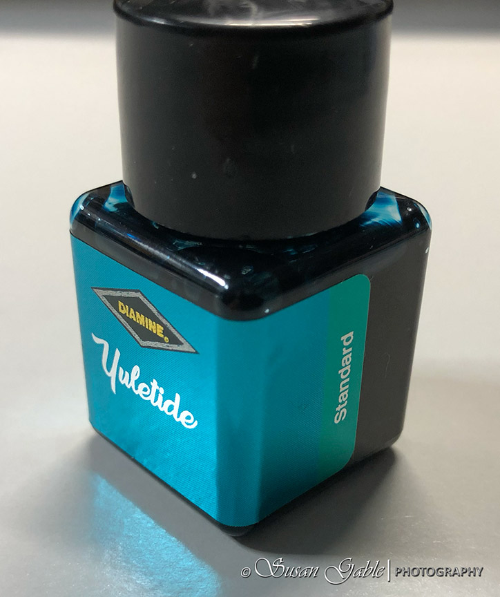
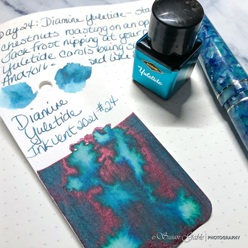
Diamine says this ink is a standard ink. It shows quite a bit of shading on my paper. My swatch card shows some interesting inky goodness.
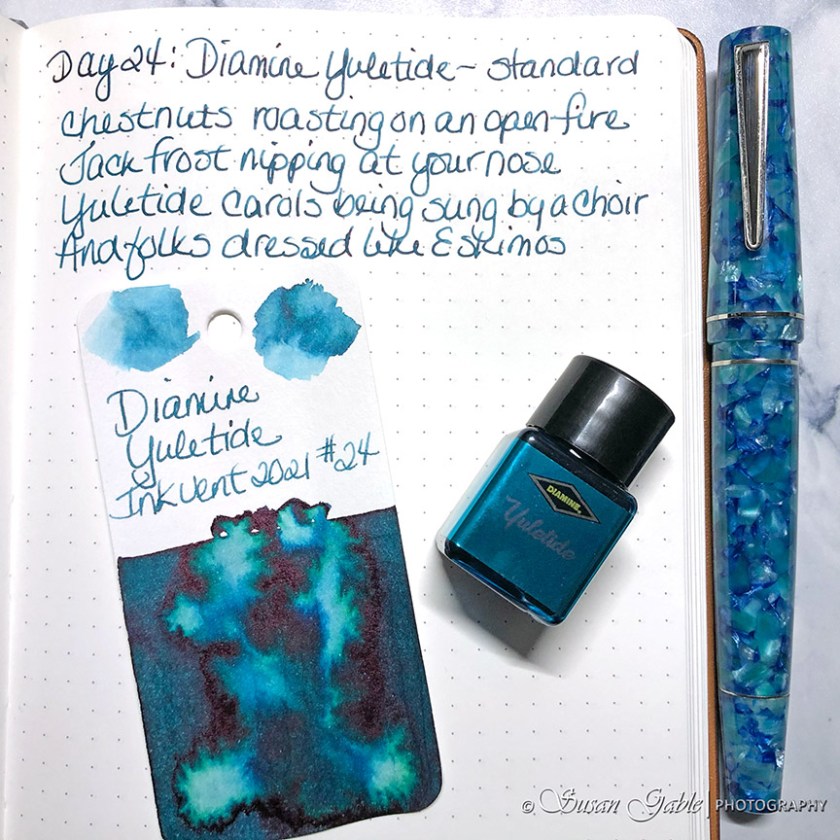
So I had a funny thing happen to me. I picked up my Maiora fountain pen and proceeded to fill it with this ink. Uh-oh. I could not get the nib/feed/section into the bottle. My pen’s section was a bit thicker than the bottle’s opening. I had a “you’ve got to be kidding” moment with my pen. I untwisted my converter from the pen and dunked my converter into the bottle and filled it with ink. Mission accomplished. 😊
Okay, let’s get back to my inky observations.
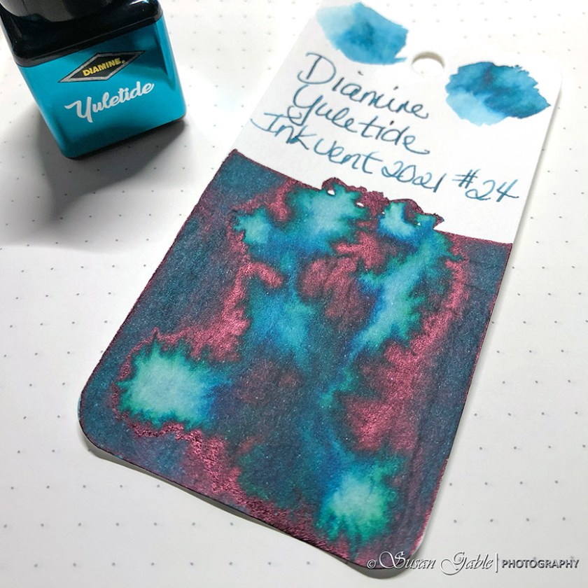
There’s a bit of pinky sheen showing up on my swatch card. I’m trying to figure out if this ink is a teal or a turquoise color.
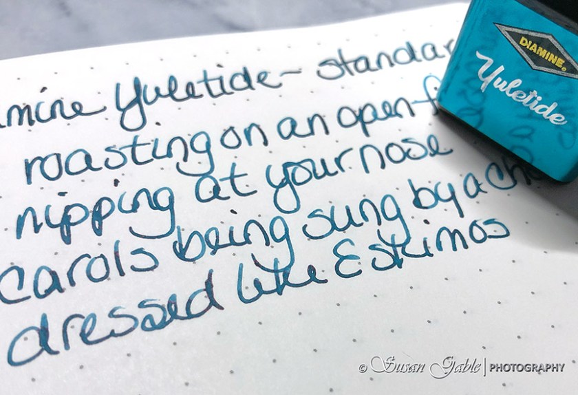
Here’s a close up of my writing sample. Did I mention the lovely shading on my paper?
In the following picture I have my Subzero swatch from a few days ago next to Yuletide. I can see Yuletide is leaning a bit towards green.
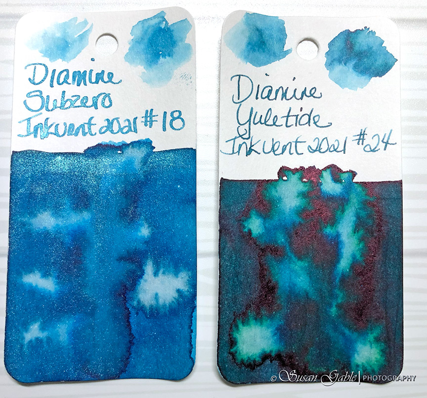
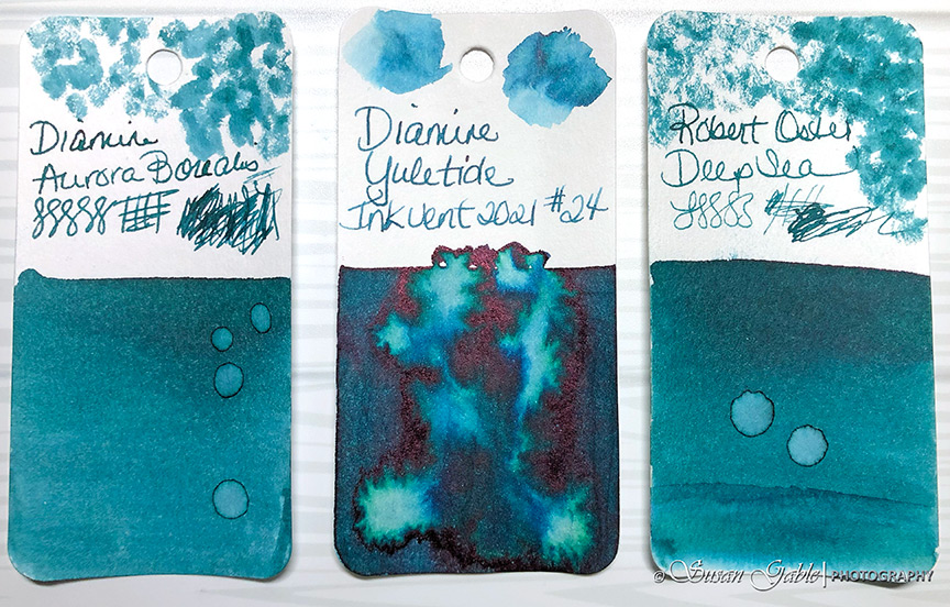
I’m now thinking Yuletide is closer to a teal color. I pull out my Diamine Aurora Borealis and Robert Oster Deep Sea swatches and compare the colors (base and underlying). I can see it’s in the similar range of colors.
There is still something unique about this ink. My brain is telling me there’s more than one underlying color. Besides green I also see some blue. I have to say my swatch card came out brilliantly with the ink dispersing in an unusual pattern.
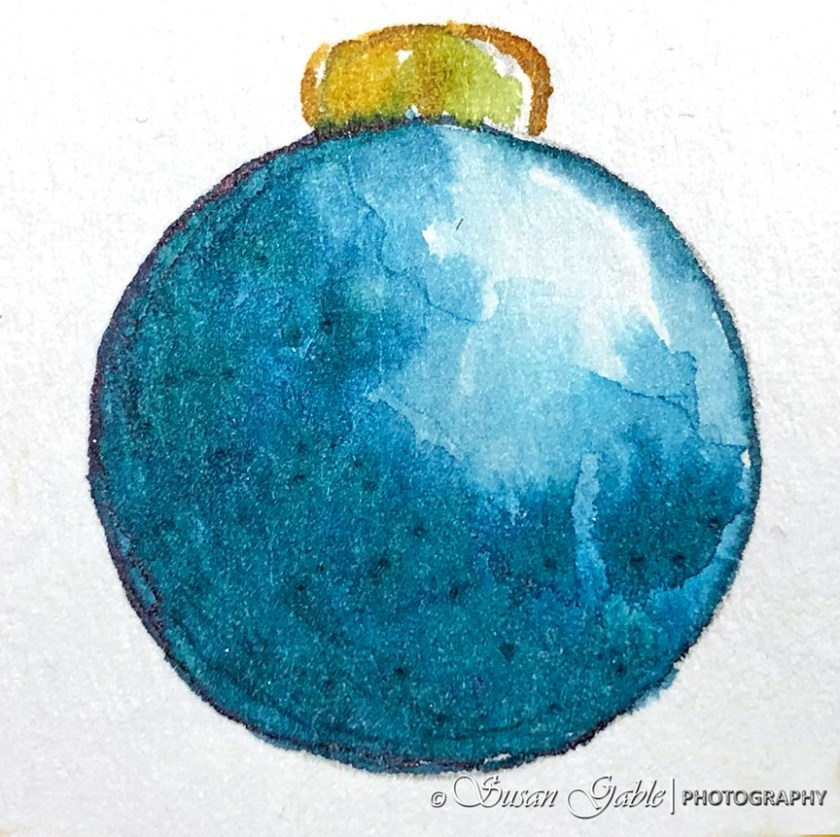
I added too much water to my inky sketch and so the sheen migrated to the edge of my sketch. I can still see some greens and blues in my sketch.
Yuletide is a gorgeous dark teal ink color with some medium pink sheen. Depending on the lighting there is also has some green and blue underlying colors. I would definitely use this ink in my artwork and for journaling. Another color on my wish list.
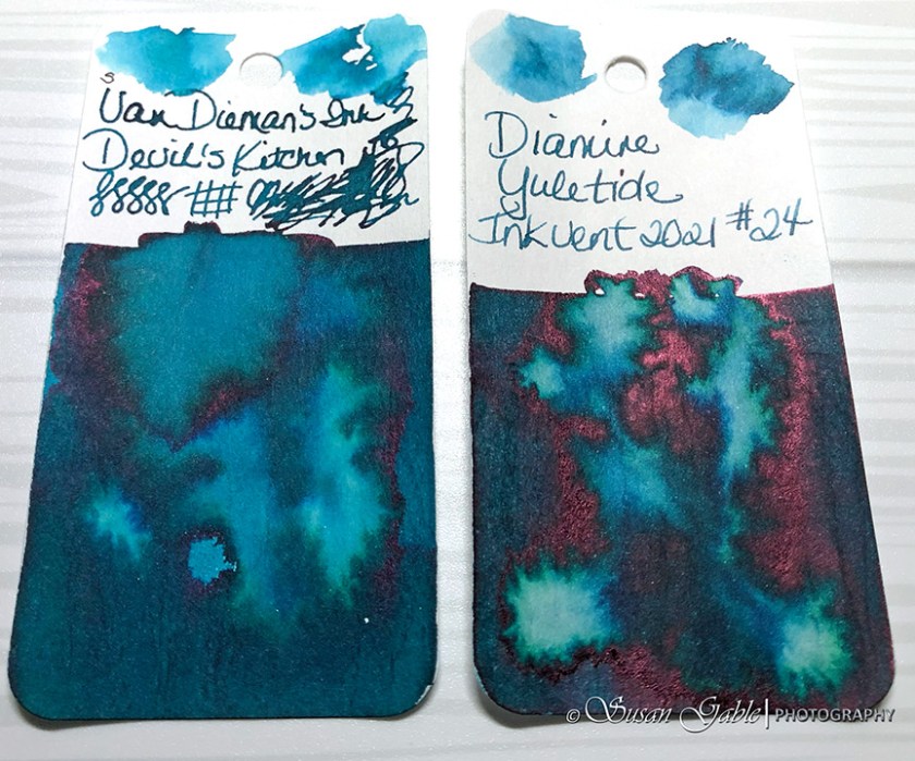
Slap the side of my head moment: I’ve been using Yuletide in a few of my sketches. There was something very familiar about this color. Yes! Of course! I have another favorite ink color I’m currently using in my lovely Lamy 2000 called Devil’s Kitchen! Here’s another swatch comparison.
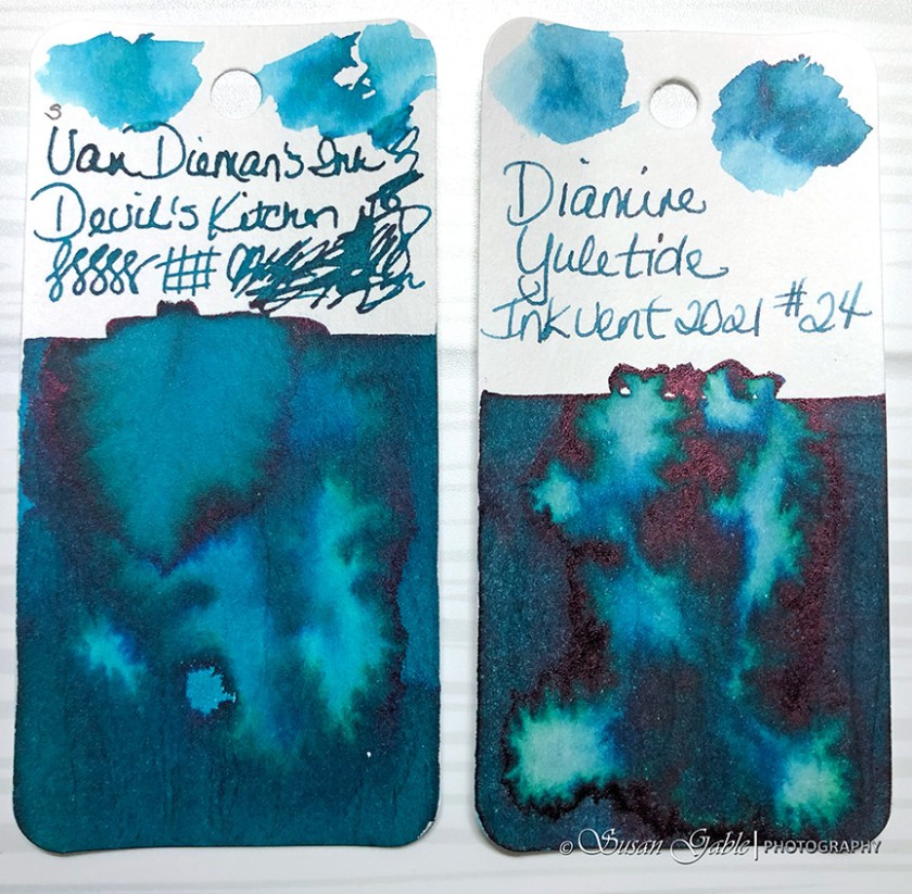
The only differences I can see is Yuletide has more sheen and is slightly lighter in color. Other than that both ink swatches look very close.
Ink: Diamine Yuletide (sheen)
Pens: Maiora Impronte OS Posilippo with Fine nib. Automatic pen.
Journal: GLP Creations with TRP (68gsm)
Paper: Grumbacher Mixed Media


Leave a comment