I’m glad there’s a break from all that shimmy and sheen from yesterday. Let me take a minute to recompose myself. Breathe in. Breathe out. Okay, onto the next ink color. 😃
Inkvent Day #5: Diamine Harmony
Diamine Harmony is a lovely purple and standard ink.
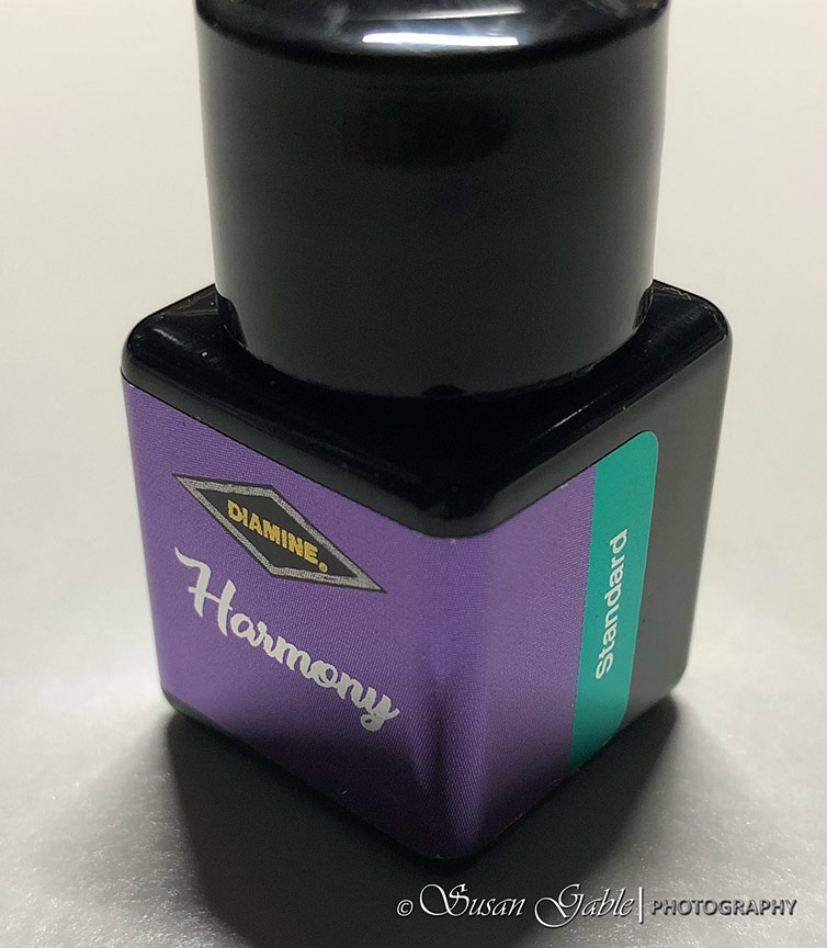
Since this ink has no shimmer nor sheen, I decided to use my glass dip pen to write with. Harmony has some lovely shading.
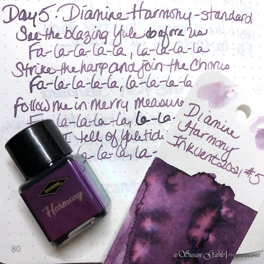
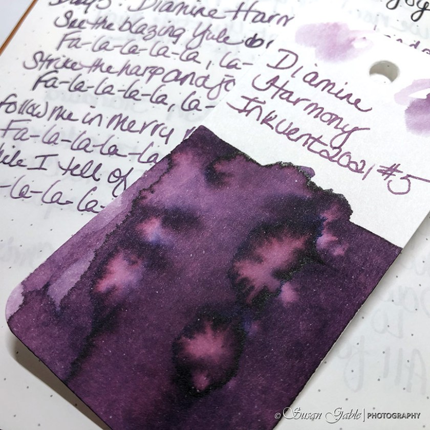
From my swatch, I can see a tiny bit of blue along with the pinky undertone color. Also I can see a tiny bit of dark sheen.
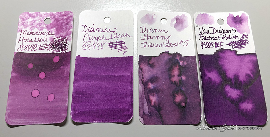
I was going through my swatch cards and most of the purple ink colors I have leans into the blue color range. Here are three colors I have that come close to Harmony.
Here’s my pen & ink sketch.
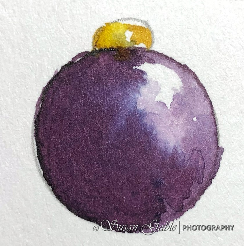
I like this purple ink color. It produces a gorgeous ink wash on my art paper. This color is not too bright and not too dark. Could be a “just right for me” purple color.
Ink: Diamine Harmony (standard)
Pen: Glass dip pen. Automatic pen.
Journal: GLP Creations TRP (68gsm)
Paper: Grumbacher Mixed Media


Leave a comment