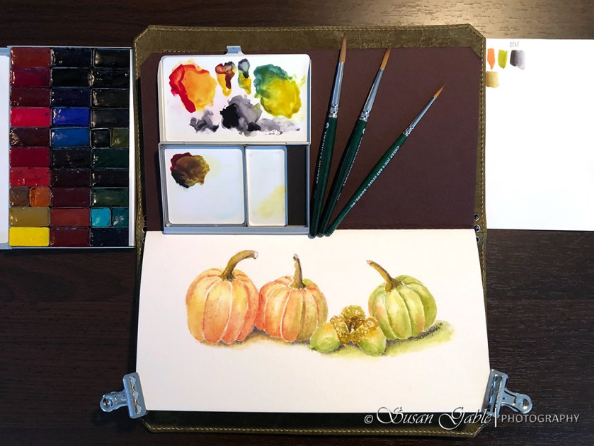
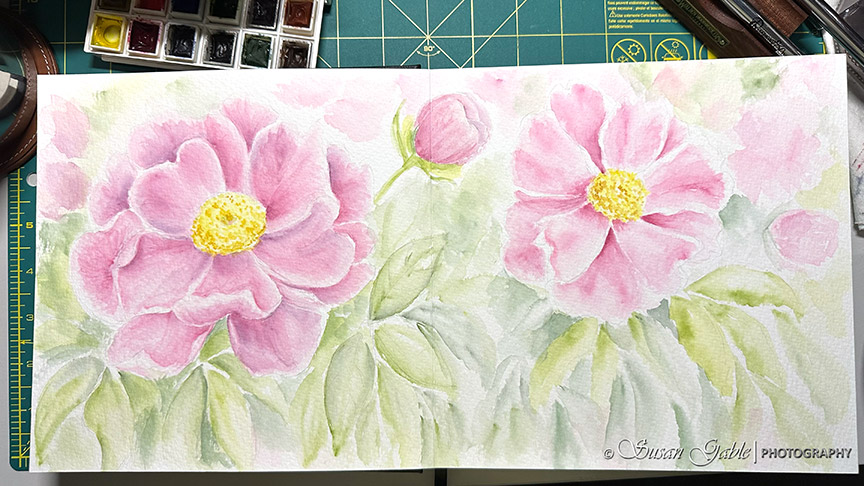
I finally finished my watercolor painting. I know from my previous post I was rather vague or did not show a complete picture of my artwork. I was testing out a new watercolor paper (journal) from Franklin-Christoph and wanted to see how well the paper held up to the copious amount of water and paint I used. Here is my setup from this morning:
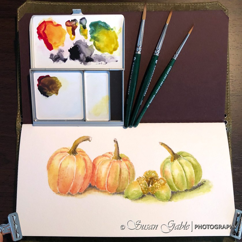
The last few layers of colors involved adding the shadows underneath the objects. Before my pumpkins looked as though they were floating on the paper. Now, they should look a bit more grounded. That’s what I was hoping for.
I also added a bit more color to the curve of the objects to make them look rounded and give more depth.
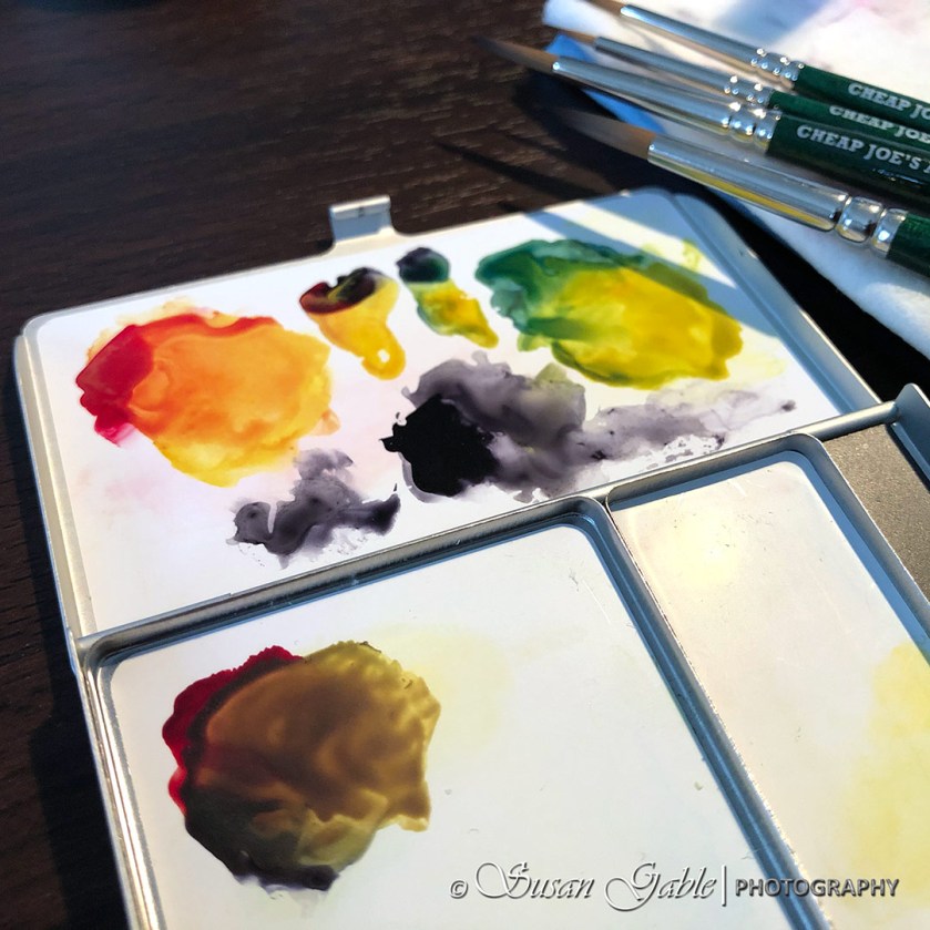
To keep a consistent feel in my artwork, I used my favorite yellow color called Nickel Azo Yellow to mix the final paint colors. I mixed that yellow paint with Alizarin Crimson to create a soft orange color. I mixed the same yellow with Cascade Green (fave color) to create a pretty olive green color. I do enjoy mixing colors together to see the cool surprises I can create. Like creating the olive green color.
You can see in my middle pumpkin I used the orange with a bit of green (colors used from the other two pumpkins) to create a bit of harmony in my painting. While I was thinking about this, I also added a bit of orange to the green pumpkin.
For the acorns I included both orange and green colors since they sit in between the orange and green pumpkins.
For the shadows, I used Neutral Tint in the darker areas and added dabs of the associated pumpkins colors to show a bit of its reflective color. I use this technique quite a bit in both of my pen & ink and watercolor artwork.
Another composition item I think about while planning my artwork is numbers or quantity. Odd numbers make an artwork look visually pleasing. It also forces your eyes to move around the artwork. I also think about odd numbers when I take my pictures.
I am thoroughly enjoying my time using this watercolor journal. There’s over a dozen layers of colors and the paper has held up well. No noticeable ripples on the backside of the paper. Love this bound watercolor journal concept with 100% cotton paper. It fits nicely in my Franklin-Christoph VN Vagabond NWF Notebook Cover or a normal traveler’s notebook cover. This journal size is about 4.3″x 8.25″.
Remember I mentioned the epiphany I had in my previous post? It was about using less water in my watercolor paintings. This made a huge difference especially when using this new journal paper. I did notice when I used too much water, the paper would produce spots in the overly wet areas. You can see it on the orange pumpkin (far left).
My favorite watercolor paper is Arches and I’ve never had any issues with that paper brand. I wished Arches still created a journal with their papers. I have one from early 2000 that I stumbled across and will eventually use it (when I get better). In the meantime, F-C’s journal is perfect for my practice and to take along with me on my travels.
In regards to using this paper with fountain pen inks, I have done a few test sketches and I’m not too happy with the results. I might need to spend another week and perhaps change up my pen & ink techniques to see if this paper changes my mind. I will definitely be back to share my thoughts on this and also a few pictures and let you, my readers, decide how to use this journal with pen and inks.
My paper thoughts: Does a decent job with watercolor paints
Paints: Daniel Smith Extra Fine Watercolors
Brushes: Cheap Joes American Journey Round #2, #4, and #6
Palettes: Art Toolkit by Expeditionary Art Folio Palette (large) with paint pans and Pocket Palette (regular) with mixing pans
Journal Cover: Franklin-Christoph VN Vagabond NWF Notebook Cover
Watercolor Journal: Franklin-Christoph VN Watercolor Refill


Leave a comment