My first Italian pen was a Visconti Rembrandt in a purple color. I ordered an extra fine nib and stumbled upon a unique nib that came with that pen. The etched writing on my nib said Calligraphy. The extra fine nib had a crisp edge and I enjoyed the writing style I was able to produce on paper. The nib made my handwriting look a bit artsy. Visconti opened my eyes and enabled me to consider other Italian brands.
I saw a pen color called Blue Hawaii. It kept popping up on my radar. I first saw one at the local pen show I attended. I knew it would be a future purchase. On my wish list.
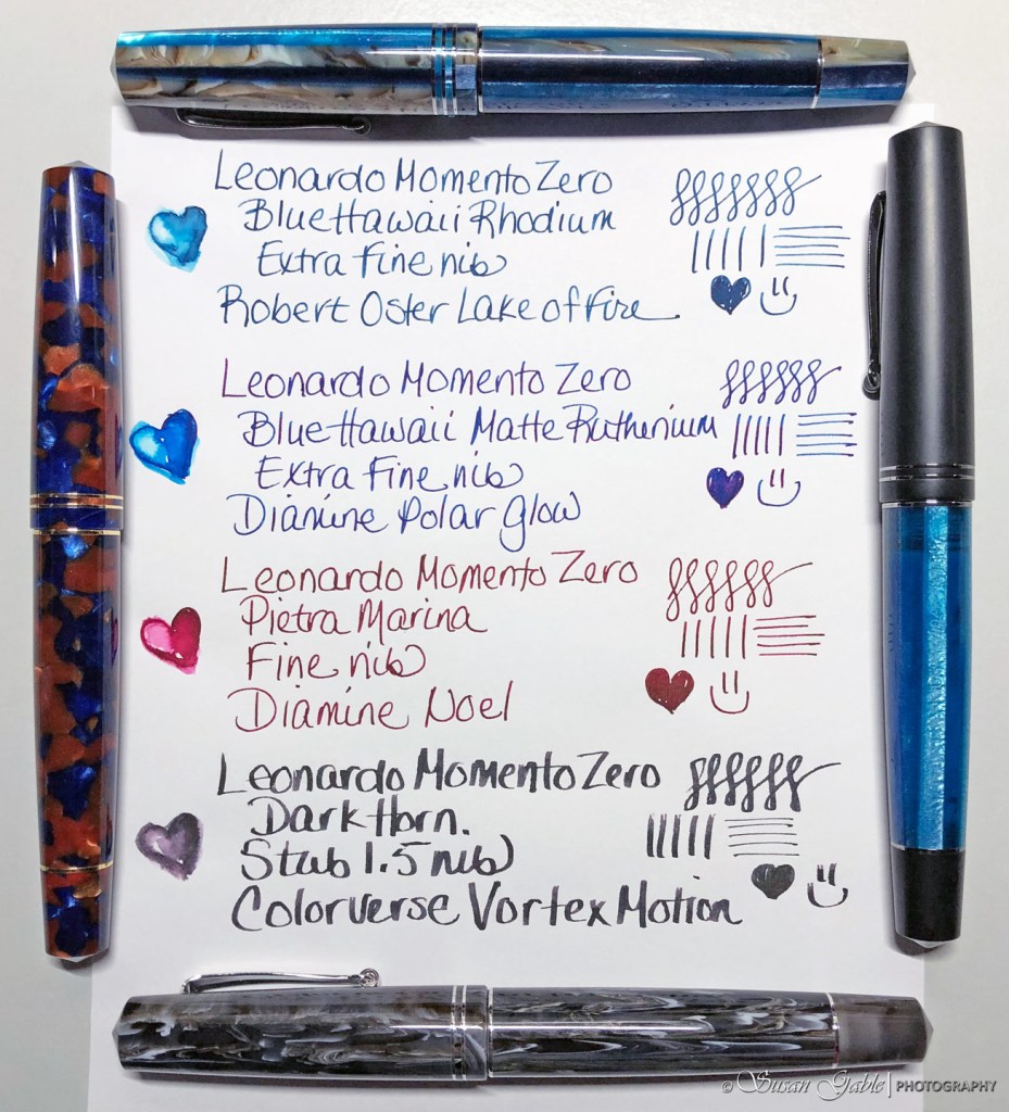
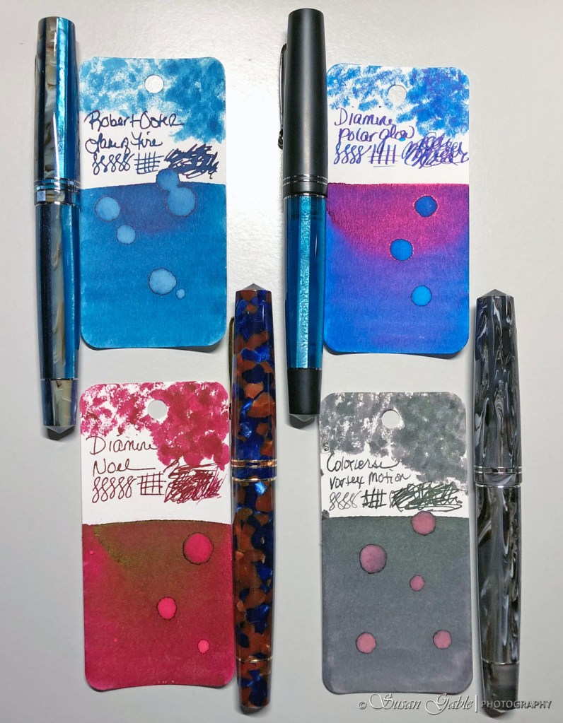
I finally purchased my first Leonardo around the same time I purchased my first bottle of Robert Oster ink. I paired my Blue Hawaii with Rhodium (exclusive pen) trim and extra fine nib with the beautiful Frankly Blue ink and that was the start of a lovely pen and ink relationship. A few weeks later, I found a great deal with the Dark Horn color with a stub 1.5 nib and paired it with Thunderstorm. That was the largest stub nib I had in my pen collection (still is) and I was floored at how bold this pen wrote. It took me awhile to get used to this interesting nib and figure out the best writing style.
Another few weeks passed and I saw a new version of Blue Hawaii in Matte Black with Ruthenium trim (another exclusive pen) and nabbed an extra fine nib. I filled that pen with Fire and Ice. My fourth Leonardo in Pietra Marina showed up with a fine nib. That pen was filled with Australian Syrah. Yes. A pattern to my rabbit-hole madness.

Overall, the nibs are smooth. The extra fine nibs are smooth with some feedback. It’s an enjoyable extra fine writing experience. More so than a few of my other extra fine nib pens (like my TWSBIs). The fine nib is also smooth, but with a hint of feedback. A pleasurable writing experience. Of course my juicy stub 1.5 is just smooth and a wet writer.
There’s a little screw cap at the end of the body that can twist completely off. This gives you access to the top of the converter. This is an alternative way to fill the pen/converter with ink instead of unscrewing the whole body to get to the converter. Just remember to put the screw cap back on as you don’t want to lose it.
The Momento Zero is a fairly light pen. The shape is beautiful and the pens are well made. They have a nice resin section and I hardly notice the threads. The pen is comfortable and well balanced in my hand whether I post the pen or not.
It feels like a girthy pen, but it really isn’t especially when you compare it to it’s relative, the Grande version.
I think we need one more picture of my pens close up.

I will do a few more writing samples and post more pictures here in the next day or so. Stay tuned!


Leave a comment