Sometimes I start out my draft blogs with an idea that’s been brewing in my head and I just start typing away on my keyboard. I save and edit several times and then add my pictures. Other times, I will just add my pictures (so I don’t forget) and add my art adventure thoughts throughout the week.
It really doesn’t matter how I start my draft blogs because my ideas for the blog post changes. My left brain thinks I need to go one direction and explain the process or take more pictures. My right brain just wants to talk about inky colors and look at all the shimmers and write about how much fun I had adding inky washes over my grape drawings.
At this point, I hope my fellow blog readers are smiling with me. Oh and I have to add that my blog title will change quite a bit. In a few titles, you might see many “&” as I keep adding additional thoughts and ideas in my blog. This is what my real artsy blogging adventures are like on a given day or week.
I have added “headings” in this blog post to make it easier to follow along. My mind was running all over the place and I could have created separate blog posts, but decided not to. Okay. I’m done with this long introduction. Let’s get back to the blog title.
I’m happy to admit that I’ve been drawing on a “regular” basis. Which means when time permits. I’ve managed to pick up my pencil and sketch something that’s been on my mind or one of the many pictures I have taken. The good thing is I’ve been relying less and less on prompts. I’ve also moved on from doing daily sketches. I’m feeling a bit more comfortable sketching when I have an hour here or there.
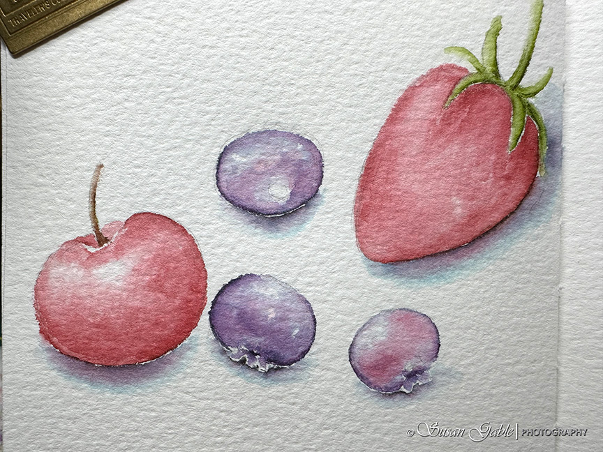
It’s easy for me to pull out my pencil and create quick sketches. Some are ten minute gestural sketches where I’m just creating the outlines of shapes and fill them in with my pen & ink wash colors. This fruit sketch was three layers of colors. Working the colors from light to dark and mindful of where the highlights are. Notice how flat the strawberry appears as I forgot to leave a bit of white from the paper. I made a note to myself: my art journal is not a coloring book.
I no longer force myself to draw. I have my drawing supplies on my studio desk ready to go and within reach. They are mostly in cases and ready for me to grab and go. I’m still using my Rickshaw Bansai bag as it’s easy for me to place my cases in that bag along with my A5 art journals.
Circle Exercises
I’ve been sketching a lot of grapes. I call it my “circle exercises” and I create the grapes when I want to draw something and keep my muscle memory active. The fun part is I get to use any color I want. This exercise or practice session incorporates a few techniques. The first is pretty evident where I just draw circles. In the following sketch, the circles are on top of each other or behind. Sometimes they are not perfect, because perfection does not exist. Remember that from my workshops?
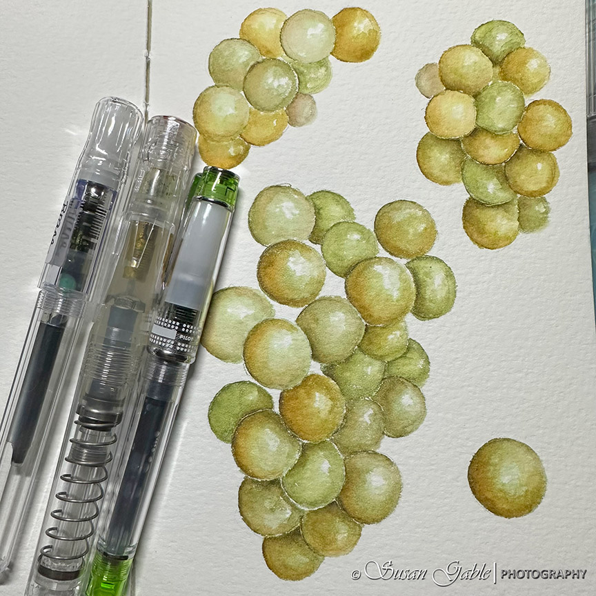
The next technique is to remember to leave the white of the paper for highlights.
There are several layers of colors going from light to dark. I also introduce other colors to add a bit more interest.
I also look for shadows and darken areas where the grapes appear to be touching each other and this makes the grapes appear to pop off the paper.
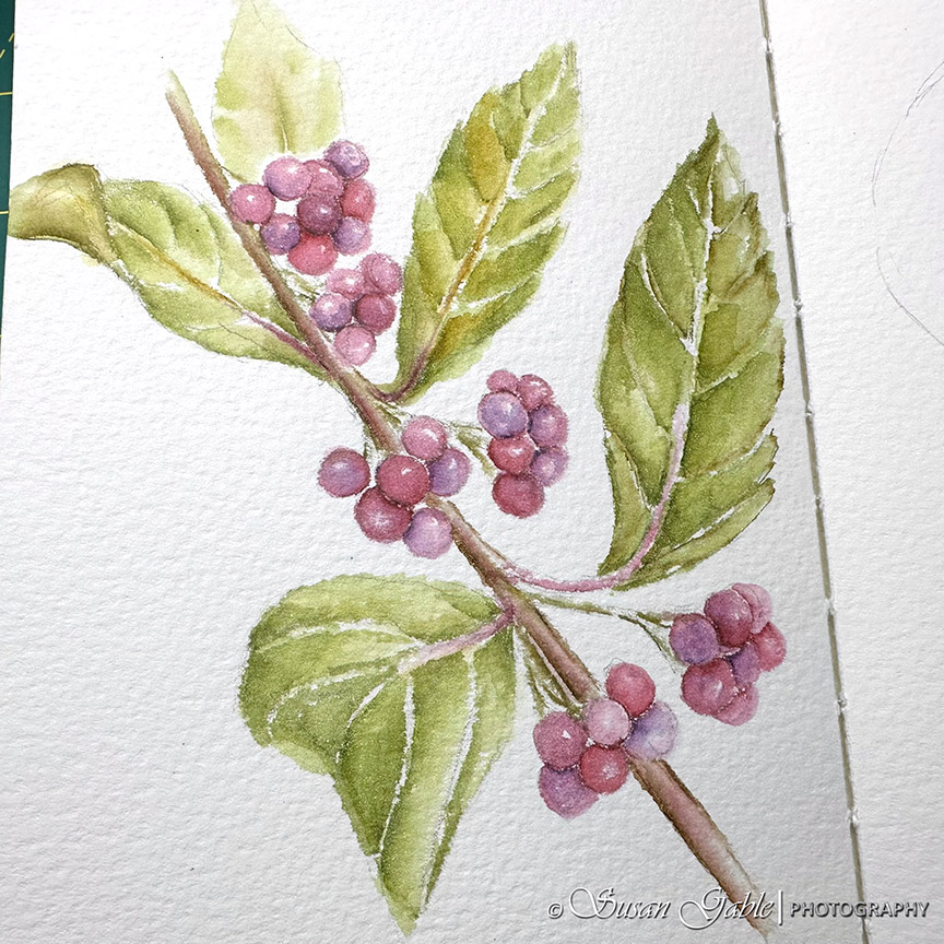
Plant Drawings
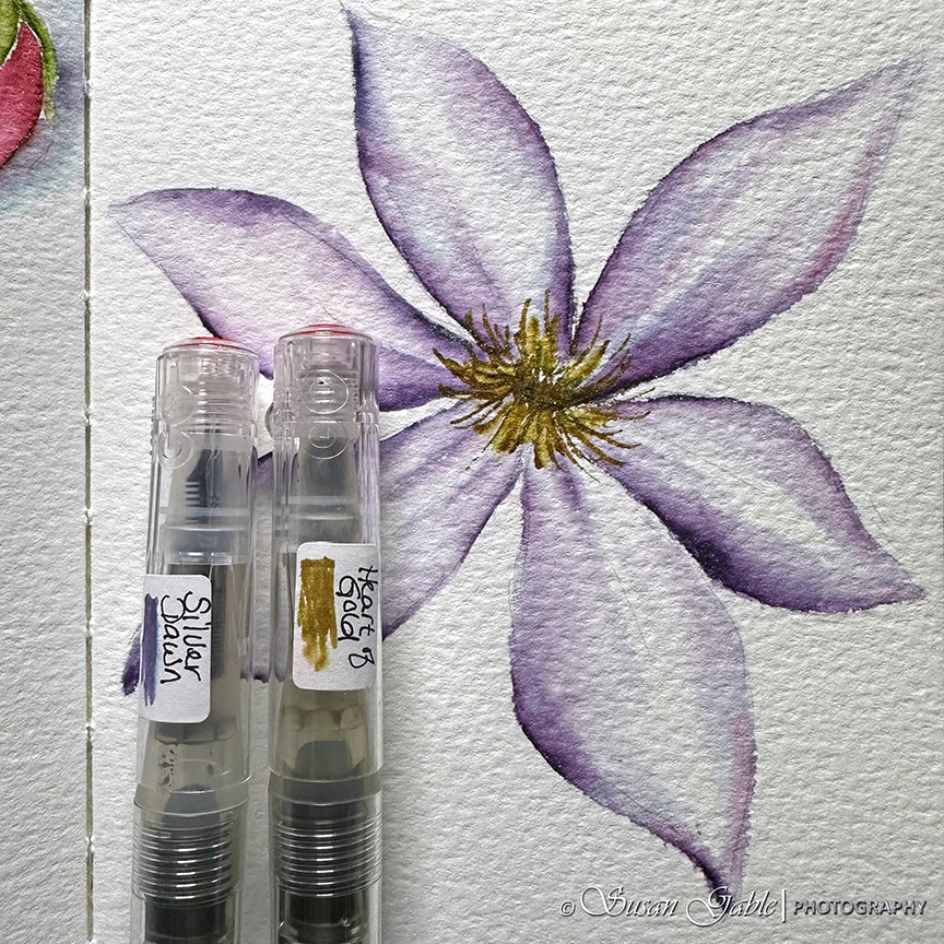
I’ve been working on floral and plant drawings. I’ve been developing my own style and playing around with techniques. The process has become easier as I make sure to sketch a flower or some leaves to keep my muscle memory active. It’s all about looking for shapes. Sometimes squinting at a flower or leaf helps. My goal is to keep challenging myself. I remind myself to tamp down the negatives in my brain when I see something to sketch. It’s not hard once I see the “shapes” and apply my inky colors.
There are times when I forget to stop and I will overdo areas of my artwork. In the following sketch, I added a fifth leaf in the background to give my sketch a bit more balance. Also with this background leaf I left off the details. It’s amazing how the mind works and fills in the details for us.

What’s on the Page(s)
I have found over a short period of time, my composition or “vision” on a two-page spread becomes easier. It feels like a brain dump and I just go with the flow. In the following sketch a few of my objects have corners or edges the disappear off the edge of my paper.
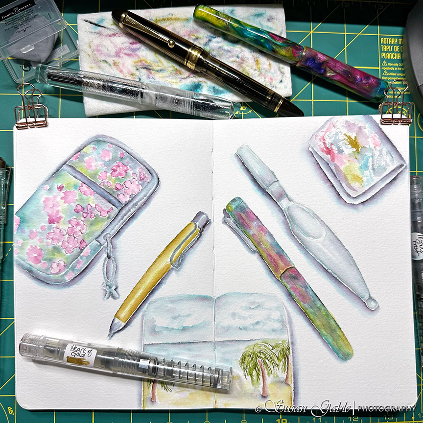
It’s fun to experiment with different colors and sketch glassware. In my glass candles there are reflections of colors from the sea glass. Also there is an odd number of candles.

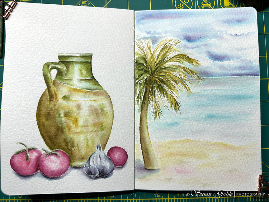
A lot of times my drawings are random. I just fill up each page or side and not necessarily follow a theme. On the left page, it was a practice piece to draw a handle. I was tired of drawing coffee mugs with handles and thought the jug handle would be fun. The beach scene on the right page was an attempt to fill a page with pen & ink wash color.
My Fave Inky Colors
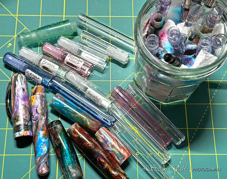
I tend to use the same inky color in my artwork. It will typically be a yellow color like Heart of Gold or a green color like Brane or Eucalyptus Leaf. A lot of times Thunderstorm will show up when I need to darken an area to create a bit more shading or add shadows under an object. A tiny bit of Thunderstorm goes a long way. Did I mention I’m on my third bottle of Thunderstorm?
Watercolors
At some point earlier this year I went back to sketching with my watercolor paints. It only lasted a few weeks. Afterwards, I went back to using my fountain pens and inks as I get more enjoyment from this creative process.
I had a scrap piece of Arches watercolor paper on hand. I created this sample artwork to show the difference of what I can do between the two art mediums. With watercolors I mixed the basic colors to produce the colors you see in the grapes on the left. For my pen & ink wash on the right I used Bless Your Heart with several layers of colors. The Arches paper is tough and can handle numerous layers of paint or ink.
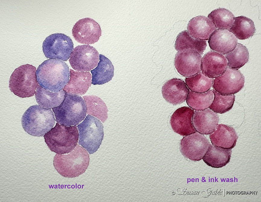
A few folks have commented that my pen & ink wash artwork looks like I used watercolors. I’m happy to receive those comments and feedback. I do apply a few of the watercolor techniques that I’ve learned over the years into my pen & ink wash drawings. Like adding layers of colors and going from light to dark colors. I also use the wet-on-wet technique where I apply a light wash of water and then add my inks to the damp area. Just like in watercolors I always try to the leave the “white of the paper” for the highlights.
I hope this was helpful. I hope this plants a seed to get motivated to sketch or draw something. Whether it’s graphite, watercolor, paint, or pen & ink wash. Just do it. I’m here if you have any questions. Have a wonderful week/weekend!


Leave a comment