I thought it would be a fun project to create a sketch of my watercolor palette that I’m currently using.


I did a blog post a little over a year ago on how I filled my half pans. You can find my post here.
The mixing areas of my palette still looks fairly new. That’s because I enjoy using my porcelain tray to mix my colors in. When I’m at my studio desk, I have a bit more room to accommodate this larger palette and my porcelain mixing tray. I can also create larger pieces of artwork and my mixing tray can hold a bit more paint.
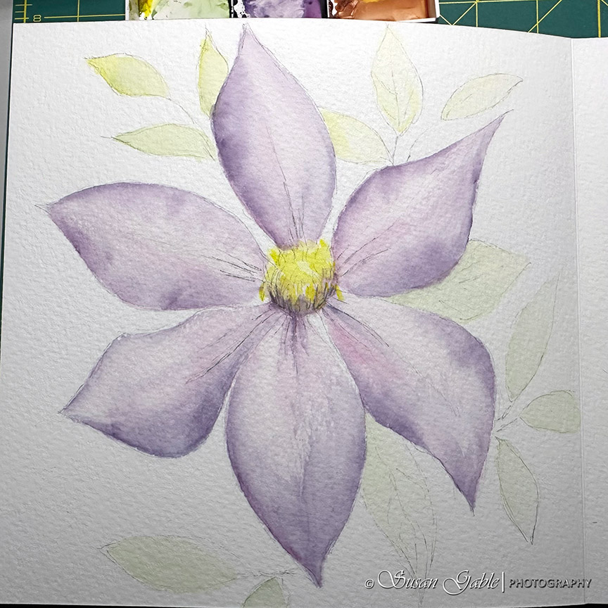
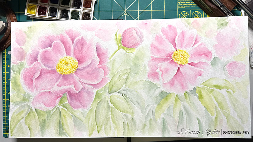
I’ve decided to stick with this one palette for the next week or two and get reacquainted with the paint colors and get my palette a bit dirty. This will help me figure out what colors I want to keep for a scaled down palette of colors for urban sketching.

Palette: Meeden Empty Watercolor Tin Box Palette Paint Case with 24 piece half pans
Paints: Daniel Smith Extra Fine Watercolors (15ml tubes)
Brush: Cheap Joe’s Golden Fleece Synthetic Travel Brush in size 6
Paper: Master’s Touch Fine Art Studio Watercolor 140lb cold press paper in size 6″x8″


Leave a comment