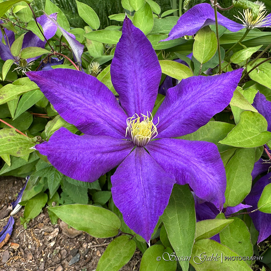
When I think about creating a painting, I’ll already have a subject or topic in mind. Most of the time, I’ll have a vision after I’ve seen a picture I’ve taken. This Spring has been a busy time for me and I’ve taken lots of pictures of what’s blooming in our garden. This one particular picture of a clematis caught my eye. I thought this would be a fun and challenging flower to paint in watercolor.
I decided not to create a two page spread of my artwork. Just stick to one page and see how it goes.
I started out with a pencil sketch. I added a few details to give my floral sketch some depth. I also sketched what would be the green leaves in the background.
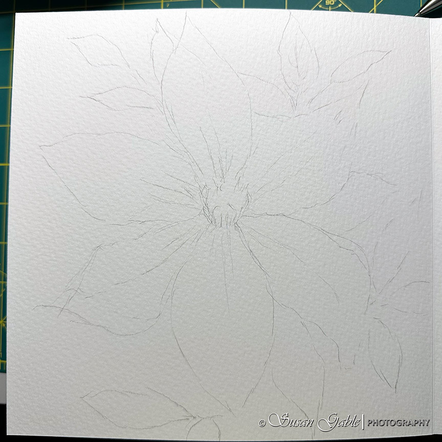
I’m using my artistic license and just using my photo for general reference. More so for the flower structure. As I continue to sketch and paint, I know I can change things up. It’s my interpretation of what my final floral painting will look like.
For this sketch I was leaning towards using a permanent ink pen. I did not want to create any harsh lines around my clematis. So, I went with my Uni-Pin fine line 05 pen with light grey permanent ink.
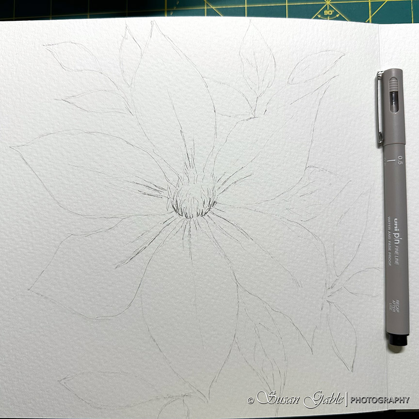
I was quite happy with the my inky sketch and pretty much drawn over all my pencil lines for my final sketch. I took my kneaded eraser and rolled it across the paper to remove my graphite lines I no longer needed. I love this light grey ink as it’s not as bold as using black ink. The lighter ink color reminds me of graphite.
Wet-on-Wet Watercolor Application
For the first few layers of watercolor washes, I use the wet-on-wet technique. Basically, I apply a plain water wash to the area I will paint. Let it dry a bit (not so glossy). On the damp part of the paper, I then take my brush and apply the watercolor paint to this area. I’m careful not to add too many brush strokes and just let the color sit on the paper.
My watercolor mix is basically a “tea-like” mix with more water than paint.
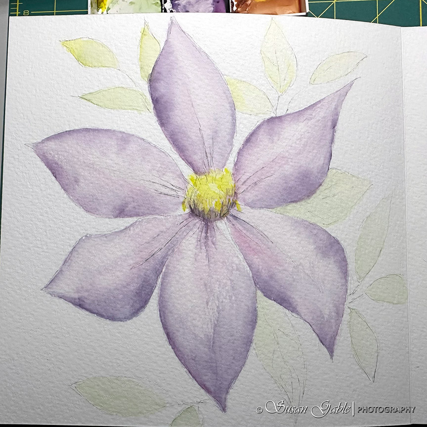
I added the first wash of watercolor to the clematis flower using a mix of Quinacridone Rose and Prussian Blue. This color mix I created leans a bit more towards rose. For the center of the flower I used Lemon Yellow. I decided to paint the background leaves using a mix of Sap Green and Lemon Yellow. Most of the leaves leans a bit more towards the yellow color.
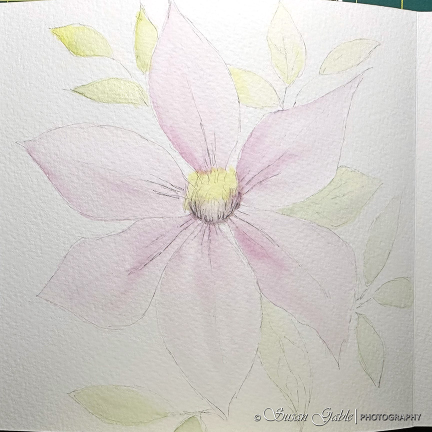
You can see how soft the petals look with the wet-on-wet technique.
For the next few layers of colors, I focused on the main flower. I added a bit more Prussian Blue to my purple mix. I gave the outer edges of the flower petals some definition. Also added some purple to the center of the flower.
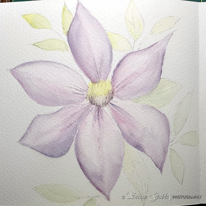
I decided to add a bit more yellow to the center of the flower as a reminder not to add too much purple to the base. I will go back later and add more details.
For the next layer, I worked on the dark or shaded areas of the clematis. This would be the folds or curls on each petal. I took my time with my brush as to not overwork each petal and to keep some the of the pink foundation color.

I also squinted and kept my eye on my reference photo to see the shadows from the curls and folds on each petal. At this point I’m not copying the photo. I’m just experimenting and figuring out color placement on the petals. I think this is working.
I’m still using the wet-on-wet technique on certain parts of the petal where I need to add more color. If you look along the edges, you can see how the paint bloomed back towards the center of the petals. I love this look and feel.
On a few petals are some hard edges towards the center of the petal. I think it adds a bit of character and I will leave it for now.
I’m not rushing to get this painting completed. I’m working at my own pace. I’m continuing to learn and experimenting with my brush as well as water to paint ratios. This allows me to enjoy my painting process a bit more.
This is a good place for me to stop painting and let the paper dry completely. Also, this gives me a chance to look at what I’ve painted and where I need to go into the next steps of my painting process. I’ll be back.


Leave a comment