
I’m back with another Van Dieman’s Ink review. This lovely ink is called Tortoiseshell. After I saw the initial ink swatches and sample writings, I knew this would become another inky fave for me.

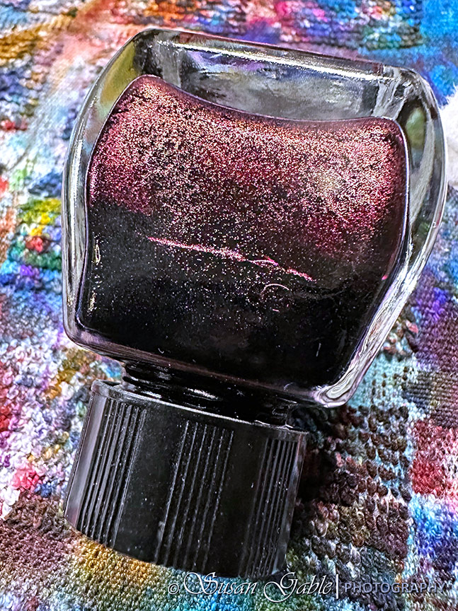
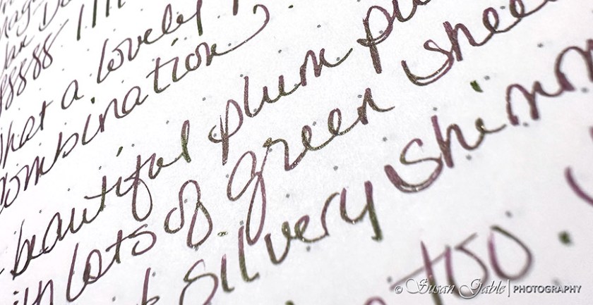
Tortoiseshell is a beautiful plummy-purple color. At first, the shimmers appear to be coppery, but my picture is showing something else.
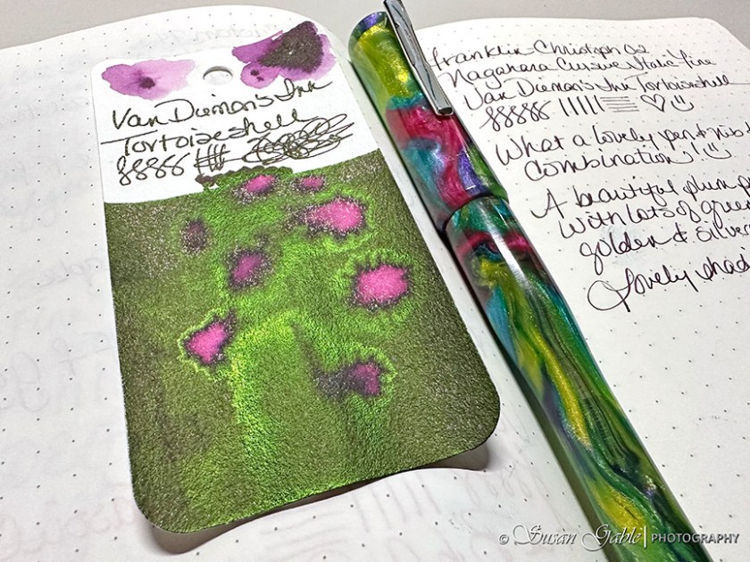
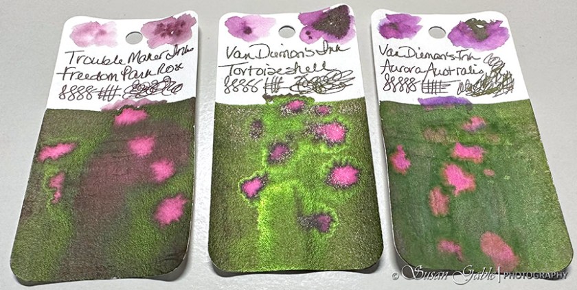
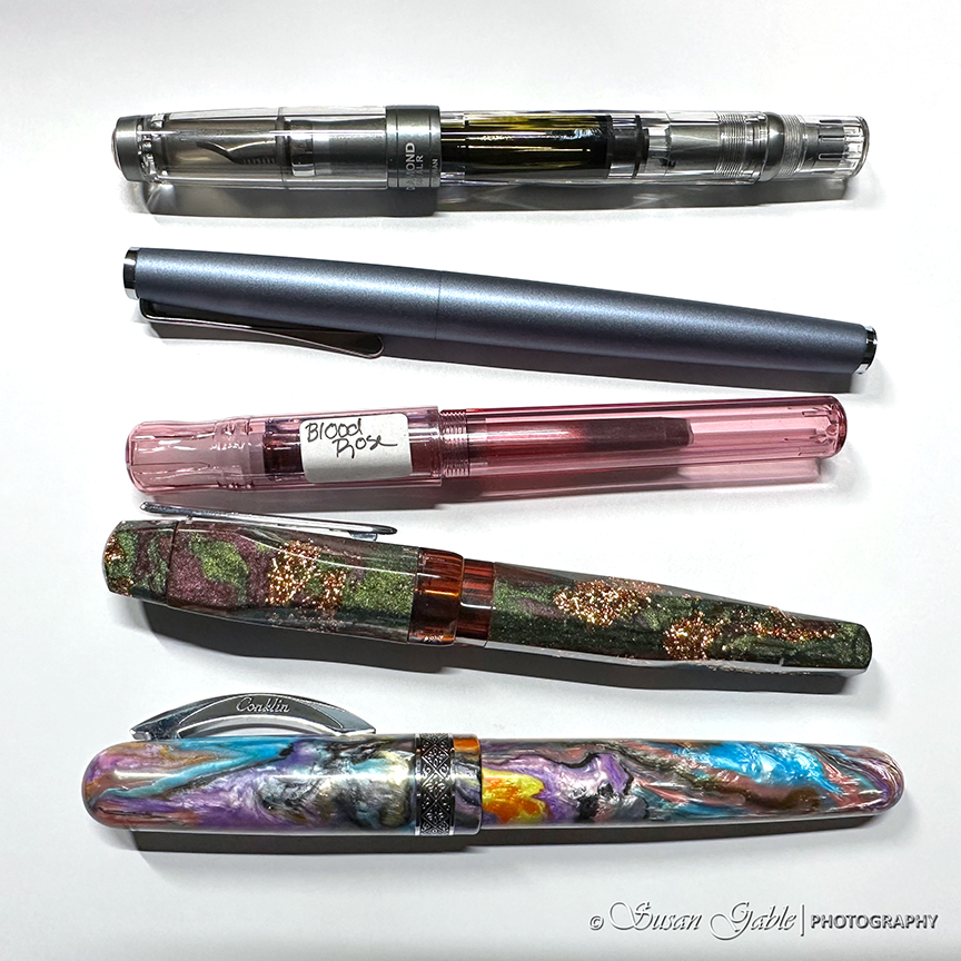
My 02 Intrinisic (prototype) from Franklin-Christoph is a perfect match for this wonderful ink color. There’s a ton of green sheen on my swatch card with some coppery shimmers.
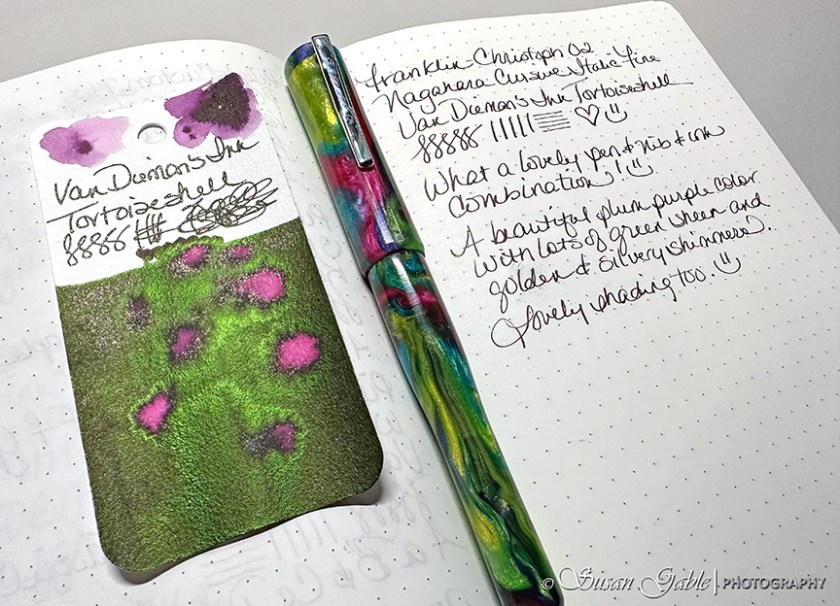
Here’s a closer look at my swatch card with the incredible green sheen.
On paper with a fine nib, my writing sample shows the purple color and hints of shimmer along with bits of sheen.
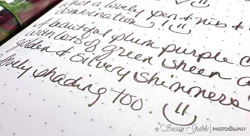
Here’s a different angle of my writing sample. I’m sure if I had used a broader nib, the sheen would show up more.
It didn’t take me too long to find some swatch cards that had similar color properties to Tortoiseshell. They are quite close in the underlying color as well as sheen.

Freedom Park Rose is just a tad bit lighter than Tortoiseshell and the green sheen is not as bright.
My swatch of Aurora Australis is from a sample and the ink looks quite dull and lifeless on my swatch card. I wonder if I received a sample from a bad batch.
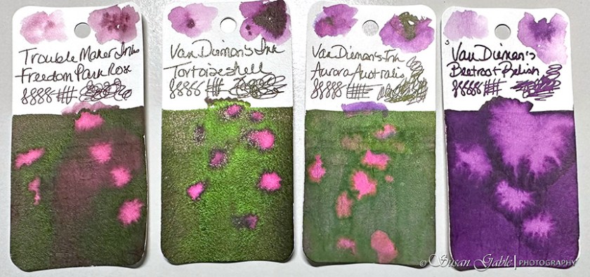
Just for fun, I added my Beetroot Relish swatch to the mix.
Tortoiseshell is a lovely and wet purple ink. The bright green sheen is gorgeous when it appears on my paper. After I shook my bottle, I purposely refrained from filling my pen quickly as I did not want to get too much shimmers in my pen.
I’ve been enjoying this pen & nib & ink combination for writing in my journal. I can’t wait to sketch with this beautiful ink and see the results.
Ink: Van Dieman’s Ink Feline Series Tortoiseshell
Pen: Franklin-Christoph 02 Intrinsic (prototype) with #6 Nagahara Fine Cursive Italic nib
Journal: GLP Creations-The Author 68gsm TRP


Leave a comment