
We’re in the Fall season and I’m feeling good about how I’m using my creative time. I’m no longer forcing myself to create daily sketches like I did earlier this year. At that time, I was just getting back in to drawing and had to re-learn a few skills which created the need to draw daily. It’s like riding a bike, right? I believe I’m going through a creative cycle in my life where I’m feeling comfortable when my pencil or fountain pen touches paper. I’m finding it’s been easier to sketch quickly and I’m also finding I’m erasing less lines.
I was going through my collection of pictures and I came across one I took a few years ago of apples I randomly placed on my kitchen counter. It’s a perfect picture to sketch from. It has three objects (odd numbers are better), it’s something I enjoy eating, and I already had the colors in my fountain pens that I could use.
This blog post will show you the steps I took to draw my apples and the layers of inky colors I created.
Oooops! I forgot to stop and take a picture of my initial pencil sketch. Oh well, we’ll start with a picture of my sketch where I used my COPIC permanent pigment ink pen. I used this pen to sketch over my pencil lines. I used my pencil lines as a guide and changed up my sketch depending on where I placed my permanent lines. I also added extra dark lines to show a bit more depth.
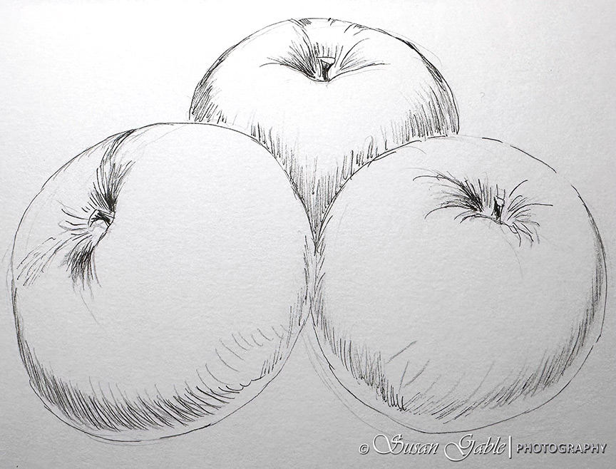
Once I’ve completed my inky outlines, I go back and erase any extra lines that are not needed.
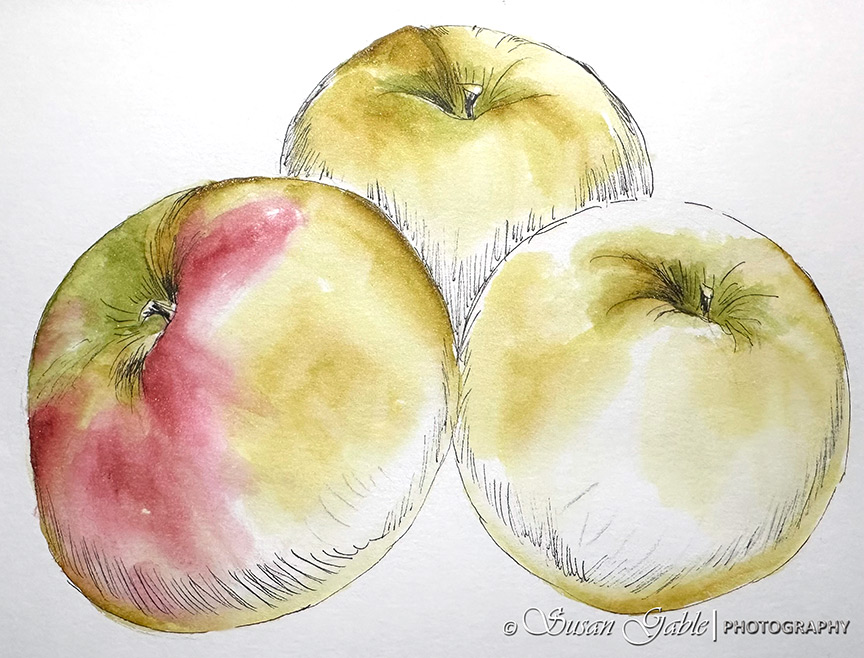
For my first layer of color, I decided to start with the Heart of Gold ink. I’m going from lightest color to the darkest colors. Once I’ve added my ink to paper, I can’t remove it. I carefully watch where I’ve placed my colors in my sketches. In the following picture, I’ve added more water to the paper to lighten the yellow. This also smoothed out the rough & harsh edges.
I’ve also left quite a bit of white paper showing as I thought about where the highlights on my apples should be. This provided me with some wiggle room in my sketch and allowed me to adjust how the highlights appeared later.

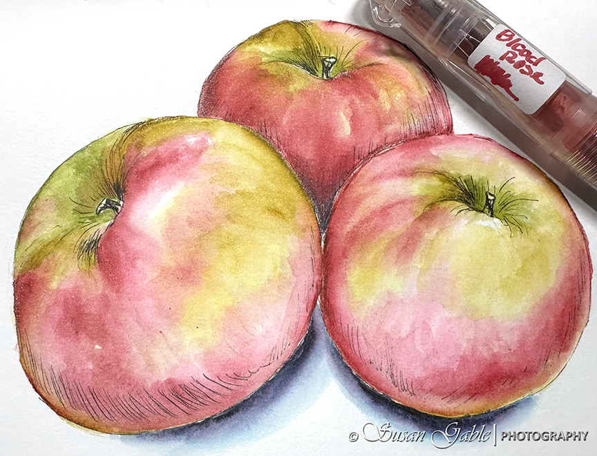
For the second layer of color, I added some green colors using Candied Mint and Brane. I also added some Blood Rose to see how the colors worked together.
Once I was happy with my results, I continued to work with Blood Rose. Initially, I worked the first two to three layers of this color on each apple before I moved on to the next one.
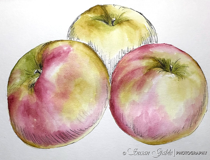
Once I was satisfied with the first two apples (front), I started to work on the last apple in the back.
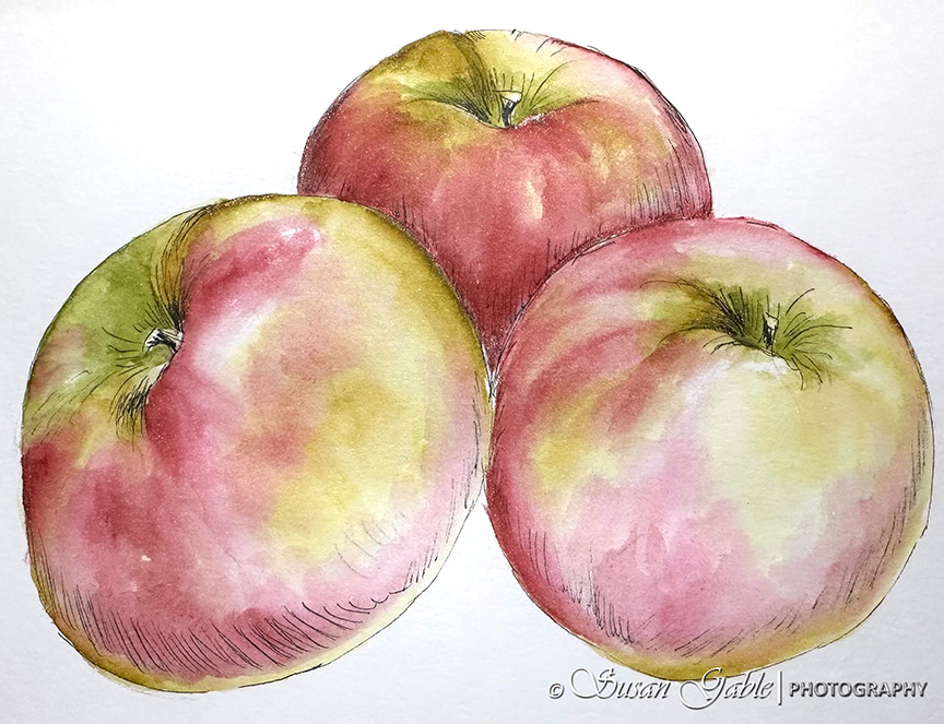
The last layer of color I used was Thunderstorm for the base shadows under the apples. Now, the apples looked stationary on the paper instead of floating. After I applied the base shadows, I went back with my Blood Rose ink and added a bit more color to make the areas darker.
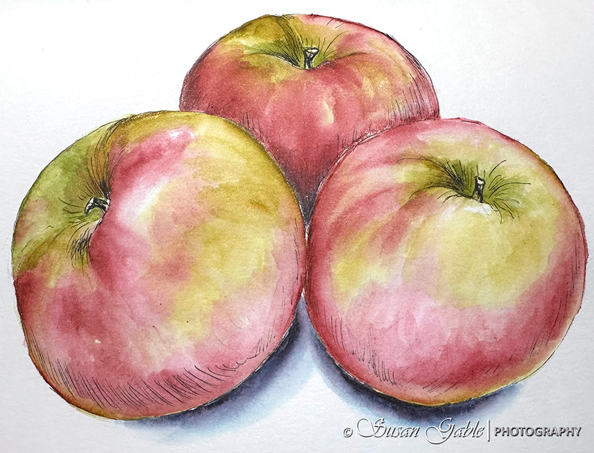
Tip #1: Going back to my comment about leaving the white space on the paper. I do this as a reminder to stop adding too much color or not completely color in my sketch. Sometimes I get in this creative inky zone and I forget to stop and look. I have to remind myself that my sketch is not a coloring book.
Tip #2: Have to remember when the ink is applied to the paper, it’s going nowhere. It cannot be removed. It can be lightened by apply additional water to the area. I also have to remember not to scrub the paper’s surface too hard as it can be damaged.
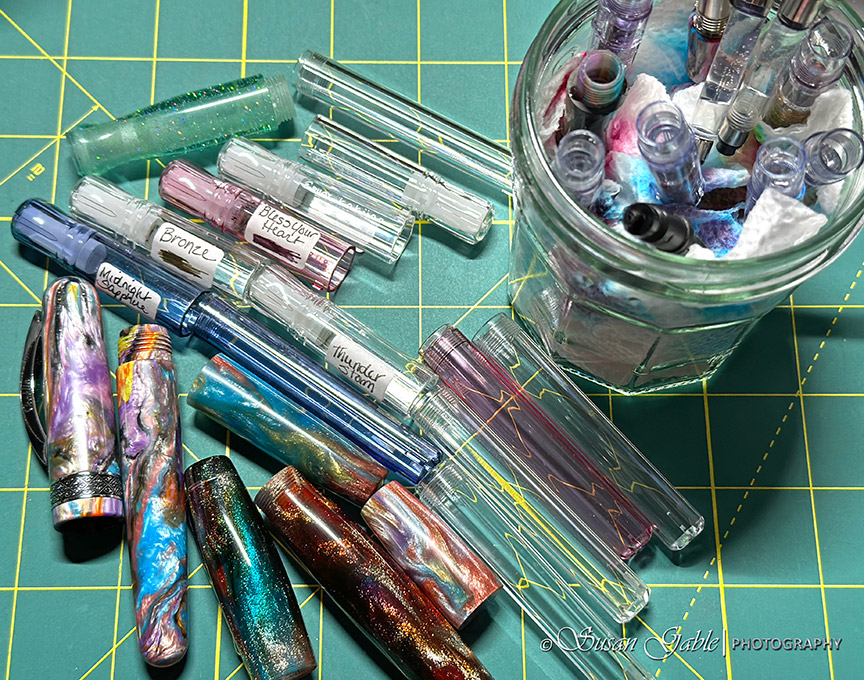
Tip #3: My favorite shimmering inky colors for sketching. The colors in my palette that I use frequently are the inks that I can find easily online or at a pen show. I have on occasion come across gorgeous colors that became my favorites and find they are exclusive or eventually become discontinued inks. I had been looking for a good replacement ink for KWZ Prairie Green. I think I’ve found some good choices. One is Candied Mint (has a lot of personality) and Brane. They are similar in color, but with different personalities. Brane is a bit brighter while Candied Mint appears to be a bit moodier. Many times I’ll use both colors in a sketch.
Tip #4: Learning to shift gears. Recently, I’ve been switching between two art journals. One has 100% cotton paper while the other has a thin mixed media paper. The 100% cotton paper is absorbant and will take a beating with the many layers of colors I apply to the thick paper. When I sketch in my Stillman & Birn journal, I have to remember to pull back on the number of layers I can apply to the paper. Three layers of colors appears to be the magic number for me. Plus I’m careful with how much pressure I use with my water brush on the paper.
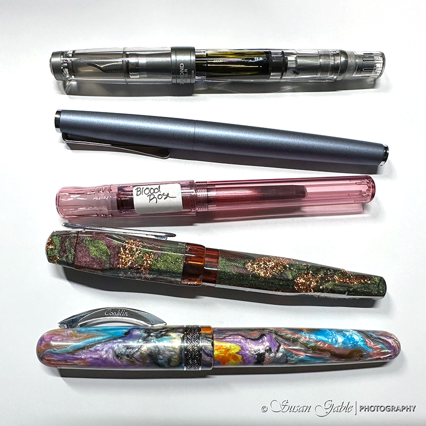
Pen: TWSBI Go with Stub 1.1 nib
Inks: Robert Oster Heart of Gold, Blood Rose, Bronze, Thunderstorm, and Candied Mint. Colorverse Brane.
Journal: Stillman & Birn Alpha A5
Permanent Pen: Copic Multiliner SP 0.3 in black


Leave a comment