Skip to content
SusieG Studio
Search
Category:
TWSBI
Framing My Sketches & Not What You Think
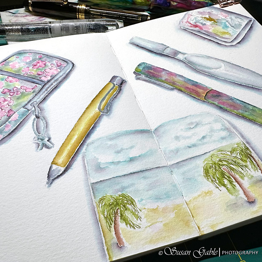
Sketching My Art Tools – Pen & Ink Wash
Starting to Fill My Fountain Pens
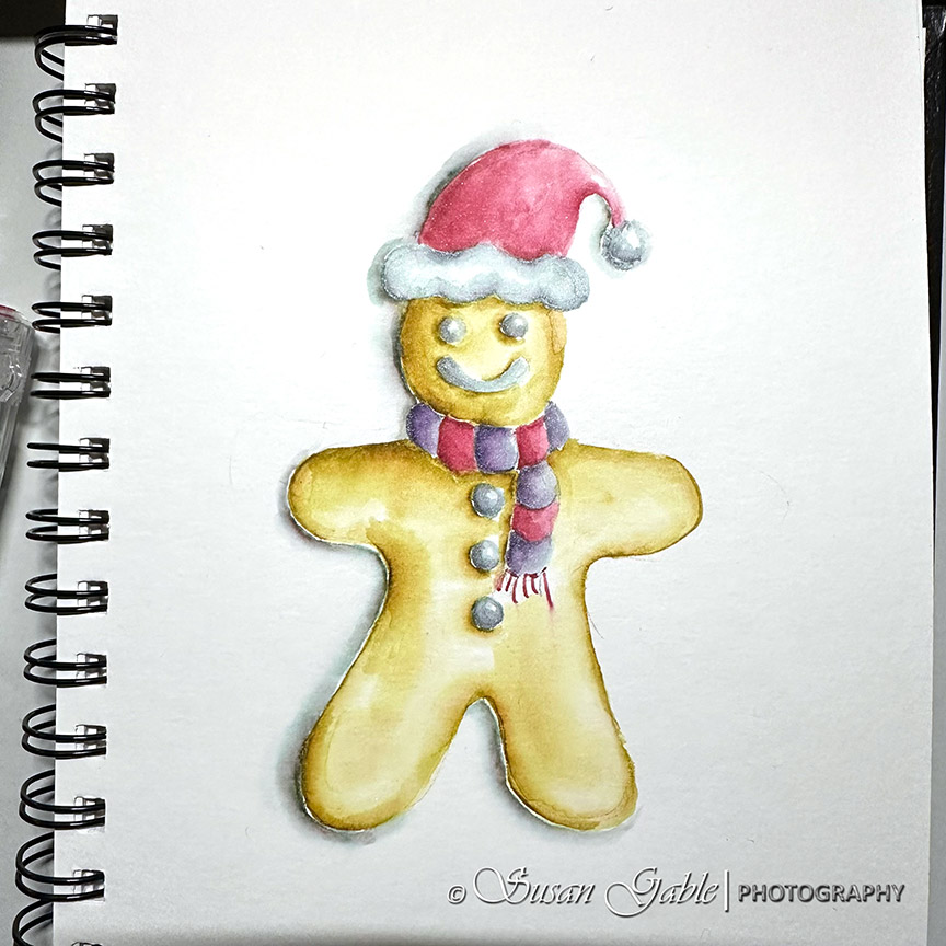
Merry Christmas! My Other December Sketches
December Inks in My Art Pens
Previous Page
Next Page
Subscribe
Subscribed
SusieG Studio
Join 87 other subscribers
Sign me up
Already have a WordPress.com account?
Log in now.
SusieG Studio
Subscribe
Subscribed
Sign up
Log in
Report this content
View site in Reader
Manage subscriptions
Collapse this bar